- This article has been translated using AI. The original text is from https://eryinote.com/post/1009. The translation has not been professionally edited and is provided for reference only.
- You are also welcome to watch my video review on this topic: https://www.youtube.com/watch?v=z-Q2YnvBN0c
- For a 7-day free trial of Heptabase, please visit: http://eryi.ink/appr
- To view shared Heptabase note examples, please visit: http://eryi.ink/gJL7
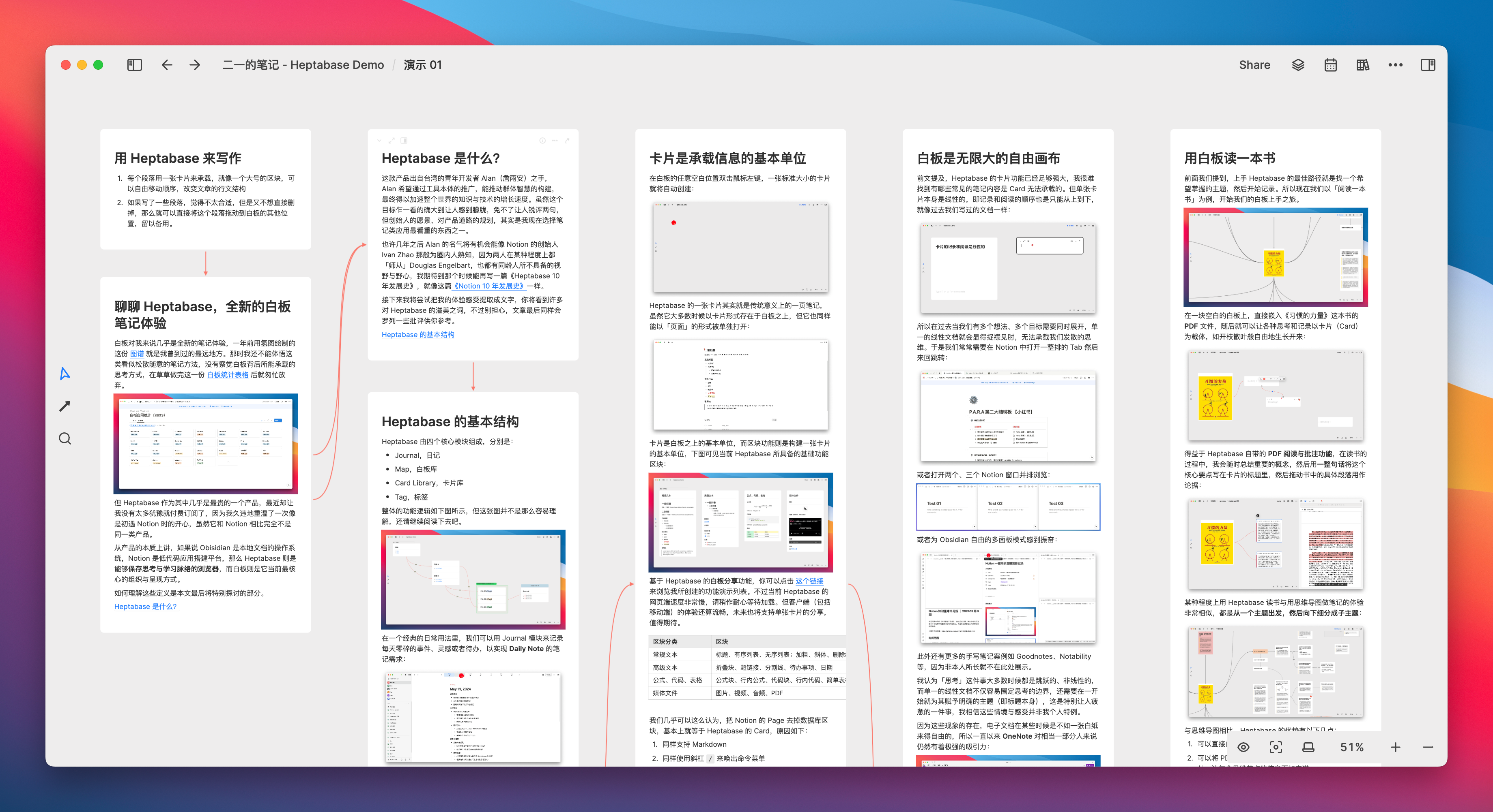
The whiteboard is almost a brand-new note-taking experience for me. The map drawn with Hydrogen Map six months ago is the farthest place I have ever been.
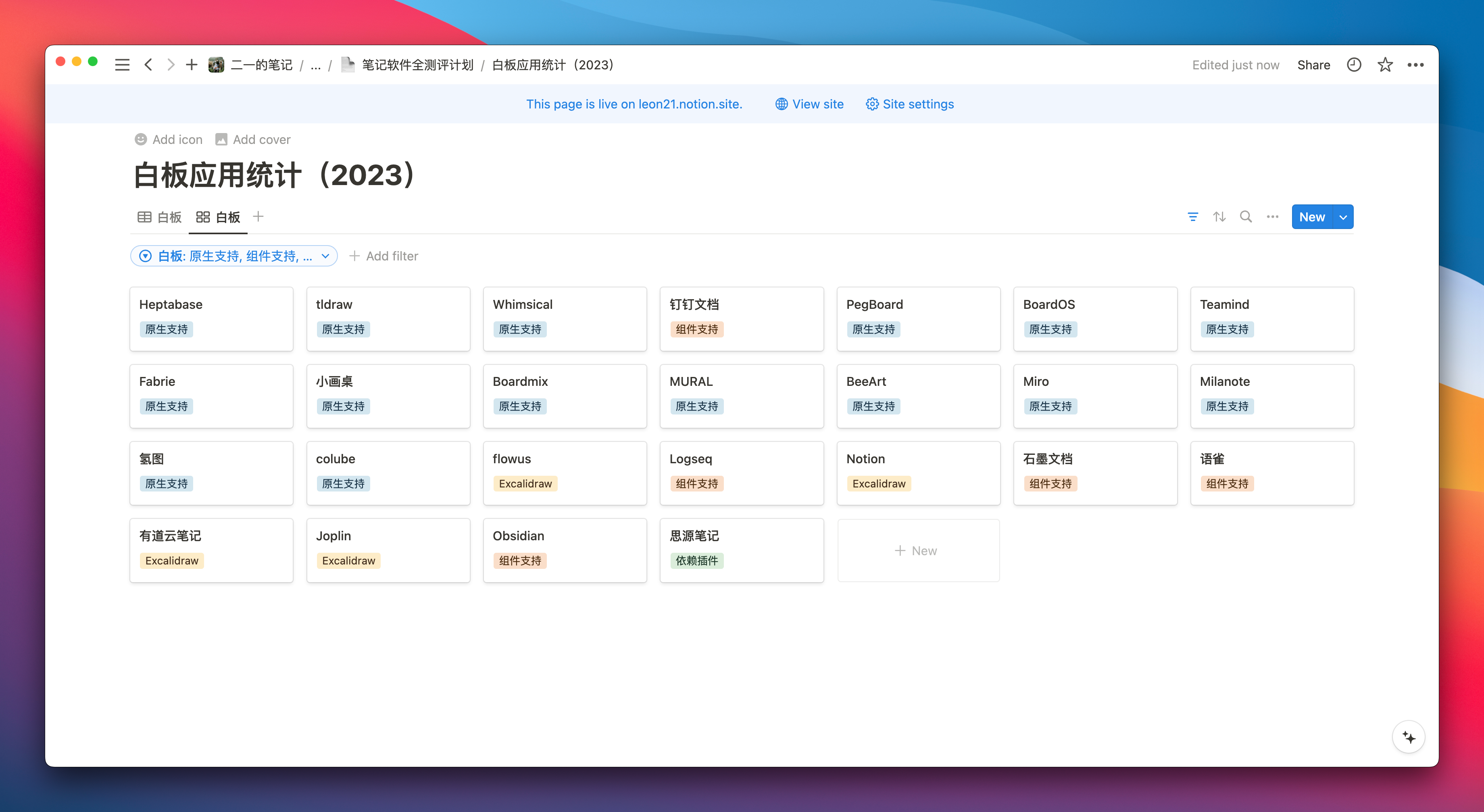
At that time, I had not yet realized the ways of thinking that a whiteboard could carry. I only felt that the whiteboard was too free, leading to a loose structure, and that it could be written on anywhere, making it unregulated. It was difficult to find a way to enter the flow of note-taking, so after hastily completing this whiteboard statistics table, I quickly gave up.
However, after I decided to study and research note-taking methods like whiteboards, Heptabase allowed me to once again experience the joy I felt when I first encountered Notion, even though it is a completely different type of product compared to Notion. If you are curious about where this happiness comes from, please continue reading.
What does Heptabase want to do?
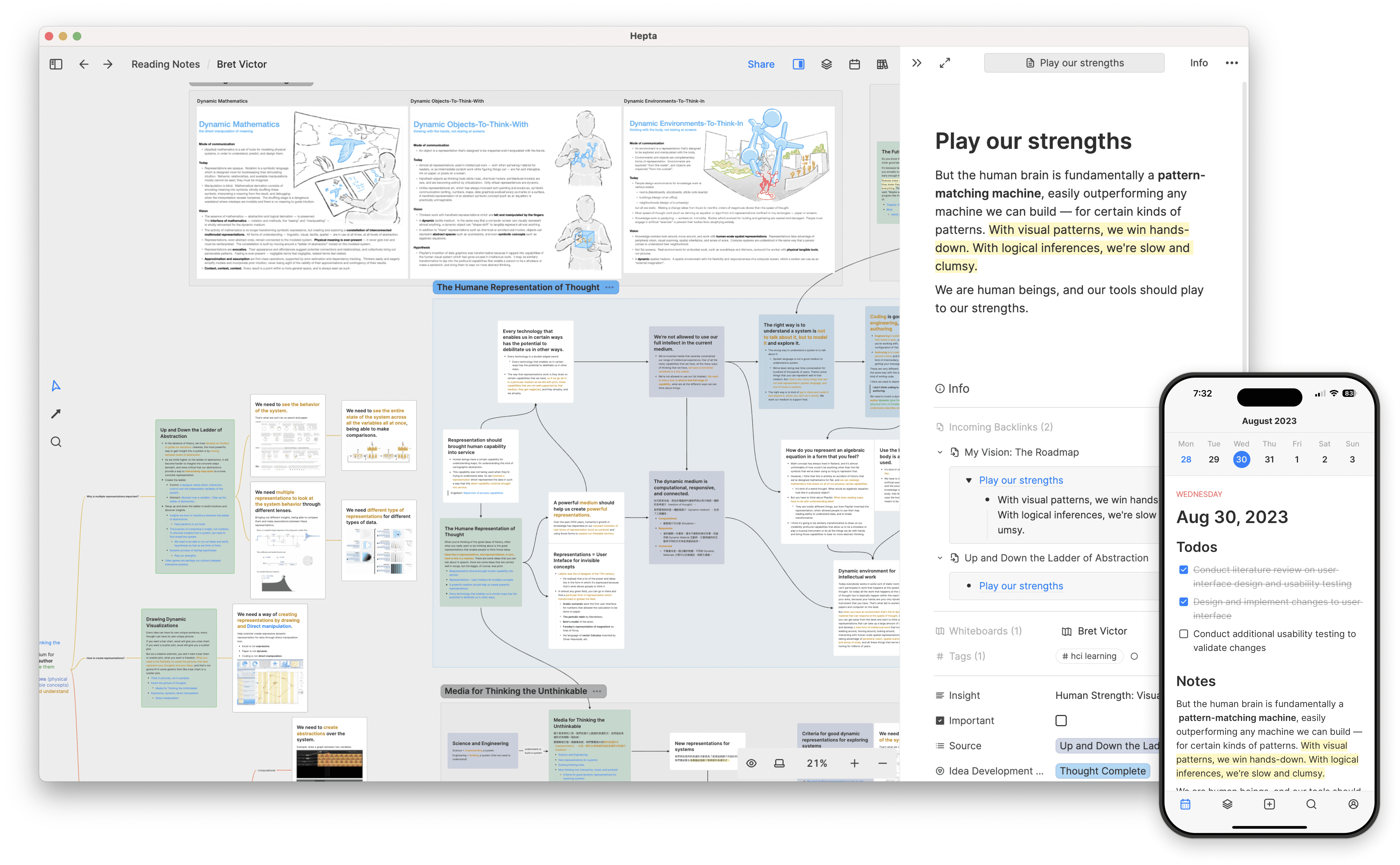
From the essence of the product, if Obsidian is the operating system for local documents, Notion is the no-code application building platform, then Heptabase is the browser that can save the context of thinking and learning, with the whiteboard being its current core method of organization and presentation.
The goal of this article is to clearly explain the origin of this definition to you: What is the context of thinking and learning? And why can Heptabase become the browser for these contexts?

This product was created by Taiwanese young developer Zhan Yunan. He hopes to create a world where anyone can understand complex things with Heptabase, further promoting the construction of collective intelligence through the tool’s promotion, ultimately accelerating the growth rate of knowledge and technology worldwide.
At first glance, this goal indeed seems so grand that it feels vague, inevitably inviting sharp criticism. However, the founder’s vision and the planning of the product’s path have actually become one of the most important factors for me when choosing a note-taking application. The reasons for this will be discussed in future articles.
Next, I will attempt to translate my experience into words. You may see many words of praise for Heptabase, but don’t worry, there will also be a concluding summary of Heptabase’s strengths and weaknesses at the end of the article.
The basic structure of Heptabase
Basic Information
- Support platform
- Windows、Mac、iOS、iPad、安卓、网页、Linux
- Note Management Methods
Whiteboard + Card + Label + Primary Database
Four core modules
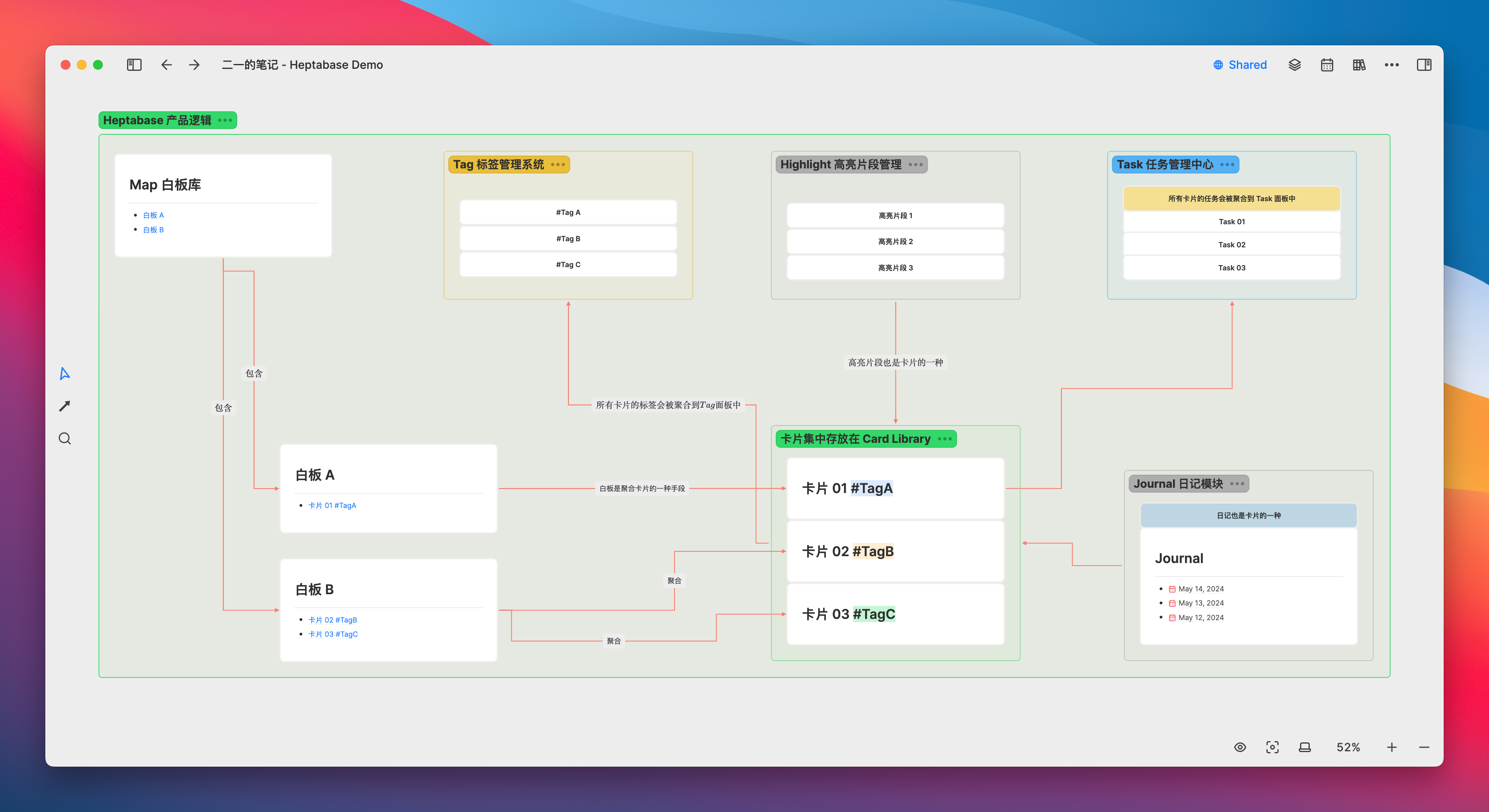
Heptabase currently consists of four core modules and two auxiliary modules, as follows:
- Core module
- Journal, diary
- Map, whiteboard library
- Card Library
- Tag, label
- Auxiliary module
- Task, Task Management
- Highlight, Highlight Fragment Management
The basic functional logic is shown in the figure below, but this figure is not so easy to understand. After reading the entire article, you will have a deeper understanding.
Journal Module
In a classic daily usage, we can use the Journal module to record daily fragments, inspirations, or to-dos to meet the needs of Daily Note taking:
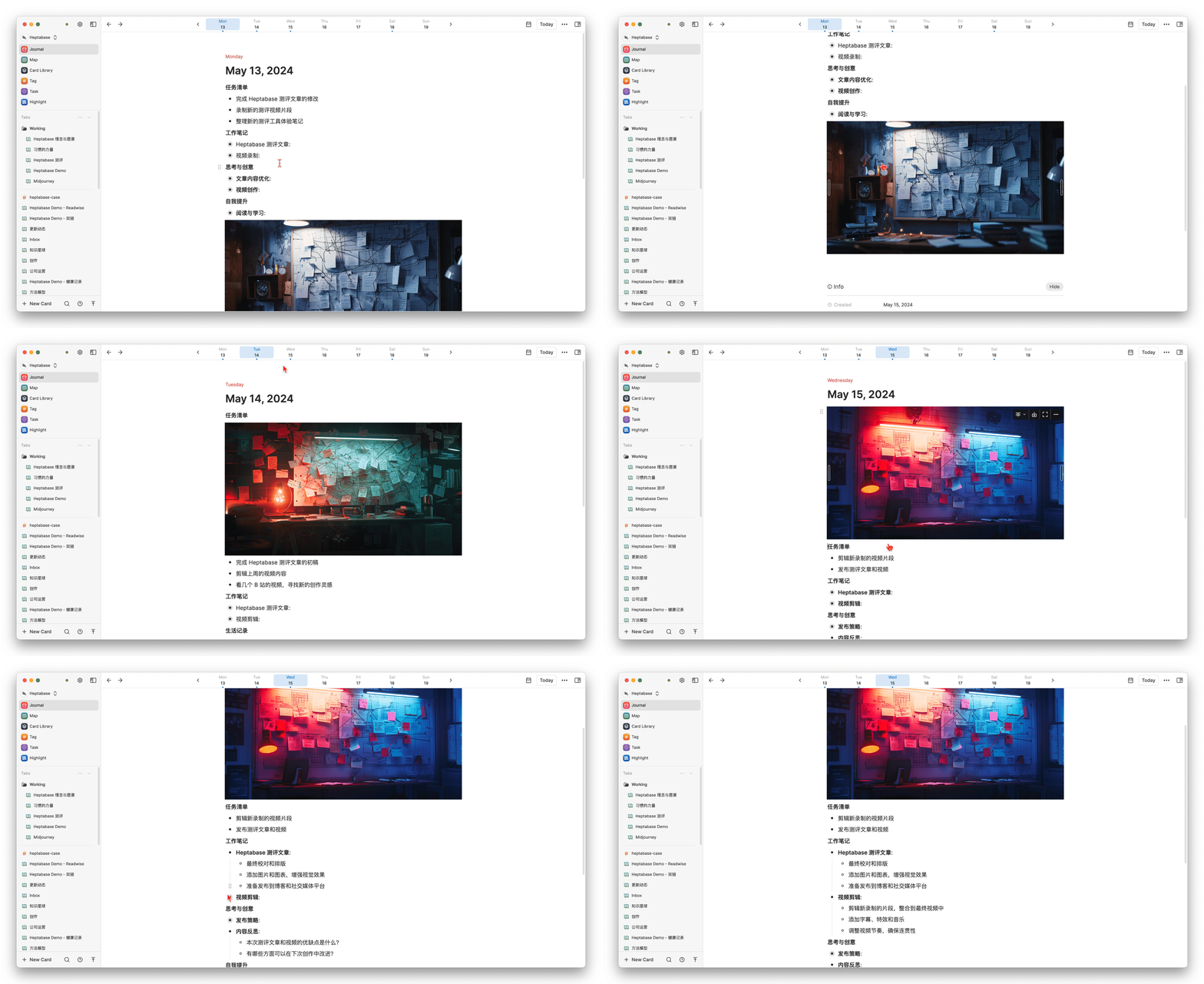
However, unlike the log modules of Logseq, which allow continuous scrolling pages, Heptabase’s daily journals are independent pages that can only be switched by clicking the date at the top. Personally, I don’t really like this design because it makes the action of “continuous review” seem less smooth.
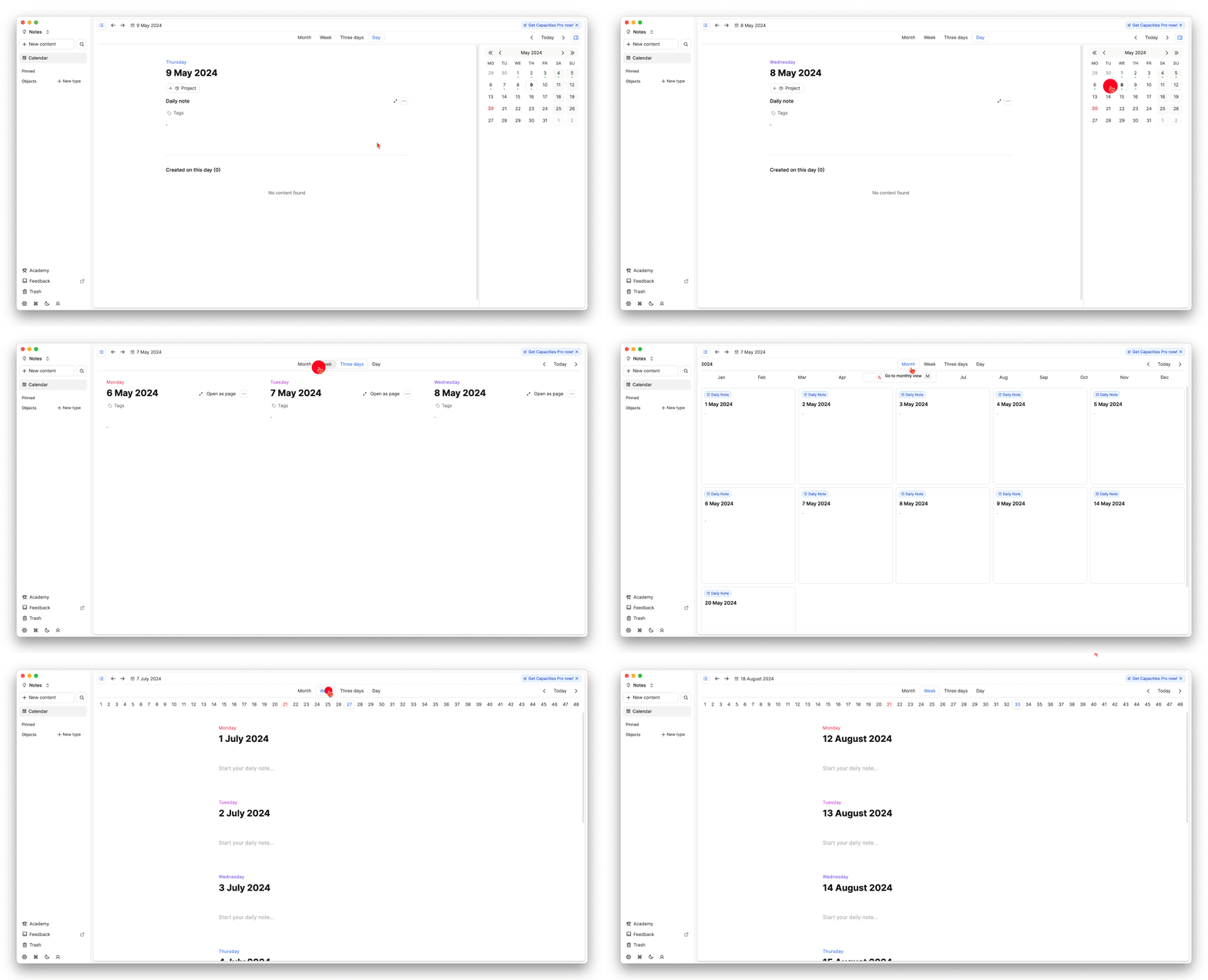
In my opinion, it would be great if Heptabase could appropriately draw on the design of Capacities. The Calendar module of Capacities offers various time ranges, allowing you to switch between month, week, three days, and one day. As for the shortcuts, it would be best to refer to the design of Notion Calendar, drawing on the strengths of many.
Map Whiteboard Module
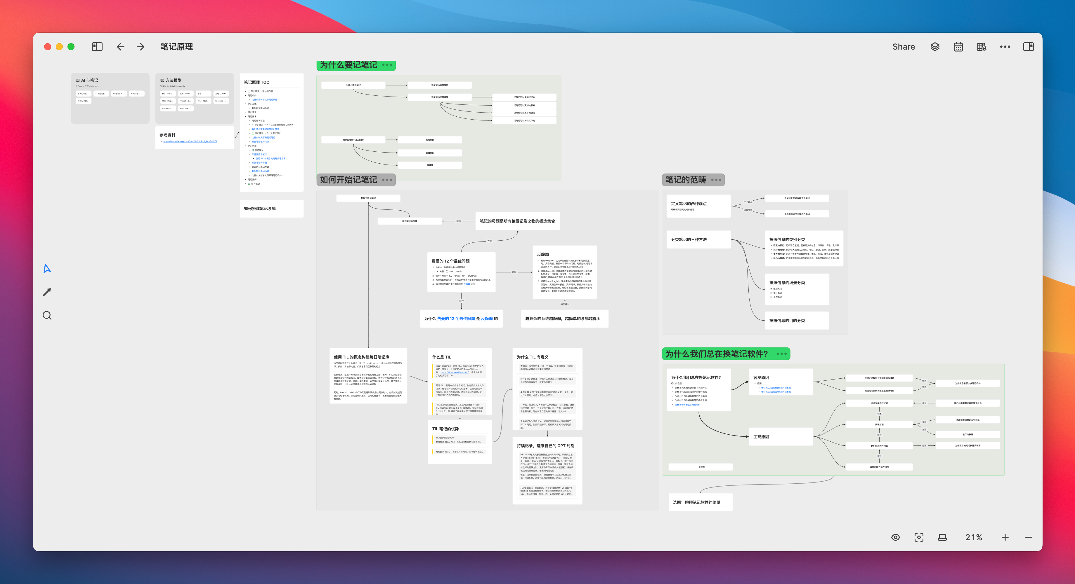
If there is a specific topic, project, or engineering research you want to undertake, you can create an infinitely large whiteboard in Map for it, and then create specific note cards on the whiteboard:
Card Library Module
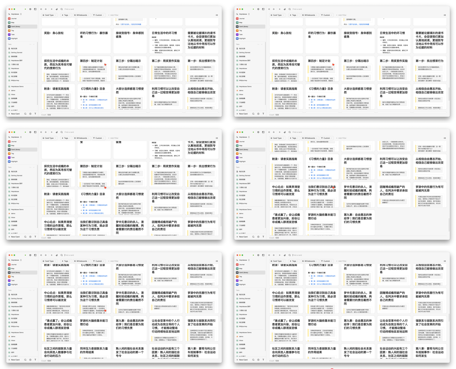
The whiteboard is just one of the means to aggregate and display cards; cards created anywhere will be truly stored in the Card Library
Tag Module
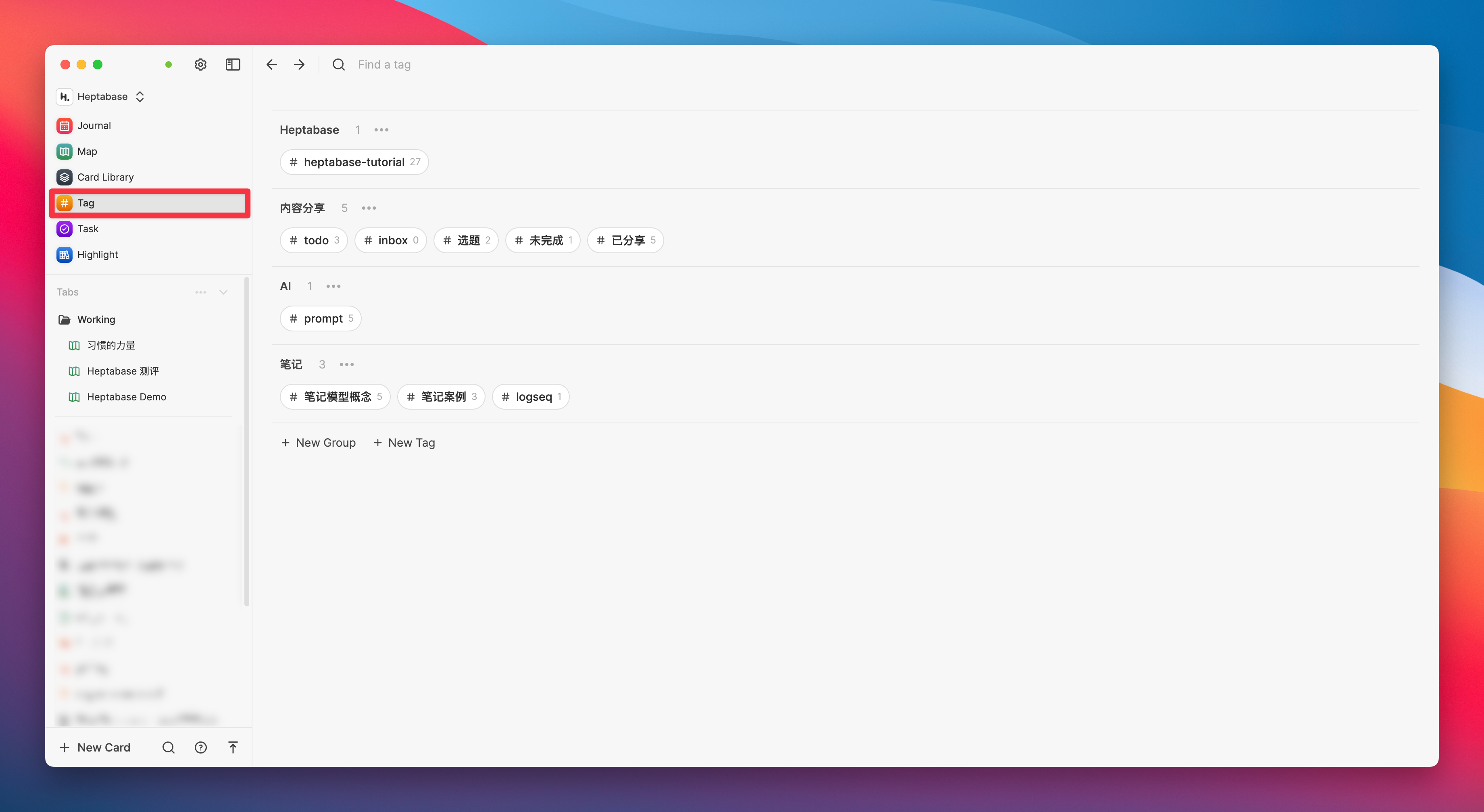
All cards can be tagged with specific labels, and all labels will be aggregated in the Tag module on the sidebar. If you have used Evernote, you should be familiar with this feature structure
However, the standout feature of Heptabase is that when you click on a specific tag, the cards scattered across different whiteboards are all gathered into a single table. Then, just like the database of Notion or the multi-dimensional tables of Feishu, we can continue to add more fields to these cards
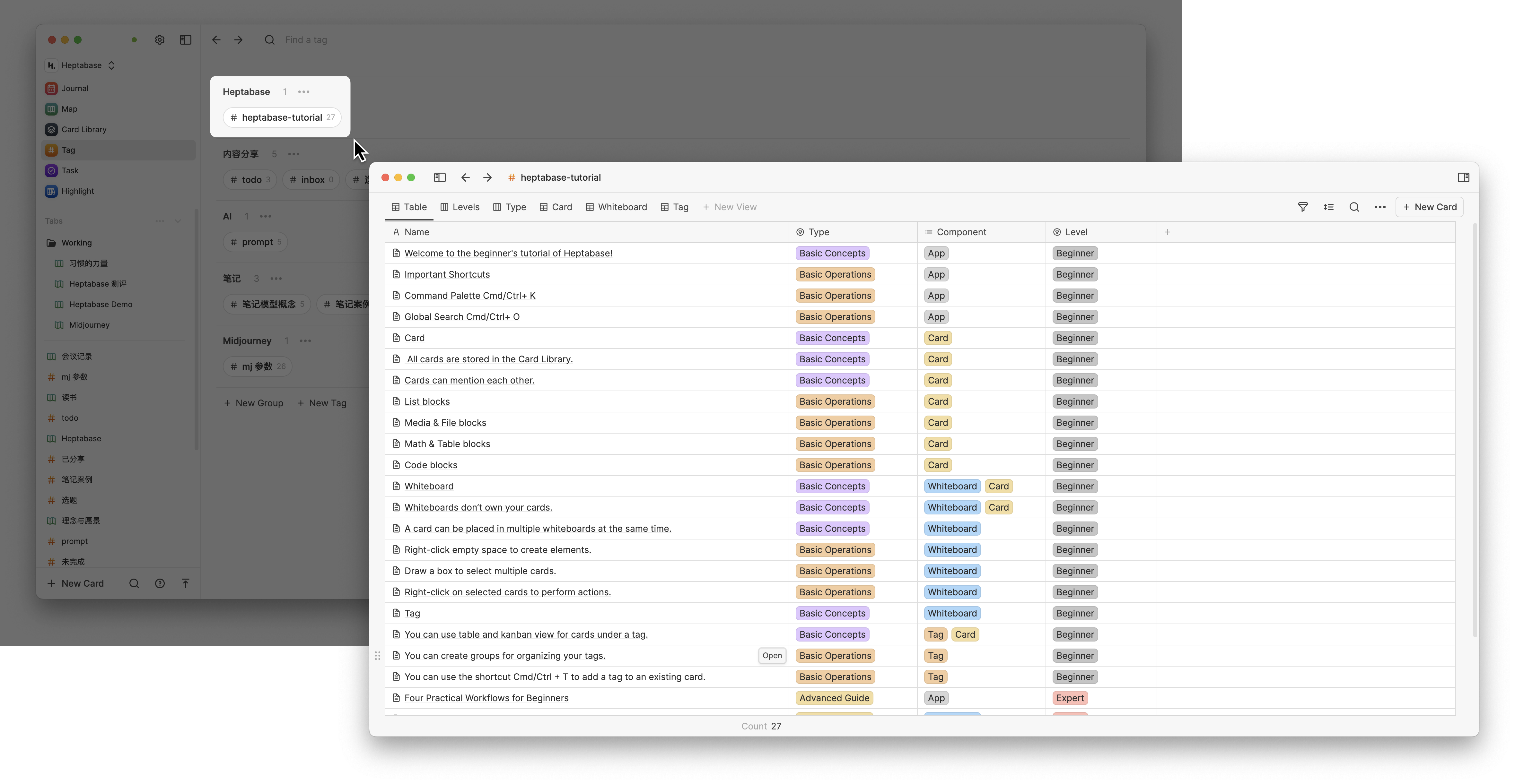
This is somewhat like the Dataview plugin of Obsidian, which allows you to query notes that meet specific conditions within any folder on a single page. However, Heptabase’s implementation is simpler and more intuitive, requiring no learning of any syntax.
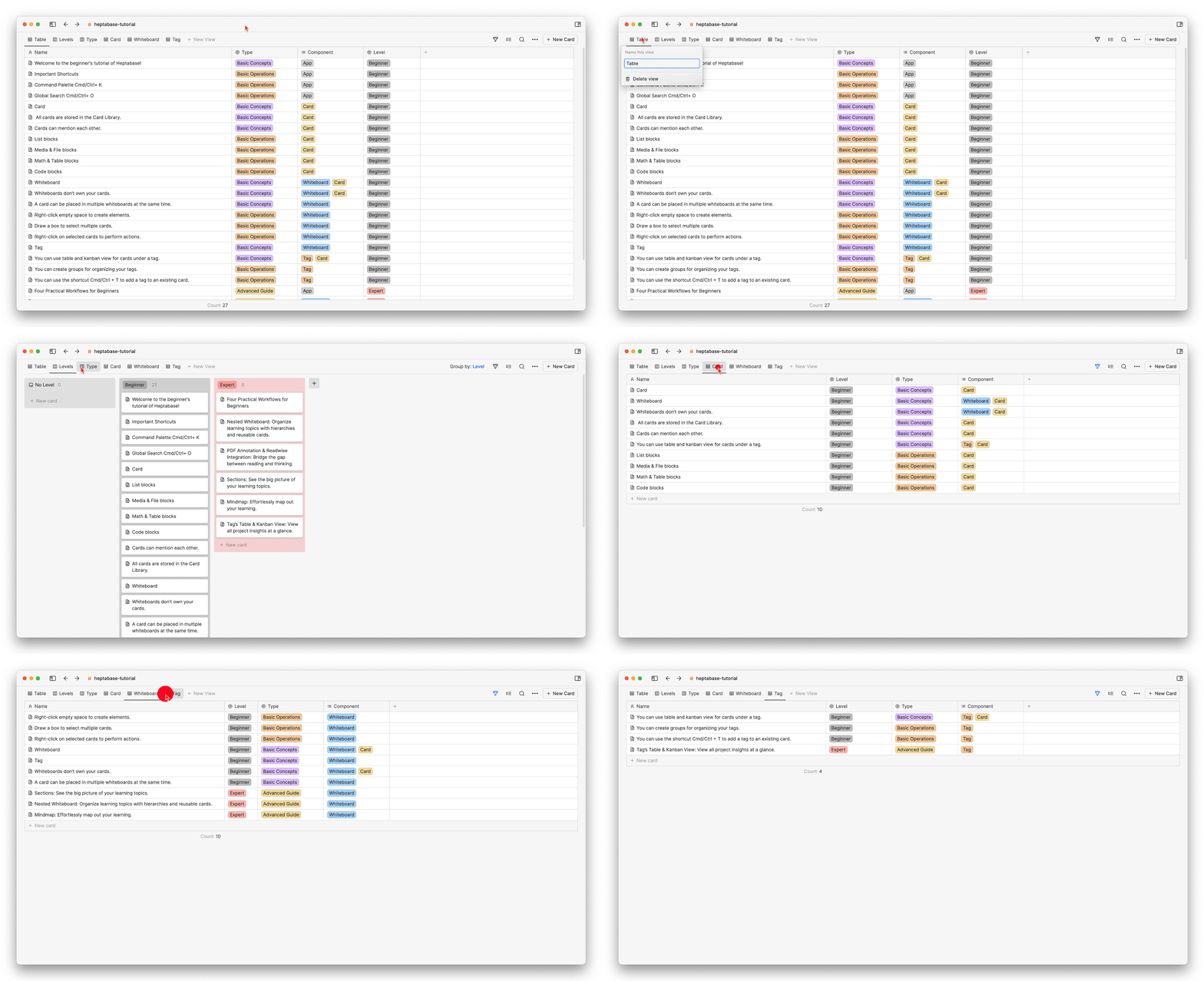
We can also switch from the Table view to the Board view, and according to Heptabase’s product development roadmap, gallery view and graph view functionalities will be added in the future.
Task Module
All todo items on the cards will be centrally collected in the Task sidebar, but the Task module is currently just a barely usable semi-finished product, only possessing the most basic task management functions and requiring more updates and optimizations.

Highlight Module
Currently, Heptabase can directly read and annotate PDF files, and it can also integrate with the read-later software Readwise. All the articles you have read and the paragraphs you have annotated will automatically become a highlighted card, which will then be centrally stored in the Highlight tab
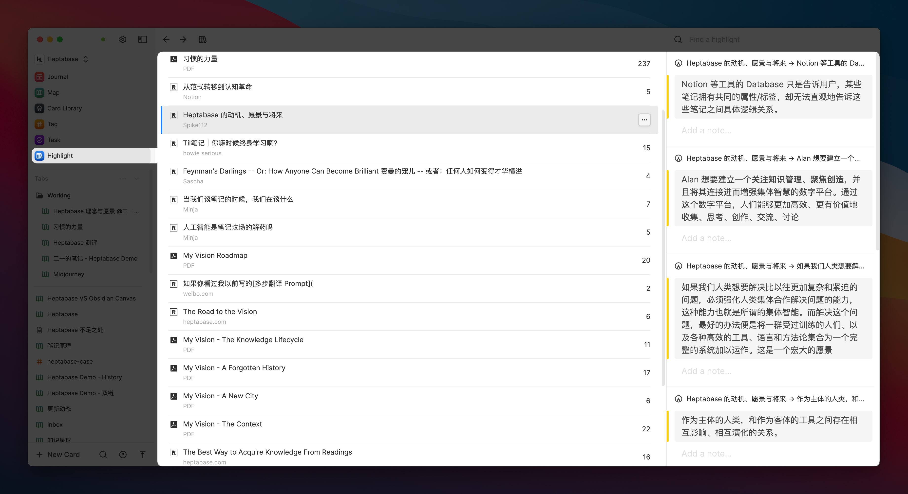
The above simple illustration should give you some initial impressions of Heptabase. I believe it is not yet suitable for recording structured notes, nor is it a tool for managing complex tasks or projects. Therefore, if you prefer a database management model like Notion, Heptabase may not provide you with immediate intuitive benefits when you first start using it.
So how can Heptabase be used? Next, I will introduce its four core modules in detail, hoping to provide you with some reference.
The card is the basic unit of the whiteboard
Double-click the left mouse button on any blank area of the whiteboard, and a fixed-size card will be automatically created
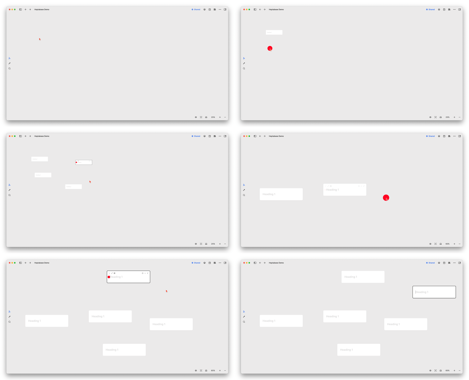
A card in Heptabase is essentially a traditional page of notes. Although it mostly exists in the form of a card on the whiteboard, it can also be opened in page form:
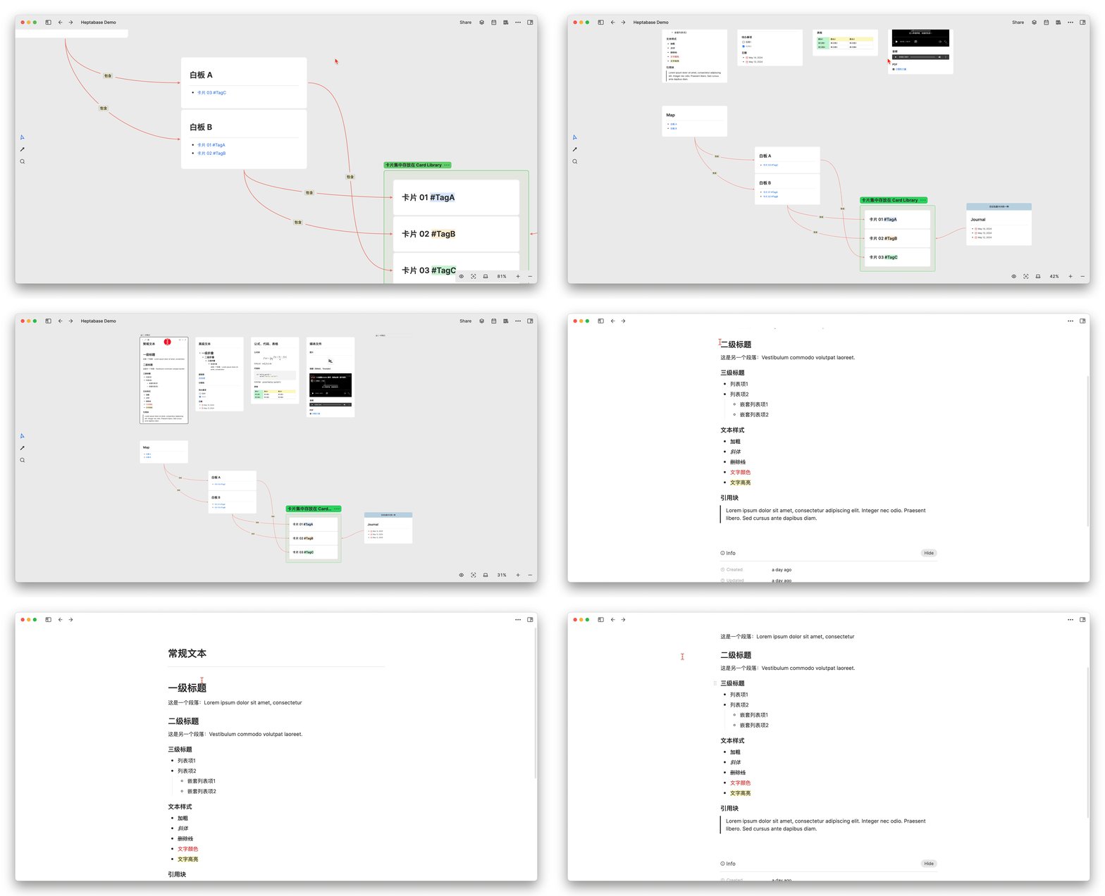
Additionally, the card can also be opened in a pop-up form by clicking the space bar, or in the sidebar in the manner of alt + 左键双击 . Analogous to Notion, it is the center peek or side peek of the database page:
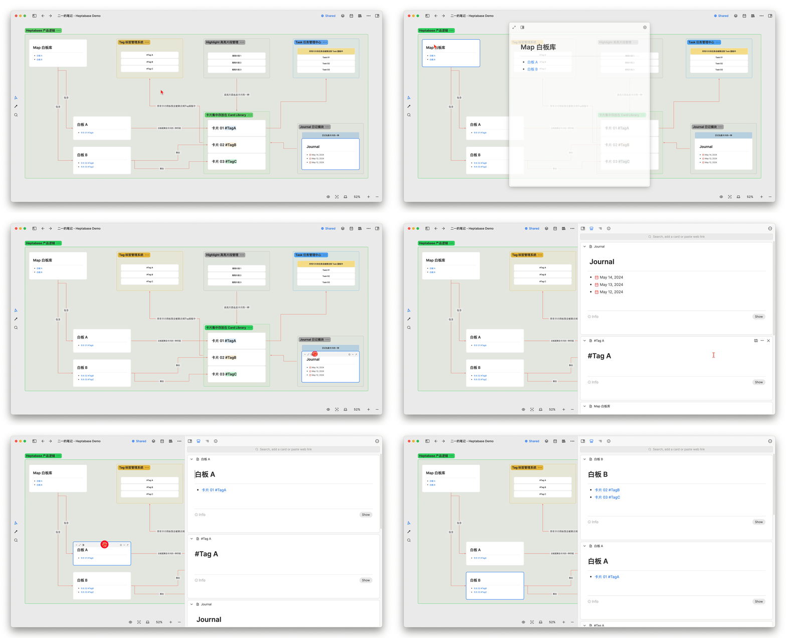
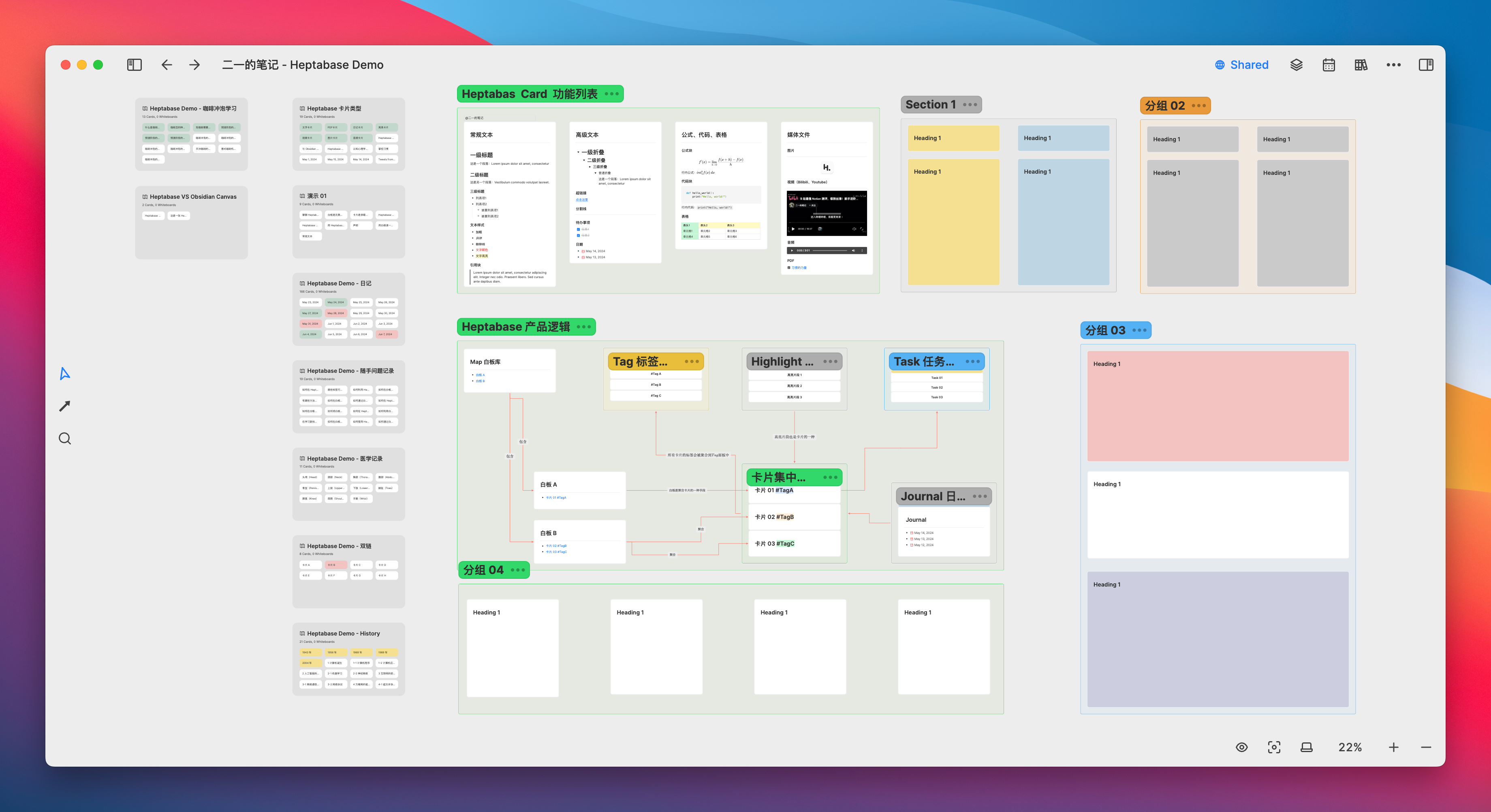
A card is the basic unit on the whiteboard, while block functions are the basic units for constructing a card. The following diagram shows the basic functional blocks currently available in Heptabase:
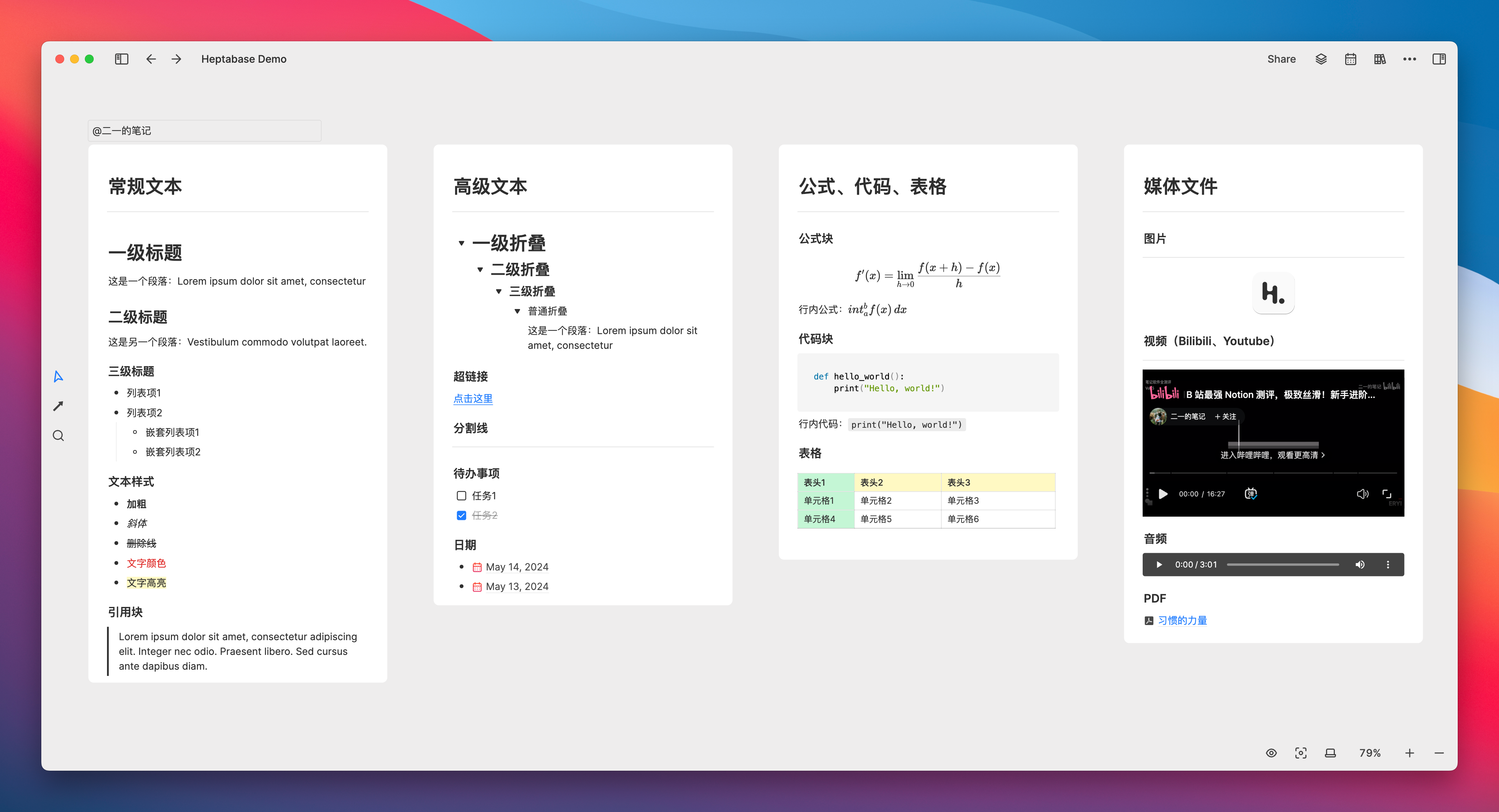
Based on Heptabase’s whiteboard sharing feature, you can click this link to browse the list of feature demonstrations I have created. However, the current web version of Heptabase is relatively slow, so please be patient while it loads. The client-side experience (including mobile) is relatively smooth, and it will support sharing individual cards in the future, which is worth looking forward to.
We can almost think of it this way: removing the Page of Notion from the database block is basically equivalent to Heptabase’s Card, for the following reasons:
- Also supports Markdown
- Similarly, use the slash
/to bring up the command menu - Similarly, it is a block editor that allows blocks to be dragged up and down (but cannot be divided into columns)
- The basic block functions are almost the same, and the operational logic is very similar
Of course, the current block types of Heptabase are far less diverse than Notion.
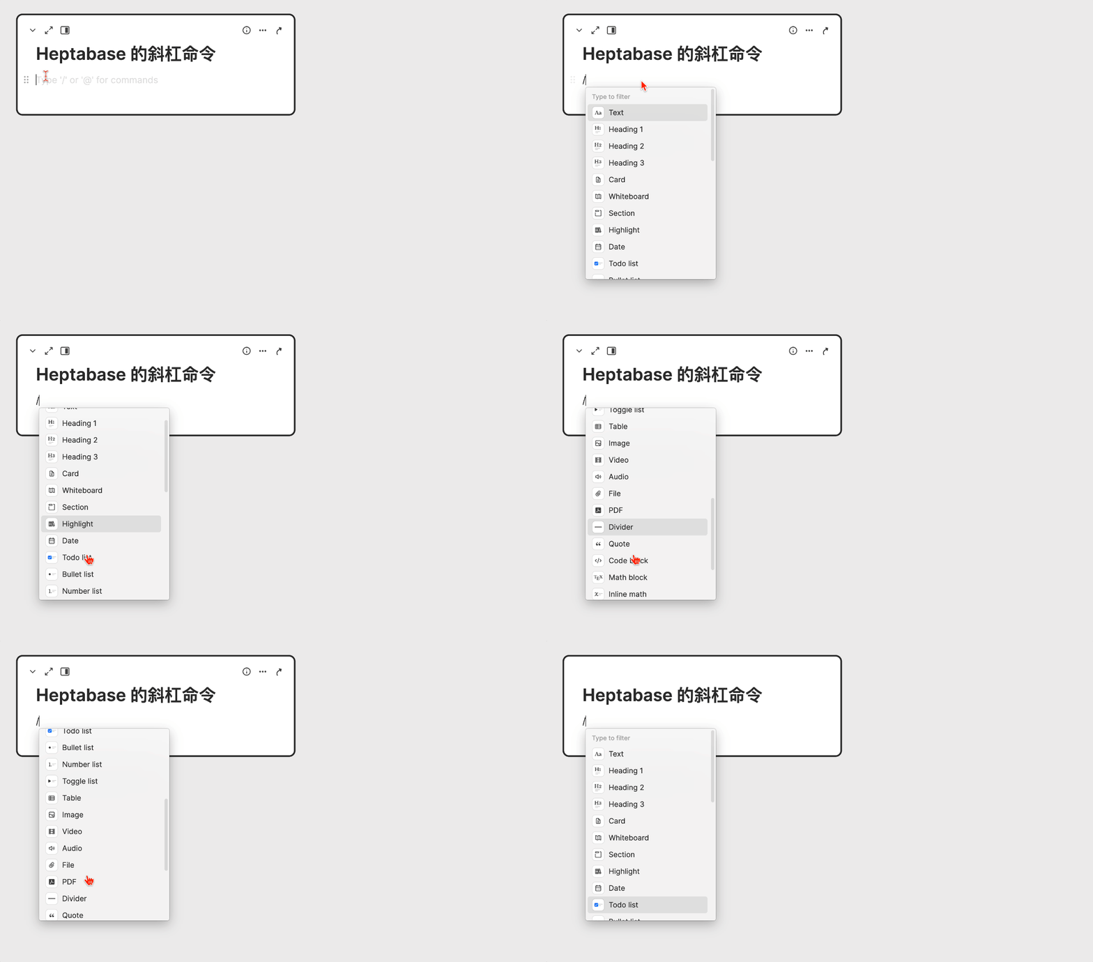
A diary is also a type of card
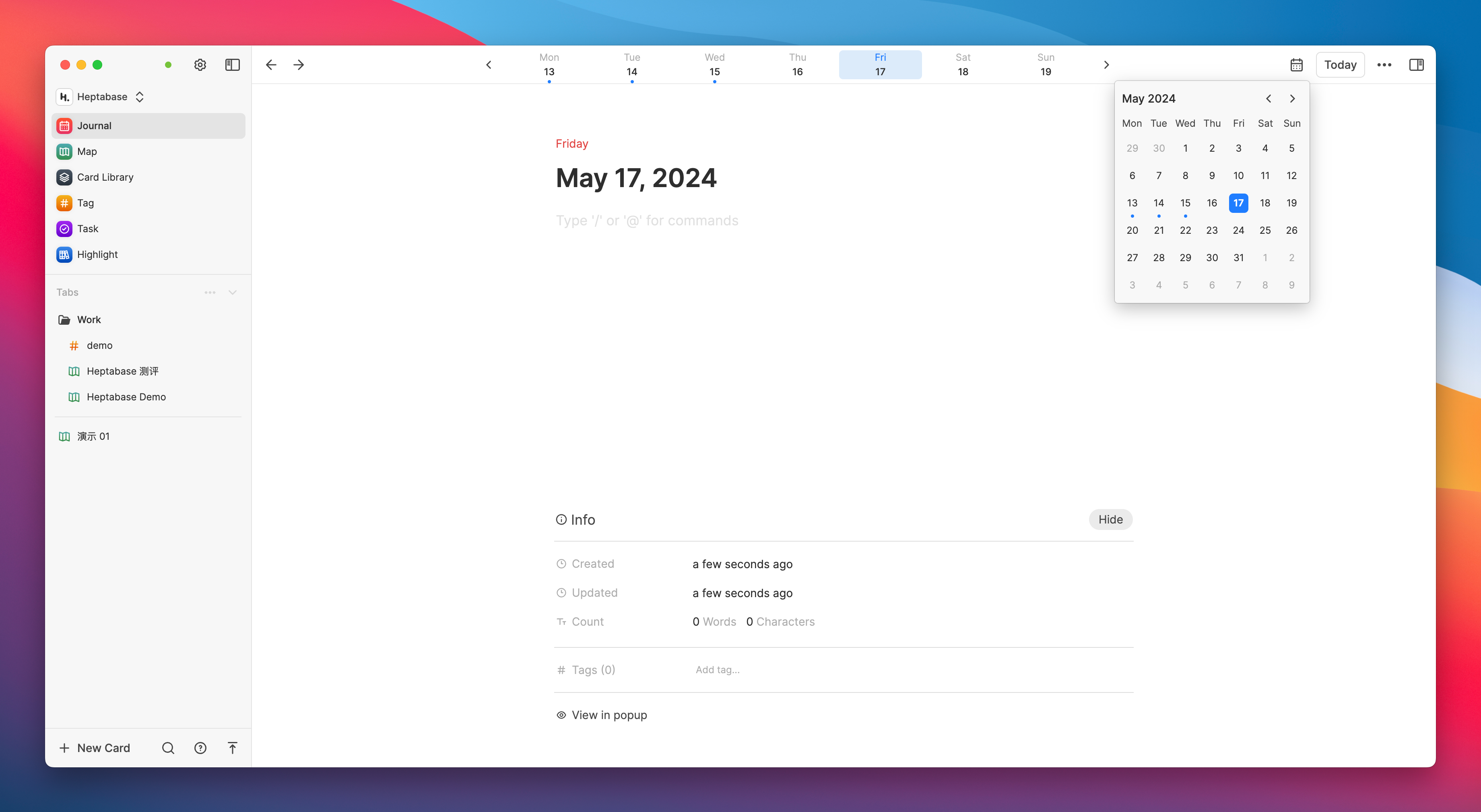
Although Heptabase has designated a separate entry for journals, the essence of a journal is just a card with the date as the title. All the block functions mentioned earlier can be used normally in the journal.
The core purpose of a diary or Daily Note is to reduce the burden on the brain. It does not require categorization or titles; the most important thing is to first write down thoughts, inspirations, or reminders. The date title that comes with each page of the diary will become one of the important clues for future indexing.
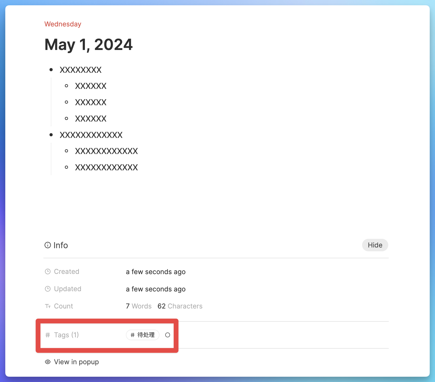
Additionally, like other cards, diaries can be tagged with specific labels. So if you haven’t decided where to place this diary entry for the time being but are worried it might be forgotten if not organized promptly, you can tag this diary entry with something like #待整理 . Then, you can organize these cards uniformly within the tagging system, which will be introduced shortly.
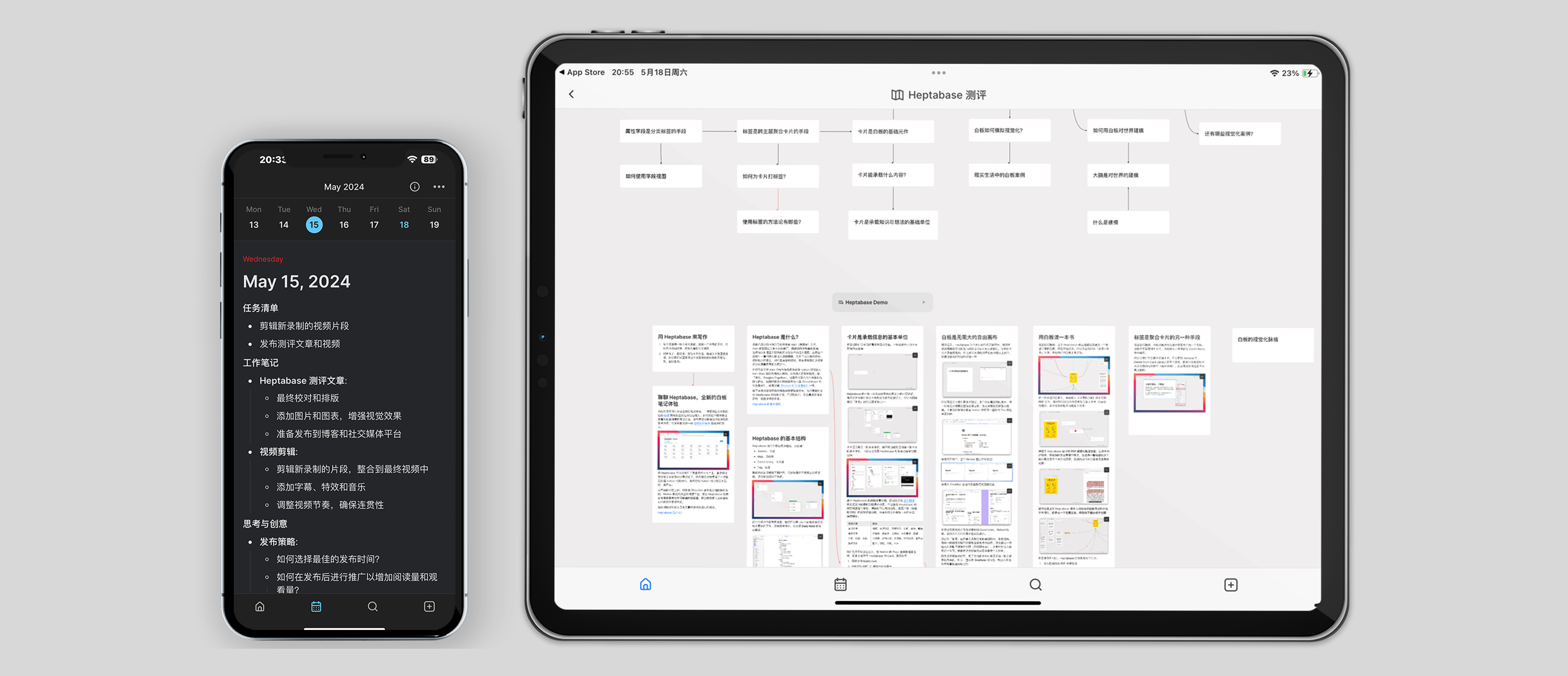
The current basic experience of Heptabase on mobile is still good, and Journal occupies a separate tab at the bottom, which can be quickly accessed for recording.
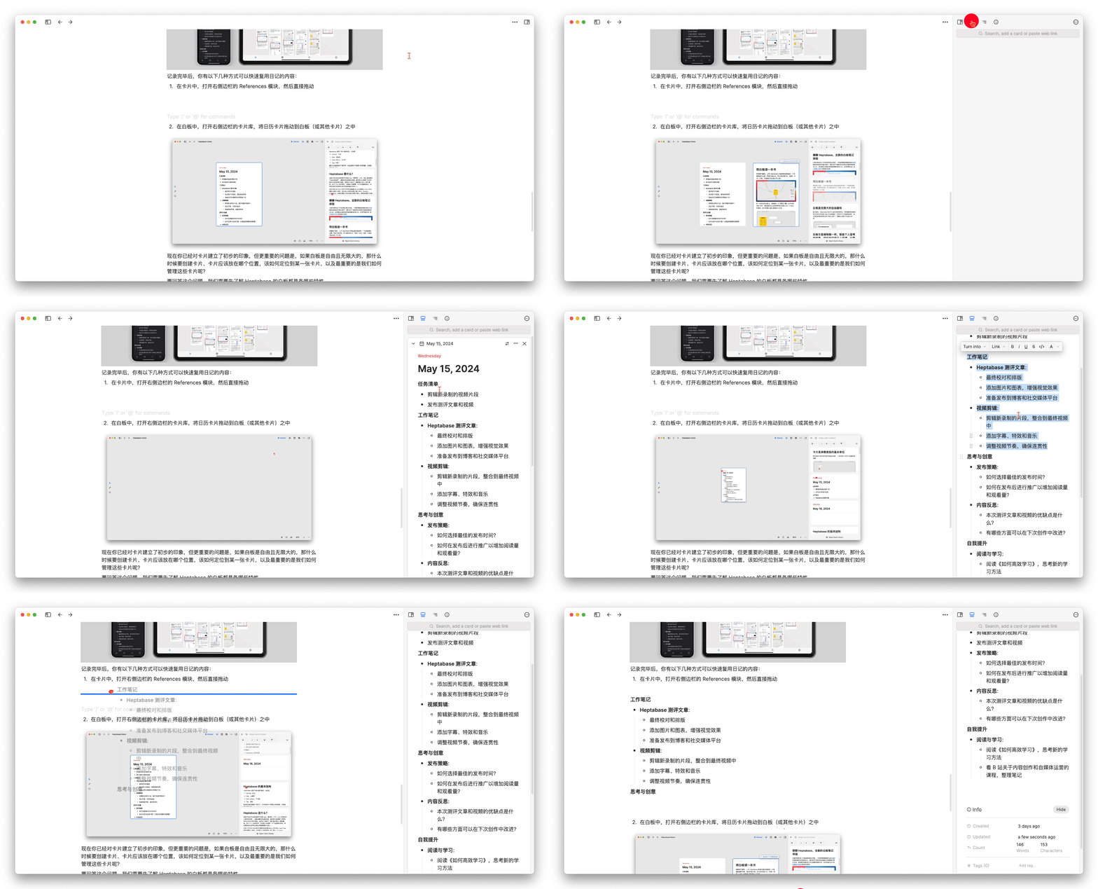
After completing the entry on the diary page, you have the following ways to quickly access the diary content elsewhere:
In any card, open the References module on the right sidebar, and then directly drag the block content from the diary
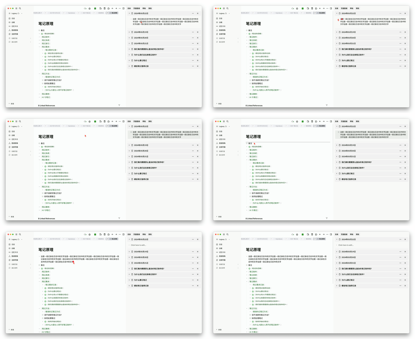
The user experience is similar to the sidebar dragging method of Logseq:
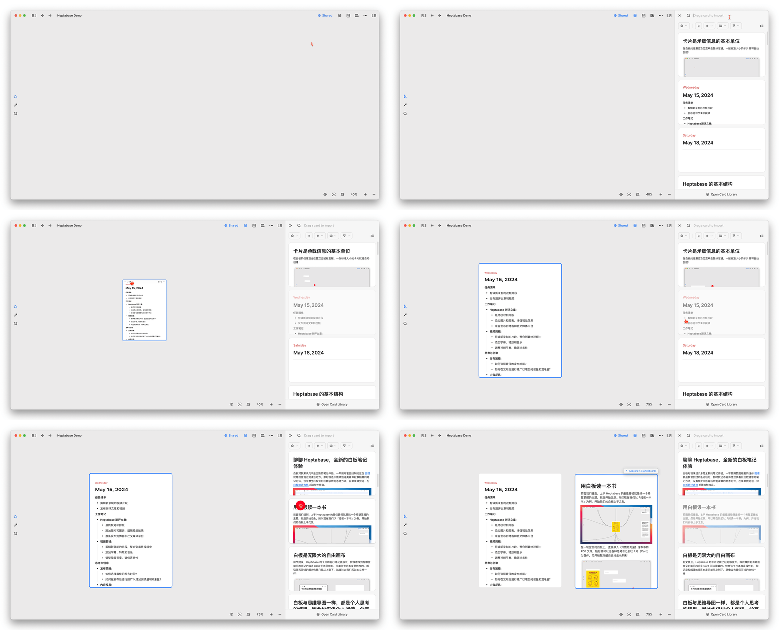
In the whiteboard, open the card library in the right sidebar and directly drag the diary card into the whiteboard
In addition to diary cards, PDF files, audio files, image files, online videos, and even web article excerpts marked through Readwise are all considered cards in Heptabase’s definition, and all can be directly added to the whiteboard
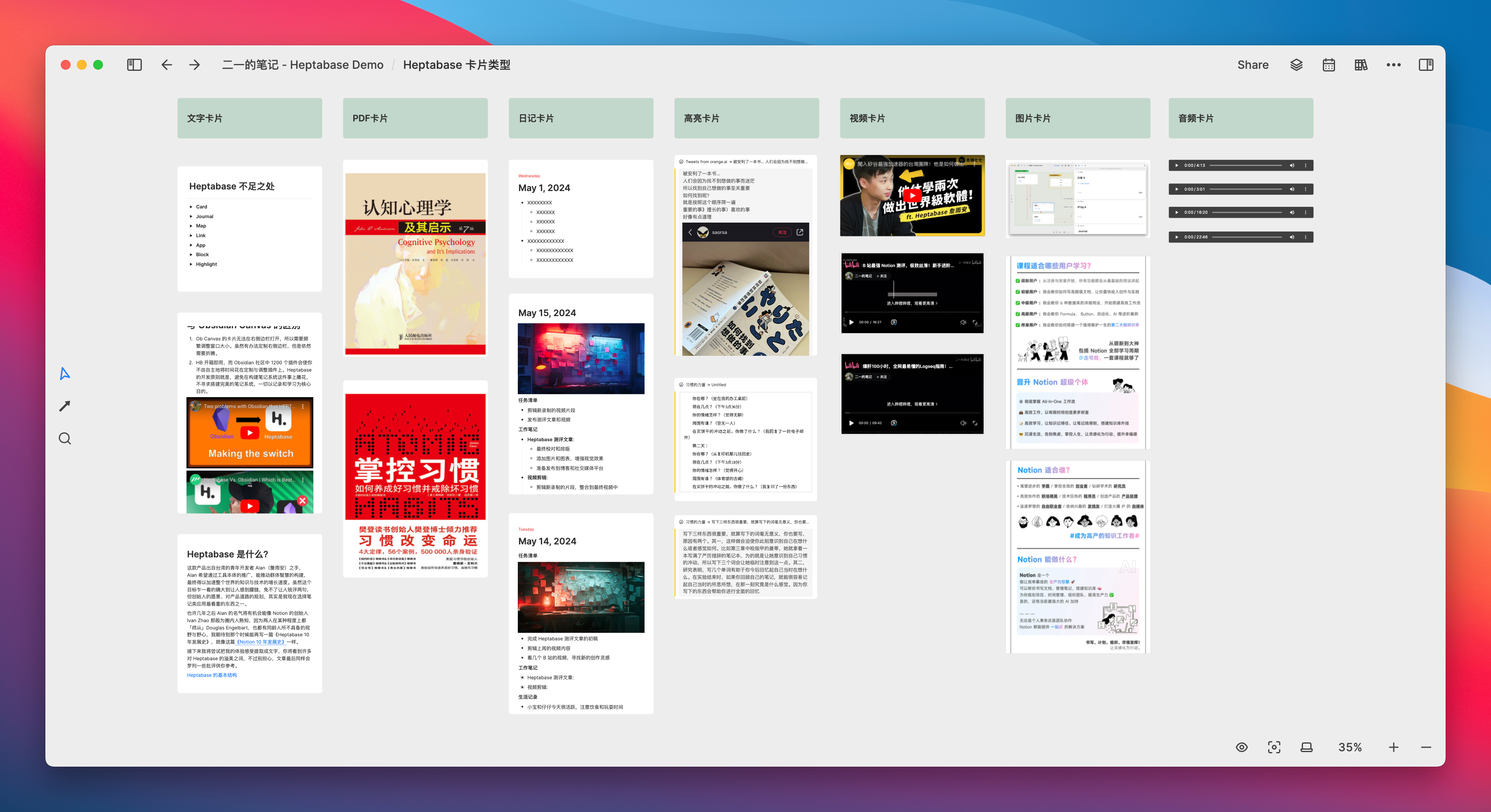
All cards can be opened in the sidebar
You should now have a preliminary impression of Heptabase’s cards, but the more important question is, if the whiteboard is free and infinitely large, when should we create cards, where should the cards be placed, how should we locate a specific card, and most importantly, how do we manage these cards?
To answer this question, we first need to understand the characteristics of Heptabase’s whiteboard.
The whiteboard is an infinitely large free canvas
As previously mentioned, the card functionality of Heptabase is already powerful enough that it is difficult for me to find common note contents that a card cannot accommodate. However, a single card itself is linear, so the order of recording and reading can only be from top to bottom, just like the documents we used to write in the past.
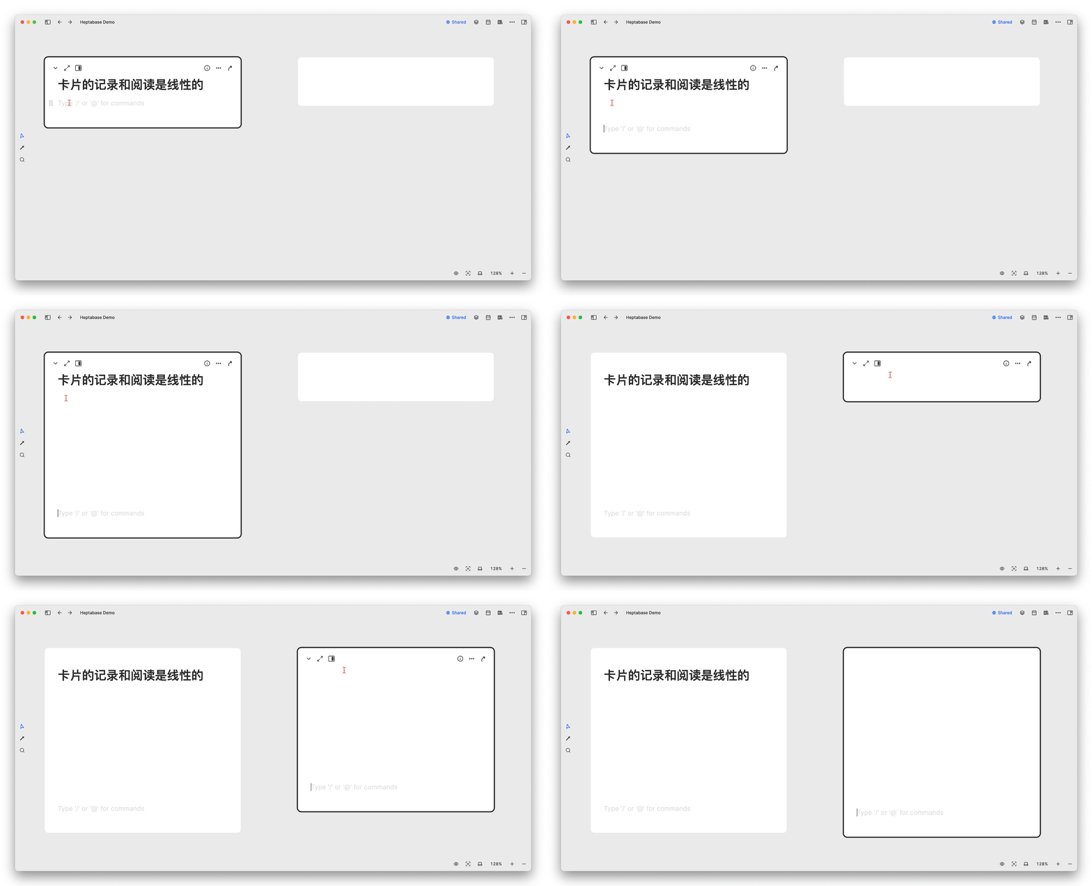
Therefore, in general, when we have multiple ideas and multiple goals that need to be carried out simultaneously, the linear window of a single document becomes inadequate and cannot accommodate our divergent thinking. As a result, we often need to open a whole row of tabs in Notion and switch back and forth:
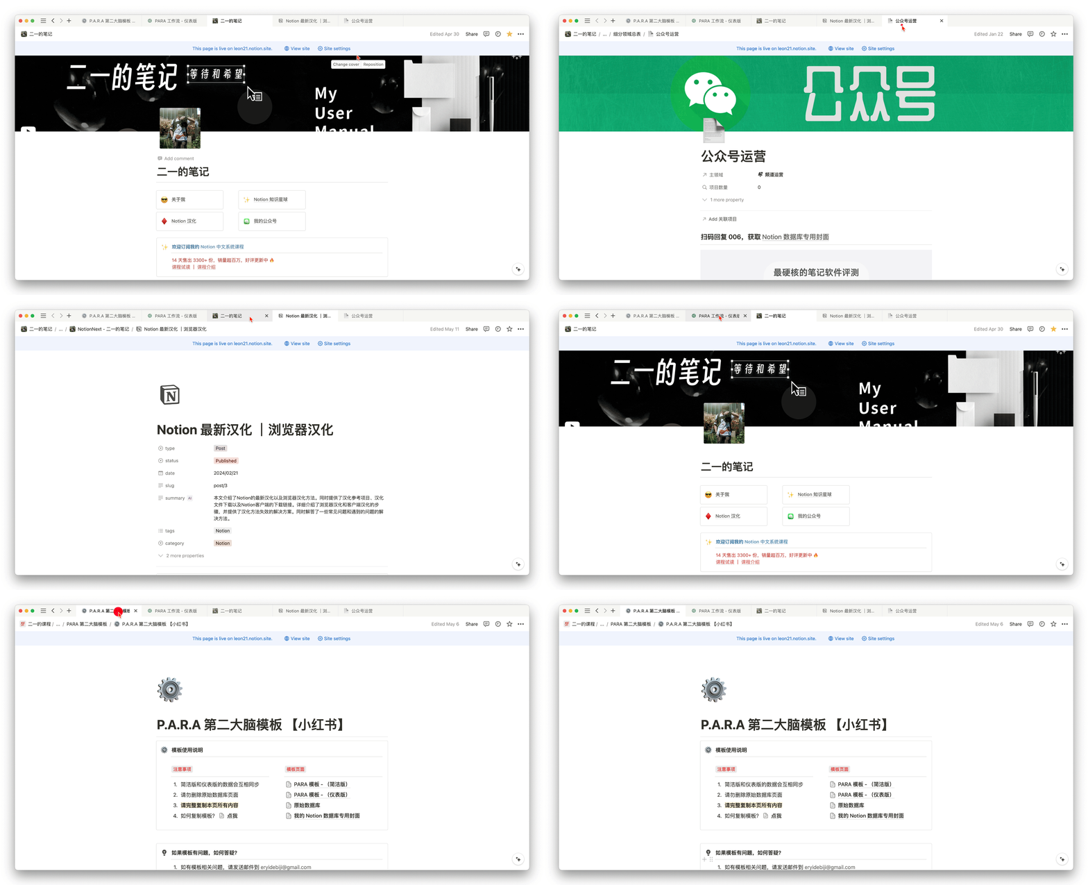
Or open two or three Notion windows side by side for browsing:

Or be excited about the relatively free multi-panel mode of Obsidian:
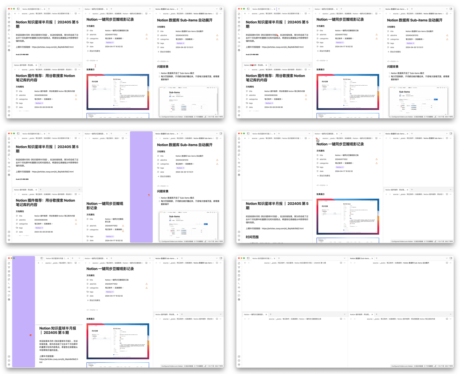
In addition, there are more handwritten note examples such as Goodnotes and Notability, which will not be displayed here as they are not my area of expertise.
I believe that “thinking” is often jumpy and non-linear, and a single linear document easily confines the boundaries of thought. What is even more exhausting is that we often need to assign a clear theme or goal from the very beginning, that is, we must write a good title for the document or paragraph, as if we need to find the exit of the maze before entering it. I believe these feelings are not unique to me.
Because of the existence of these phenomena, electronic documents are sometimes not as free as a blank sheet of paper, so OneNote has always had a strong appeal to a considerable number of people:
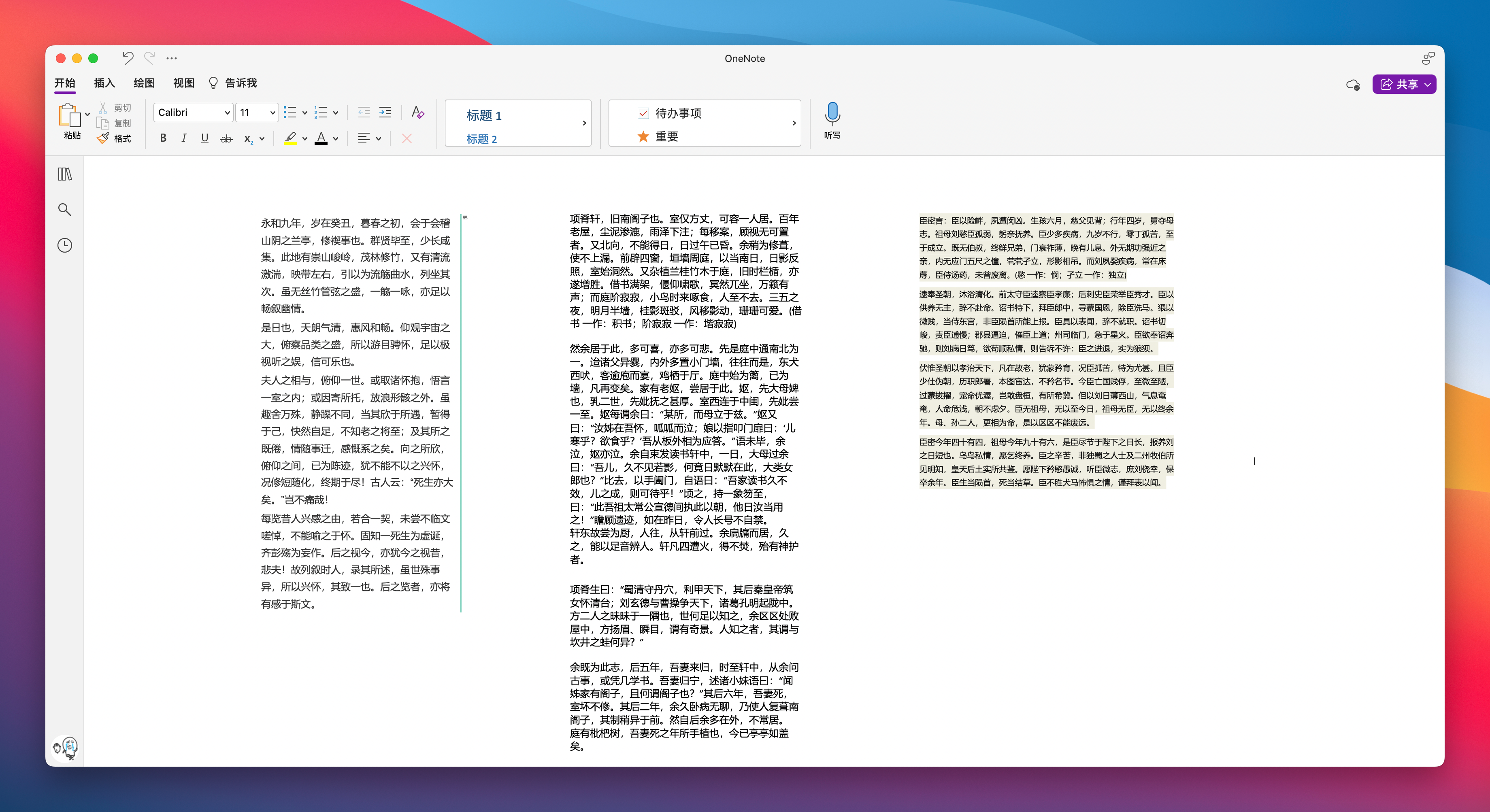
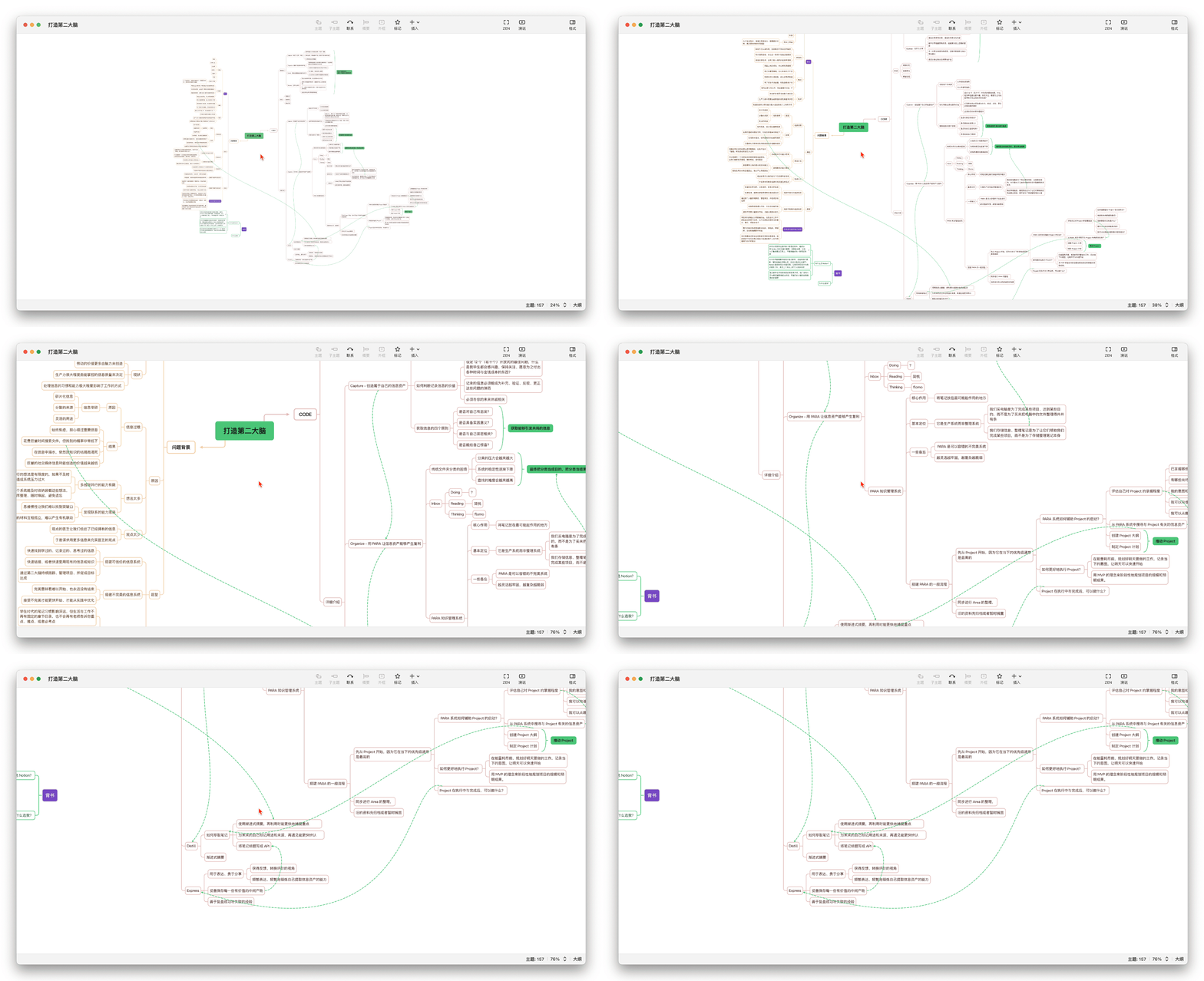
Mind maps like XMind, which are based on the divergence of a certain theme, are also powerful tools for brainstorming and organizing details
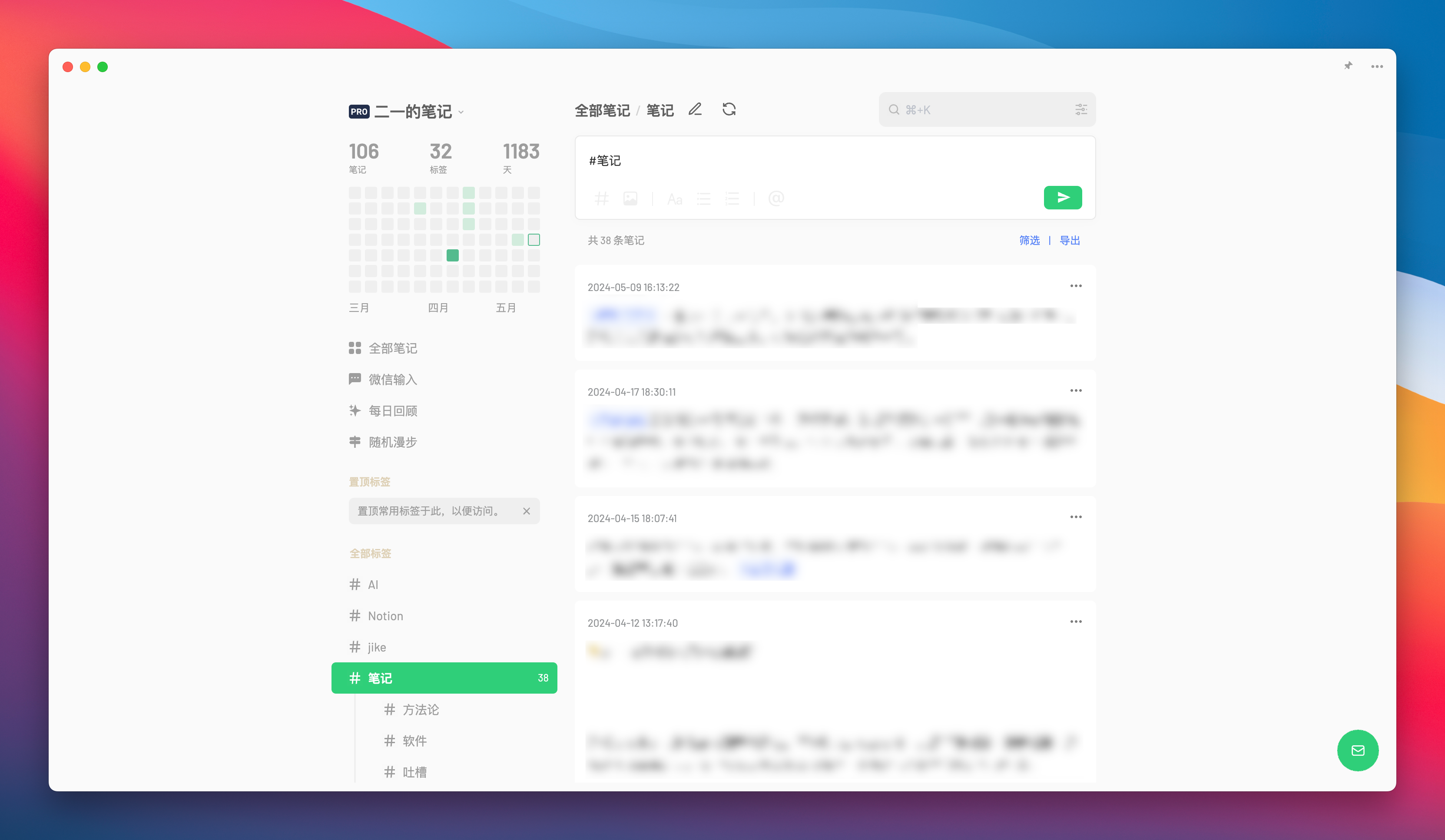
The reason why flomo is so popular, I believe, is that “not setting a title structure” is certainly one of the important factors:
Now let us extract the note-taking requirements represented by the above-mentioned note-taking cases:
- Multiple item simultaneous preview
- Nonlinear thematic divergence
- Low-cost rapid recording
So can the whiteboard meet these needs?
First of all, the cost of creating a new card on the whiteboard is very low. Its title is not mandatory; a paragraph, an idea, or a question can all be a card. Therefore, you can think of it as an electronic sticky note posted on the whiteboard
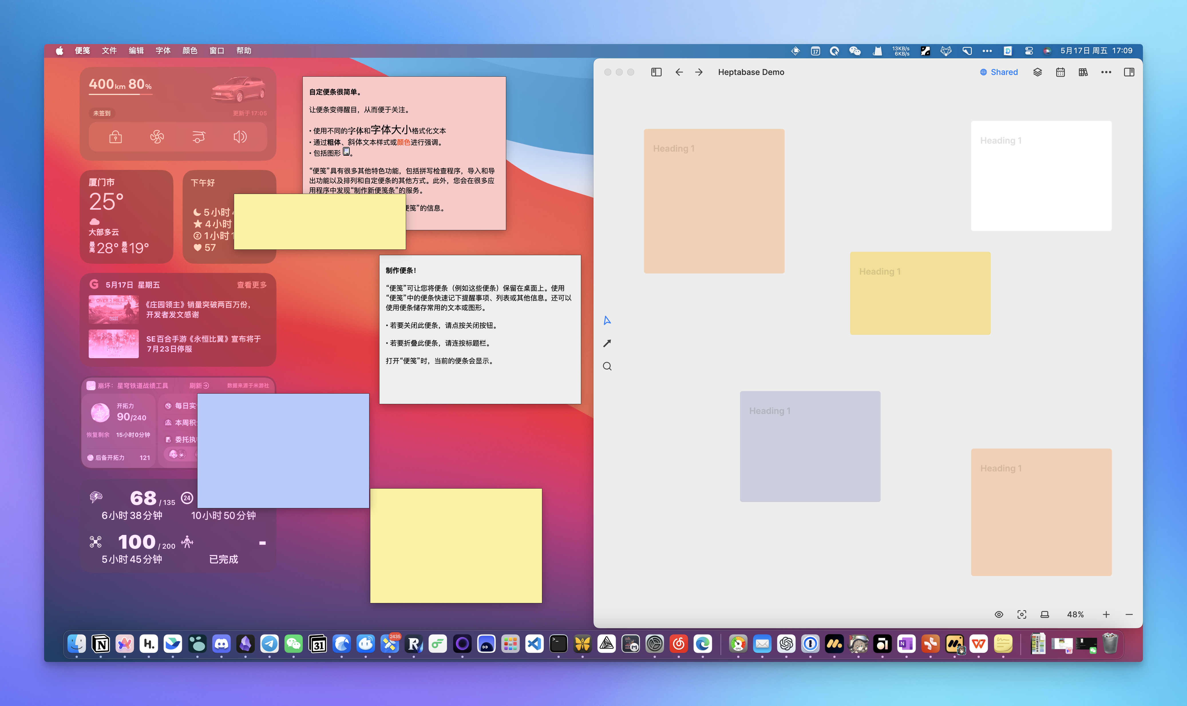
Heptabase provides an infinitely large whiteboard as a free canvas for our thoughts, allowing us to freely place, link, and move cards on it. This is like arranging furniture freely in an open space, rather than being forced to fit into a nearly fixed layout in a cramped room.
Before discussing the relatively abstract concept of “visual note-taking” on a whiteboard, I believe one of the whiteboard’s obvious characteristics (or advantages) is that it can simultaneously provide a free overview perspective for multiple fragmented “information nodes”:
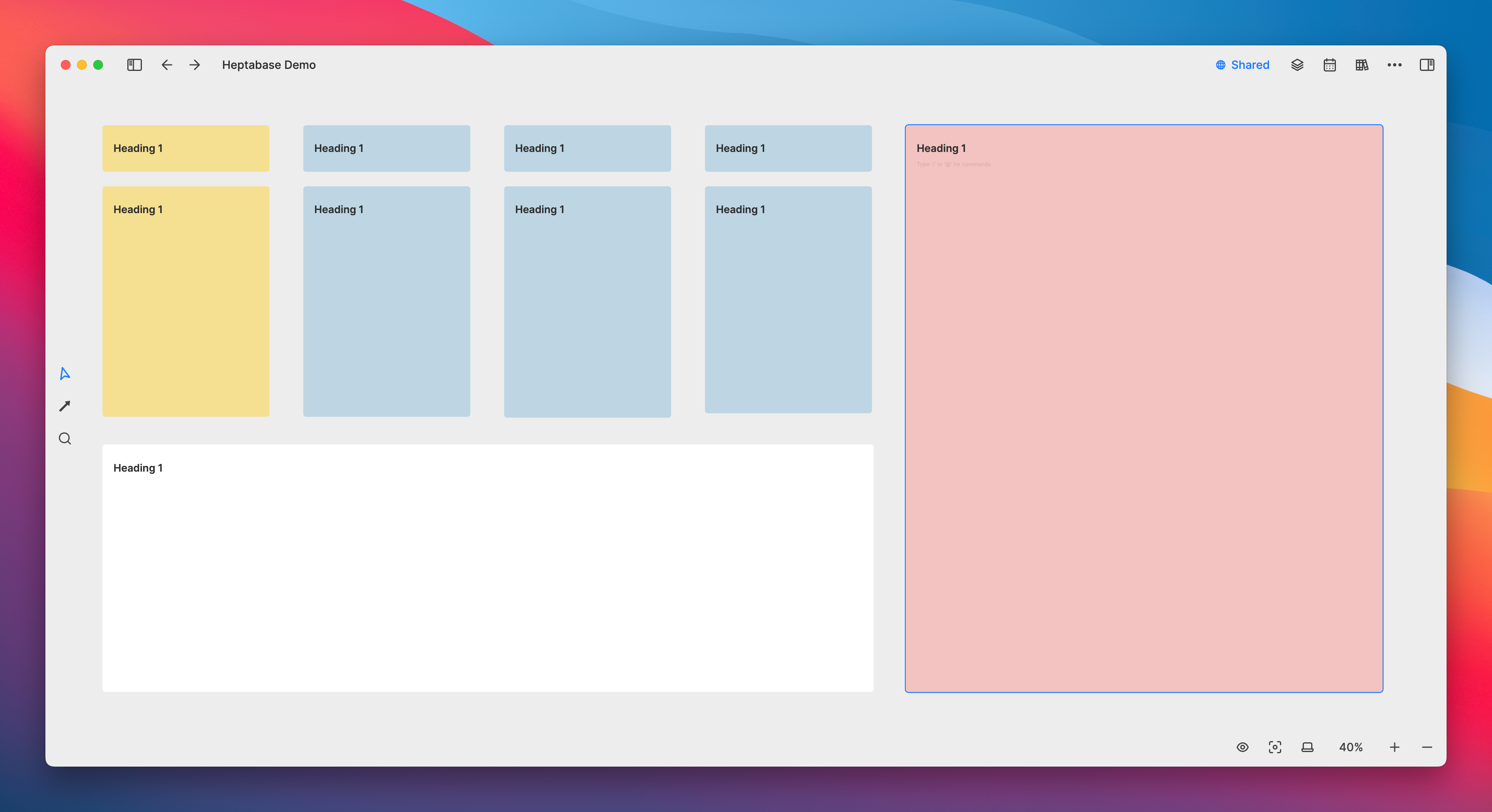
Compared to traditional documents, the freedom of a whiteboard comes from its boundless expanse; and because the whiteboard is built on “orderly” cards, the sense of order is more pronounced, preventing the feeling of helplessness about where to write unsightly handwriting, as often experienced with handwritten notes.
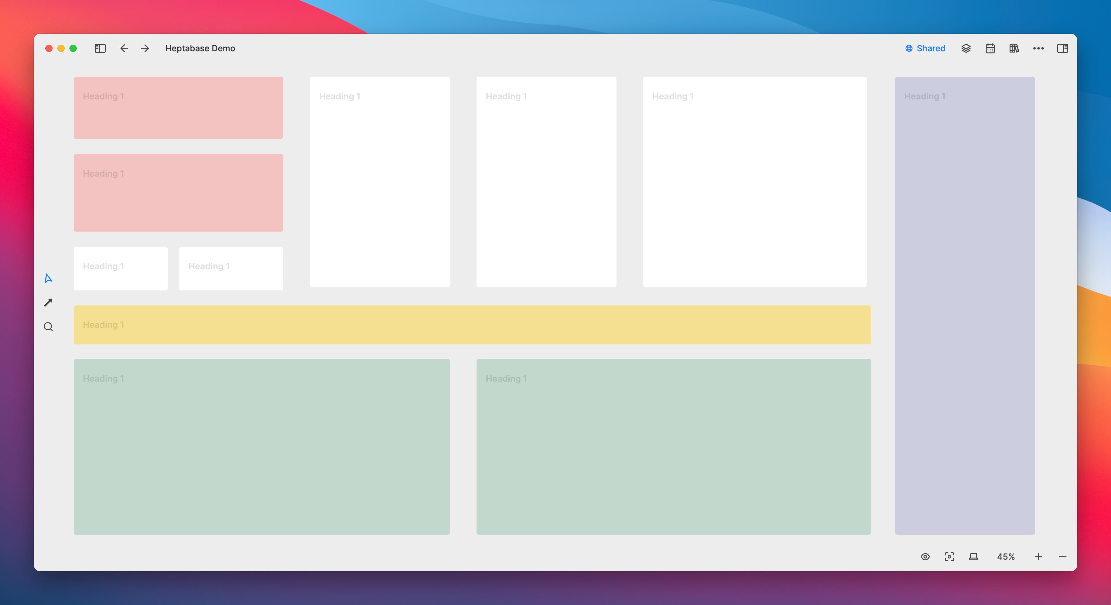
I don’t use handwritten products mainly because of my almost obsessive need for a “neat and uniform interface,” and Heptabase’s whiteboard offers a wealth of alignment features to make the cards appear more orderly:
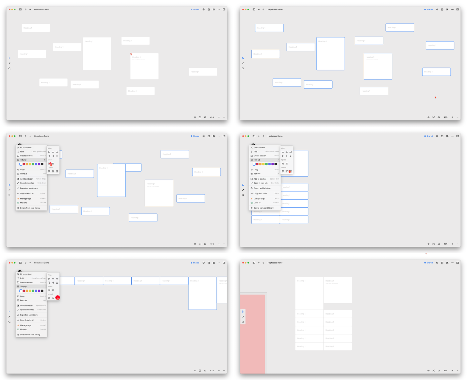
In addition, Heptabase also provides a grouping function called Section for organizing cards, and the title of each group will enlarge as the cards are minimized:
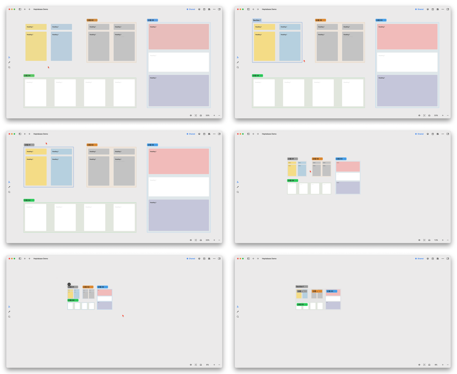
Based on the characteristic that cards can be viewed side by side simultaneously, if you want to write an article, then each article (or each paragraph within an article) can be carried on a separate card. This way, you can scan multiple nodes at the same time, and the length of the cards can visually and intuitively allow you to compare the length of each content
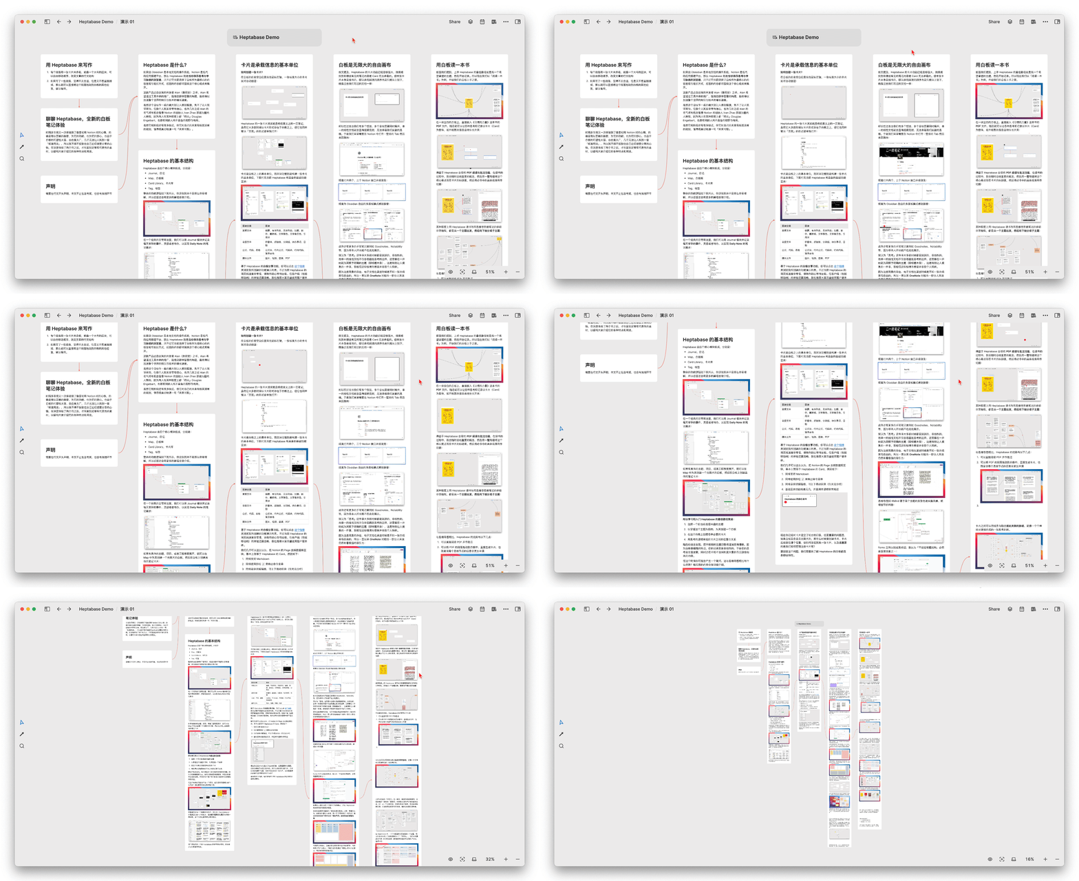
Enlarging cards can focus on the theme, allowing you to be more immersed in writing; reducing the size of cards can provide a more comprehensive perspective, enabling you to review the relationships between the cards. However, this type of product has an unavoidable issue: as the number of cards increases, the frequency of zooming in and out of the whiteboard will also increase, thus some of the drawbacks of mind maps are also present in Heptabase.
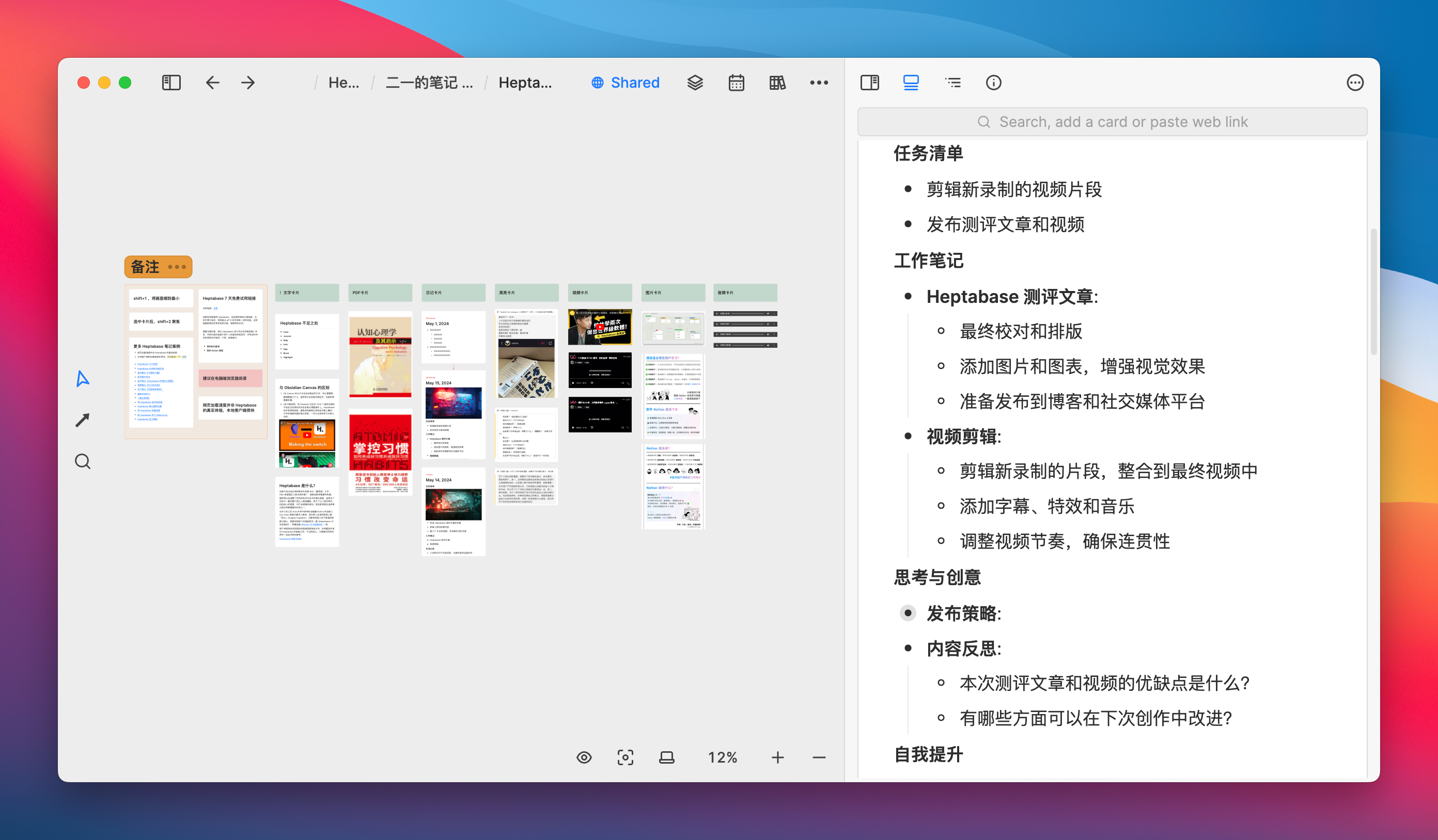
However, by using the shift + 1 shortcut key, you can quickly zoom the entire whiteboard to fit, select certain cards, and then use shift +2 to focus the screen on the selected cards:
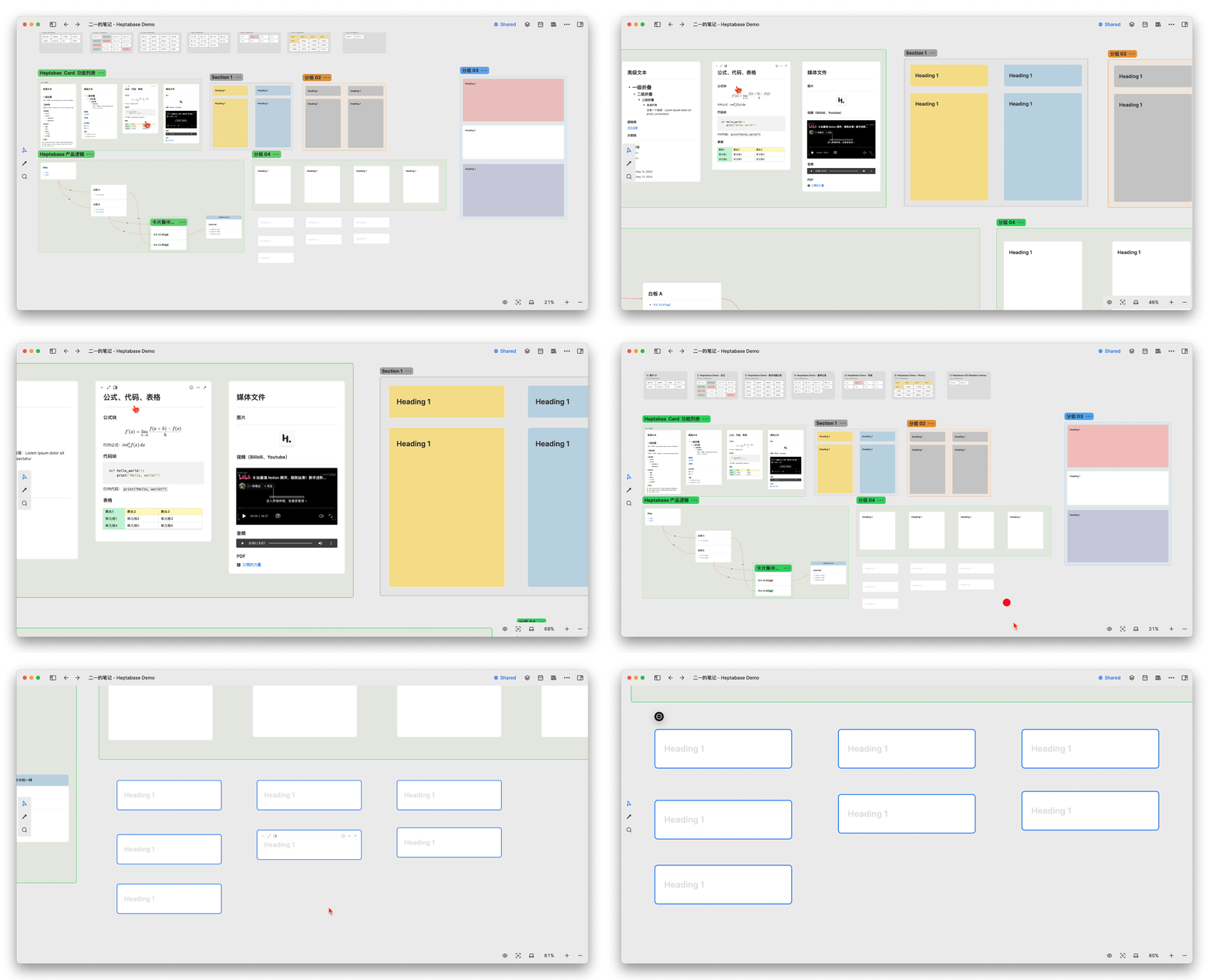
Reading a Book with a Whiteboard
The best way to get started with Heptabase is to find a topic you want to master and start taking notes directly. So now, let’s take “reading a book” as an example and begin our whiteboard journey.
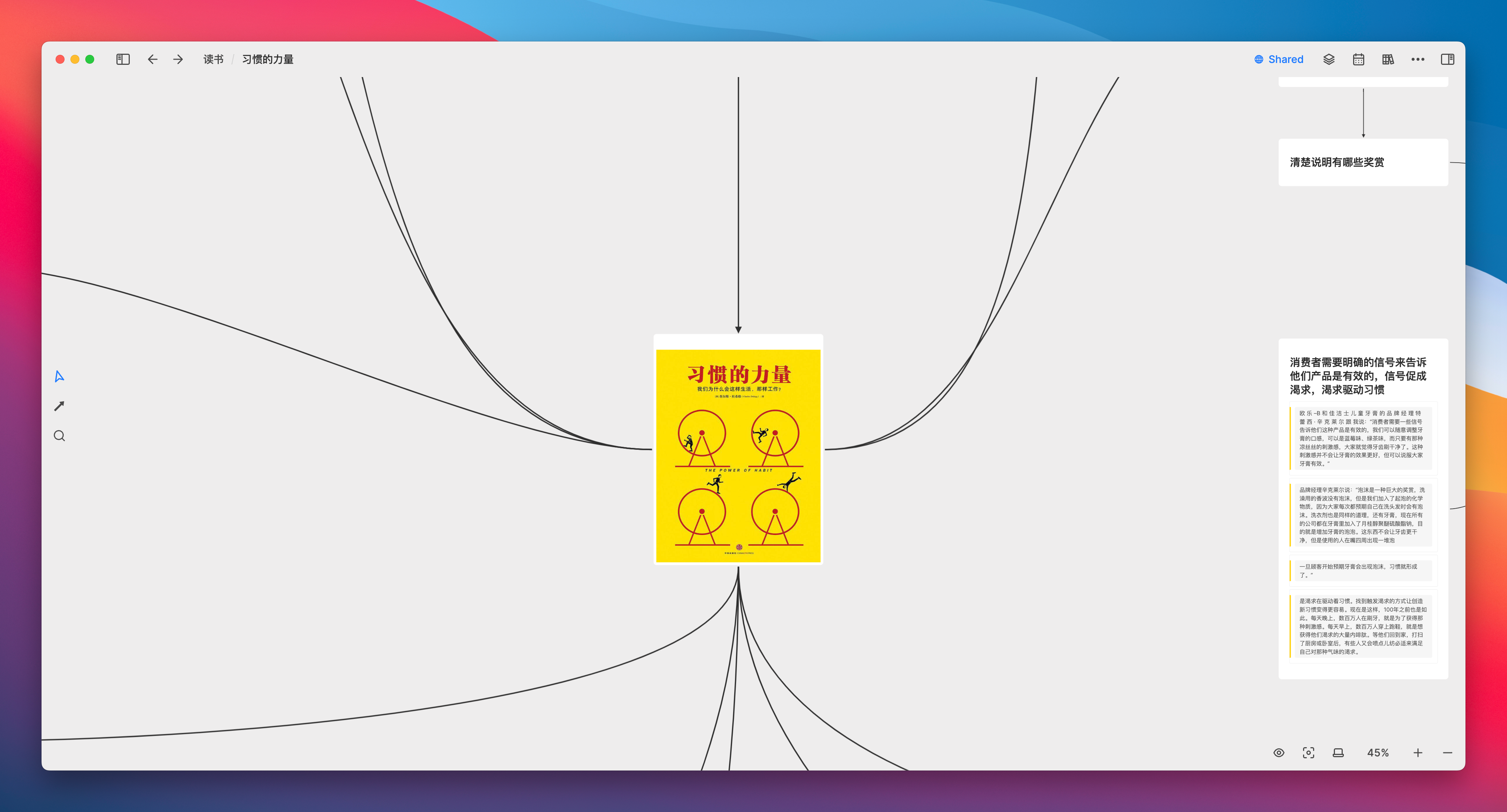
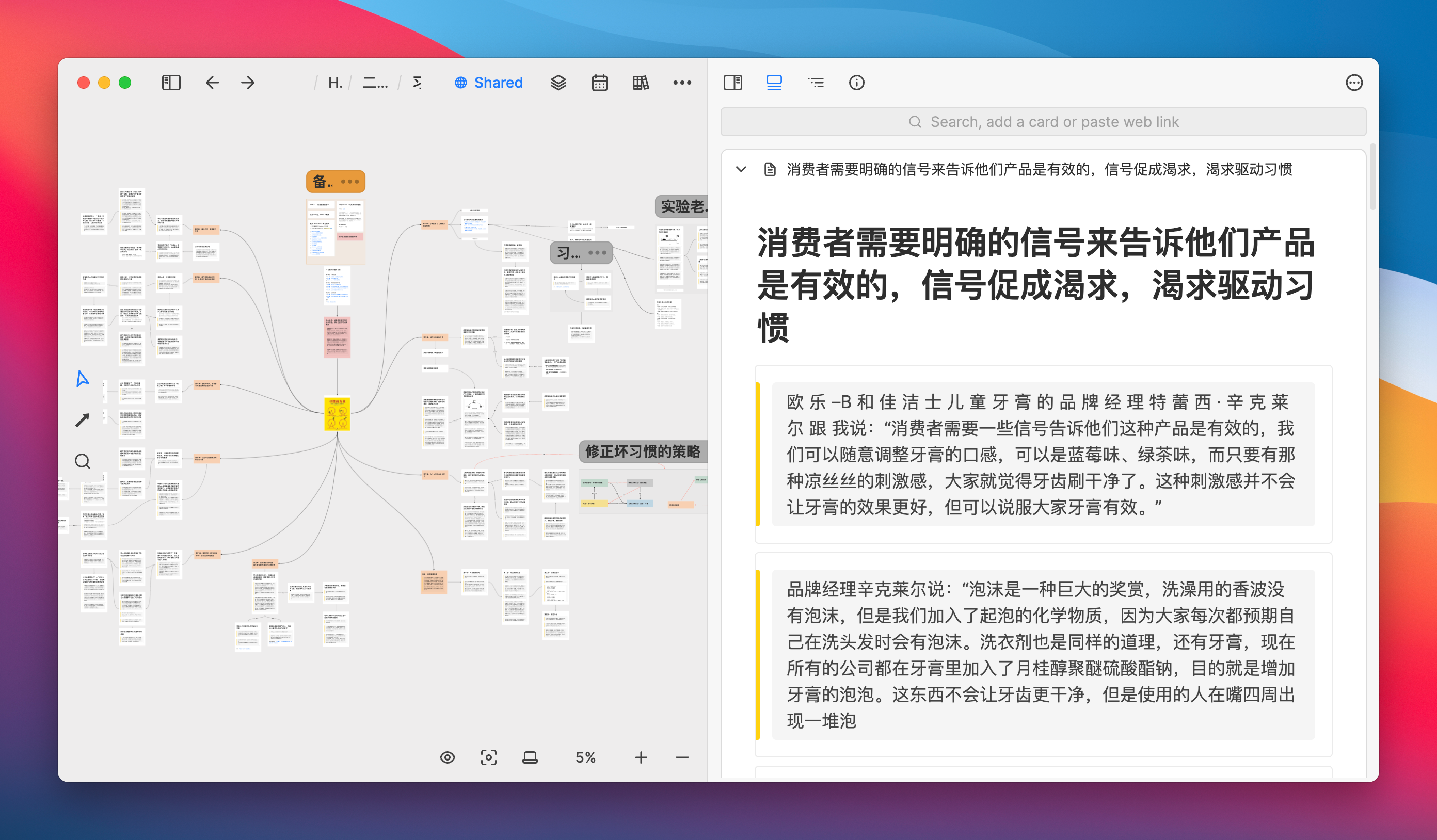
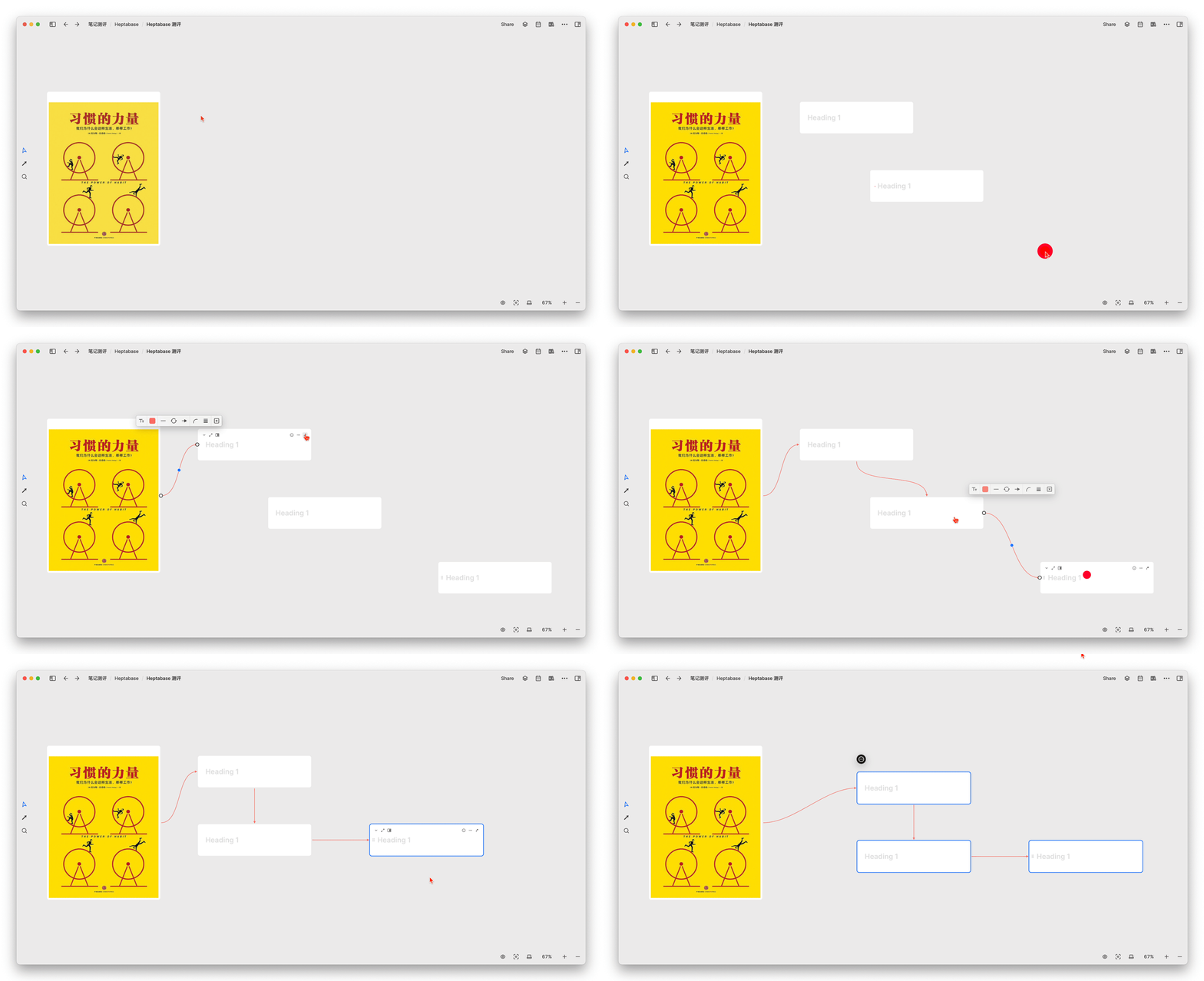
On a blank whiteboard, directly embed the PDF file of the book “The Power of Habit,” and then various thoughts and records can freely grow like branches and leaves using cards as the medium
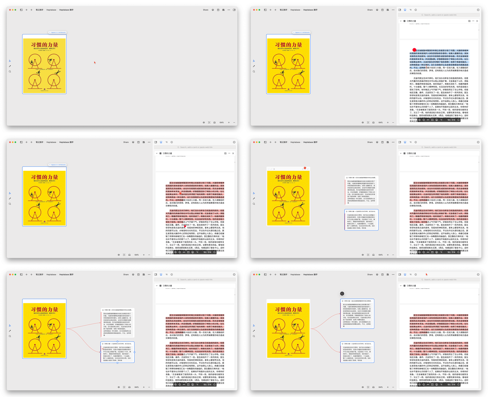
Thanks to Heptabase’s built-in PDF reading and annotation features, during the reading process, I will summarize important concepts at any time, write this core point in the card’s title in a complete sentence, and then directly drag specific paragraphs from the PDF into the card so that they can be used as evidence in the card
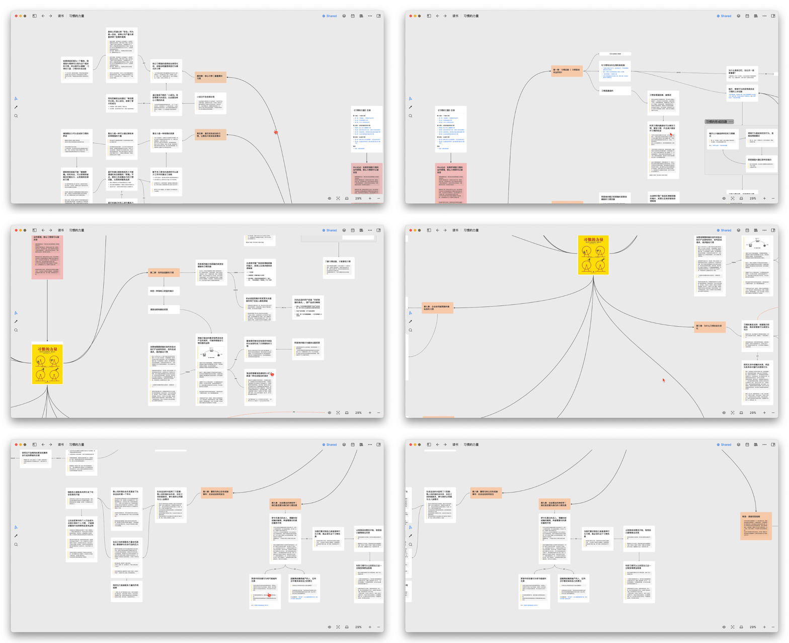
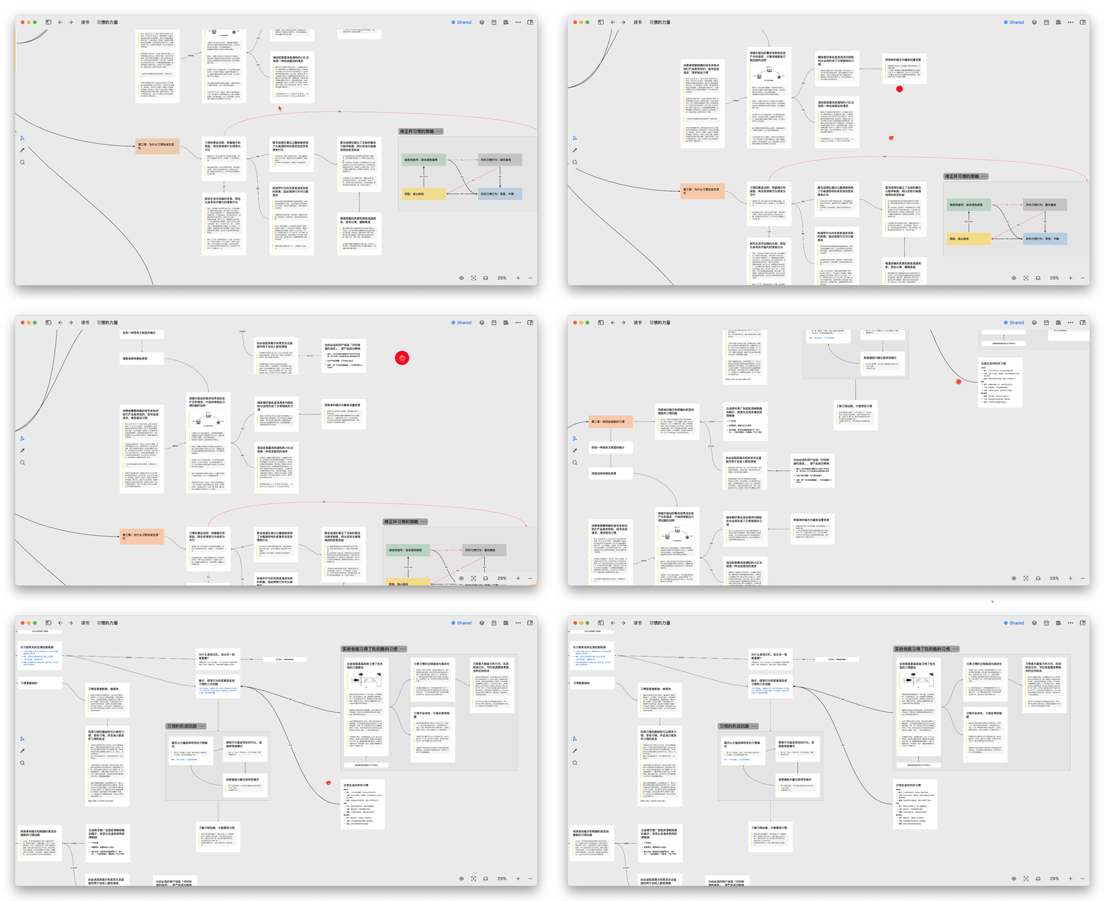
It can be found that reading with Heptabase is very similar to taking reading notes with mind maps, both starting from a main theme and then subdividing into sub-themes:
However, compared to mind maps, Heptabase has the following relatively intuitive advantages:
- You can directly read and annotate PDFs
You can drag the original paragraphs of the PDF onto the whiteboard to directly generate cards, making the information of each thought node more comprehensive- Heptabase’s cards can be opened in the sidebar

Most importantly, each card of Heptabase’s nodes can be tagged or reused by other whiteboards. In contrast, the nodes of a mind map can only be single words or phrases and can only exist within the current map, making them difficult to query and reuse.
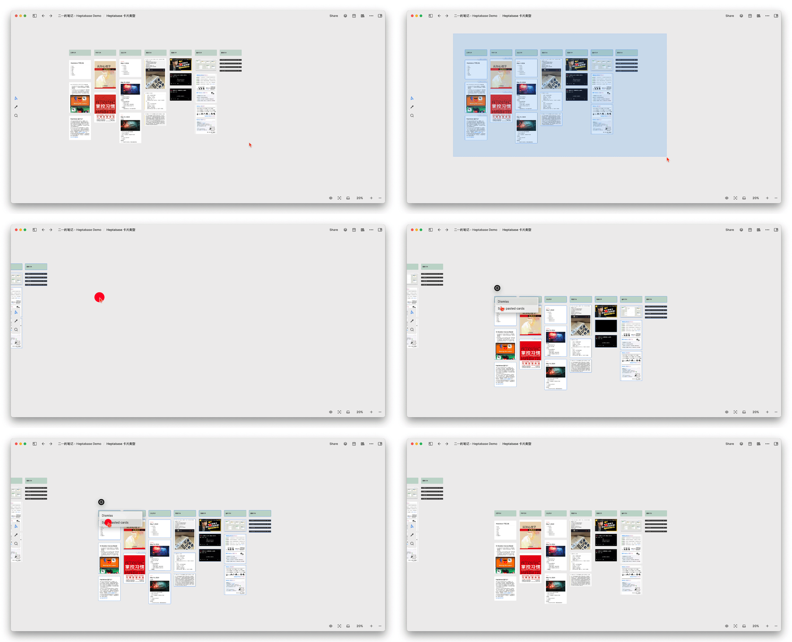
Therefore, a mind map is just a “map,” while the cards on Heptabase whiteboard A can be freely reused on whiteboards B, C, and D. For example, you can select multiple cards, then use the shortcut key ctrl+C to copy these cards, and then use ctrl+V to paste them on other whiteboards, synchronizing the cards across them.
If understood using Notion, a card is a huge synced block; using Logseq or SiYuan Note, a card is an embedded block that can be embedded anywhere; however, Heptabase uses a free-form whiteboard as its canvas, while other products still have a linear document structure.
The connections between the cards can be outlined with lines, forming a web of thought similar to the links between neurons, and the same neuron (the same card, the same concept) can be reused in other thinking scenarios (i.e., other whiteboards).
You can click this link to open the reading notes.
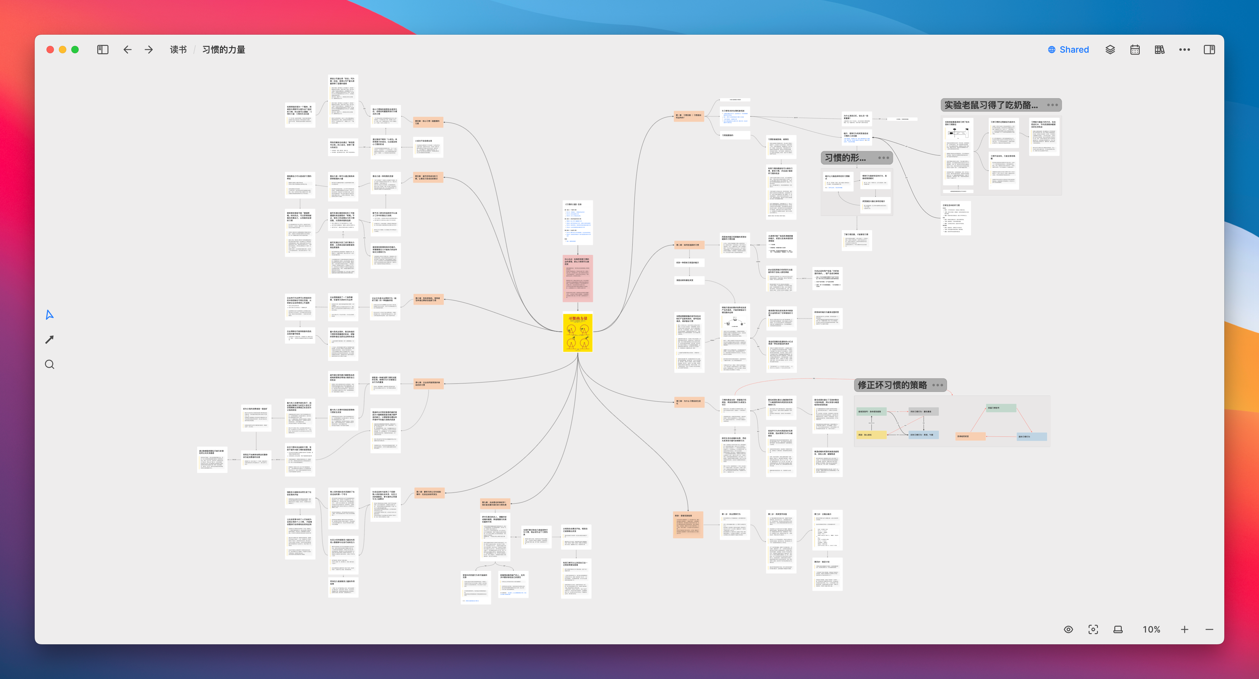
So now I am beginning to believe that whiteboards are indeed the best tool for “visualizing” the process of brain thinking: starting from a topic, exploring non-linearly, drawing analogies in associations, retracing the thread of thought in visible links, and finally returning to the topic itself.
The latter part of this paper will further explore the concept of “visual note-taking.”
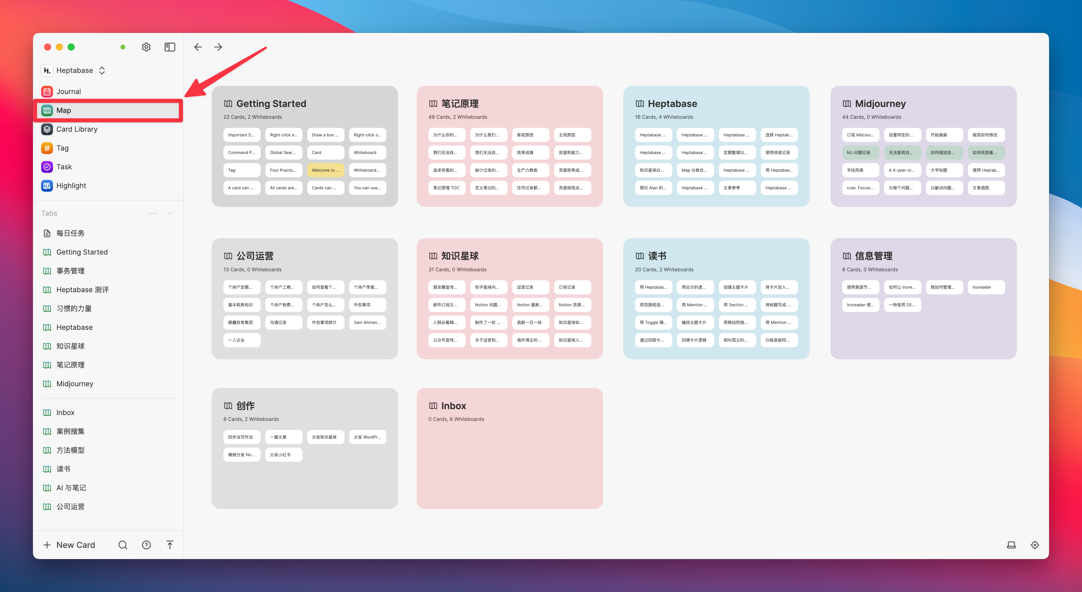
In Heptabase, a whiteboard is usually used to focus on a single topic, so to some extent, you can also think of a whiteboard as a “folder,” and all top-level folders (i.e., top-level whiteboards) will be aggregated in the “Map” tab on the left side of the software:
Of course, other whiteboards can also be embedded within the whiteboard, or other whiteboards can be referenced, just like the Page of Notion can also embed (or reference) other Pages and databases:
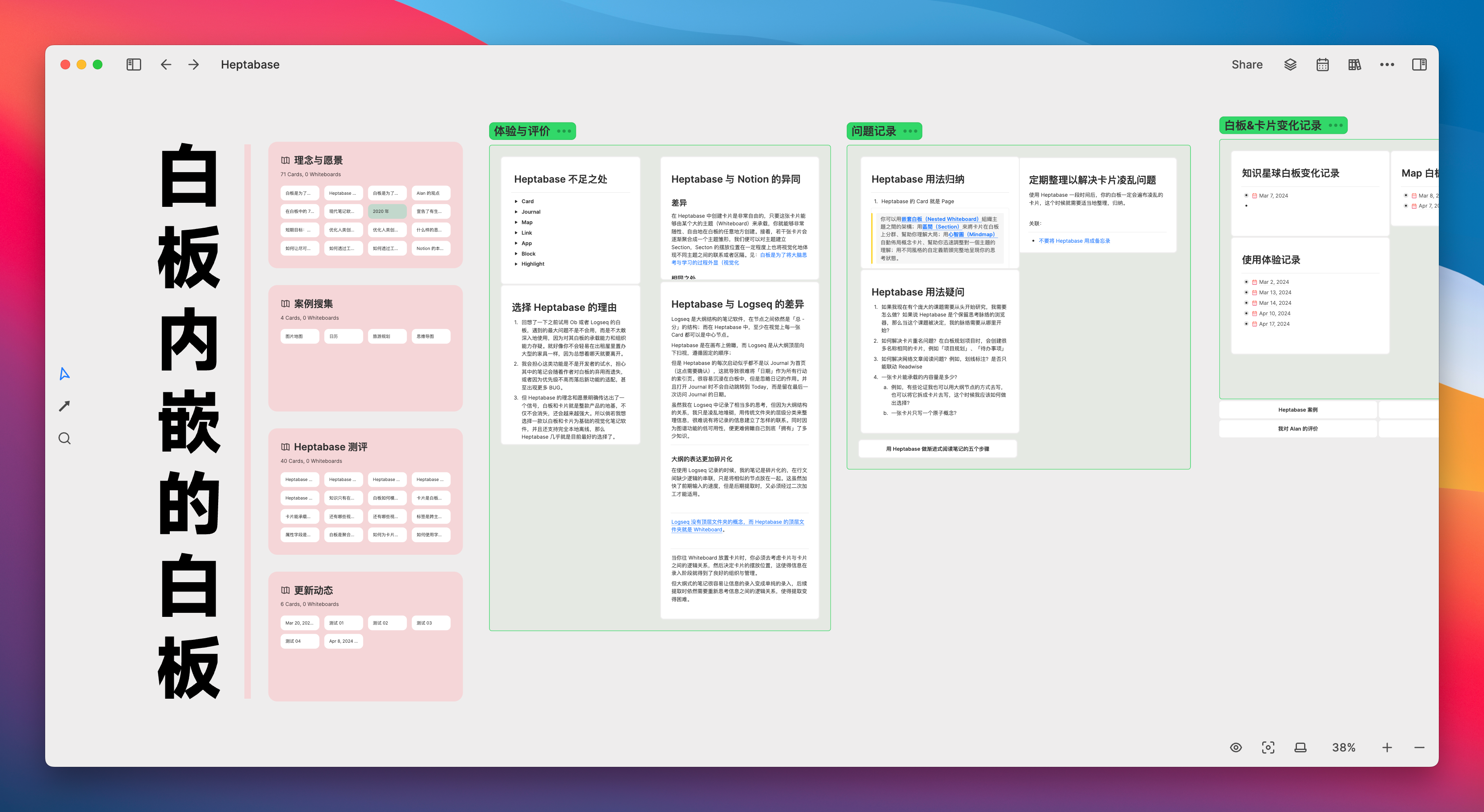
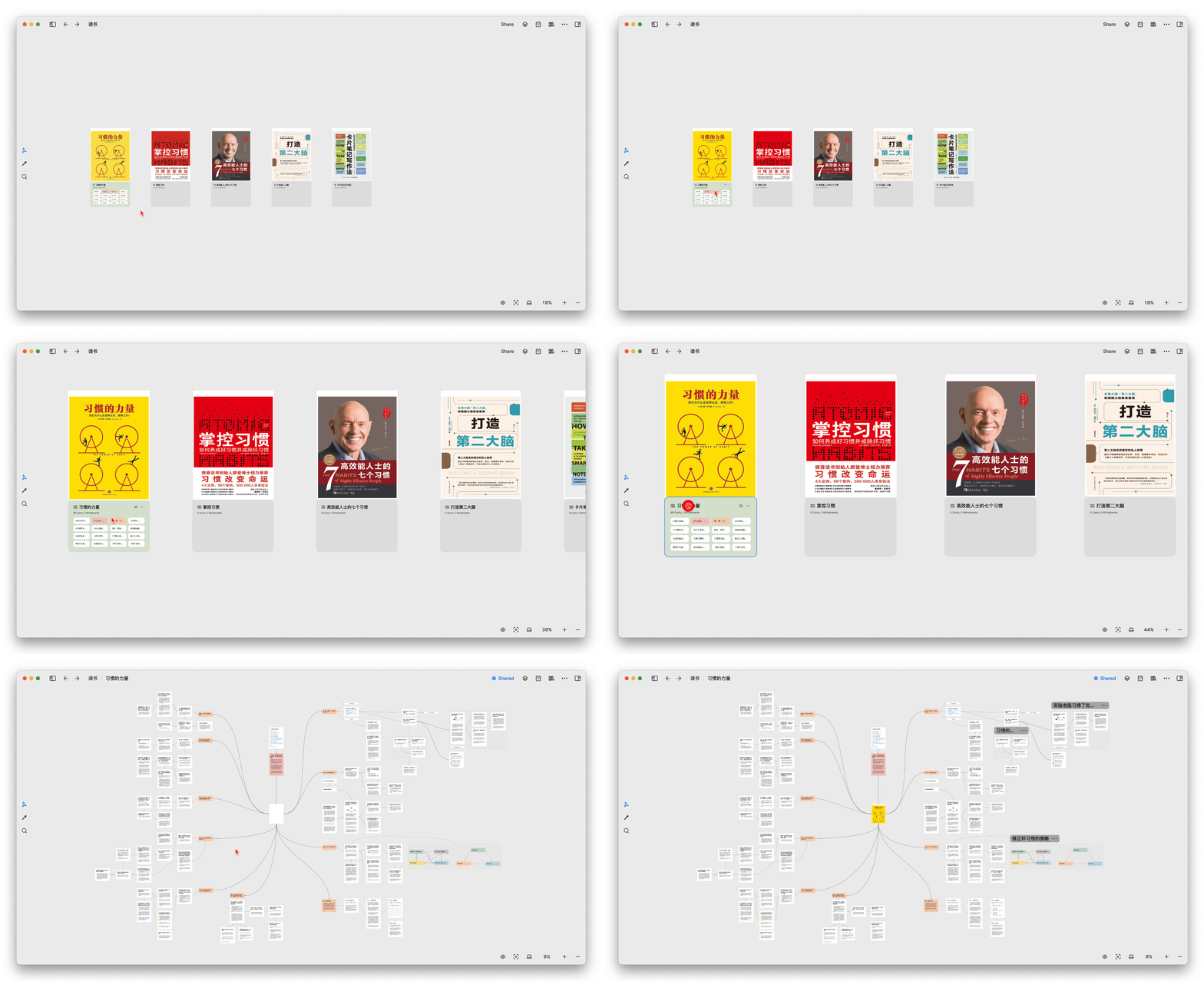
Based on this feature, we might be able to construct a reading notes library like the one shown below, using PDFs as gallery covers and embedded whiteboards to store notes for the book:
Labels are another means of aggregating cards
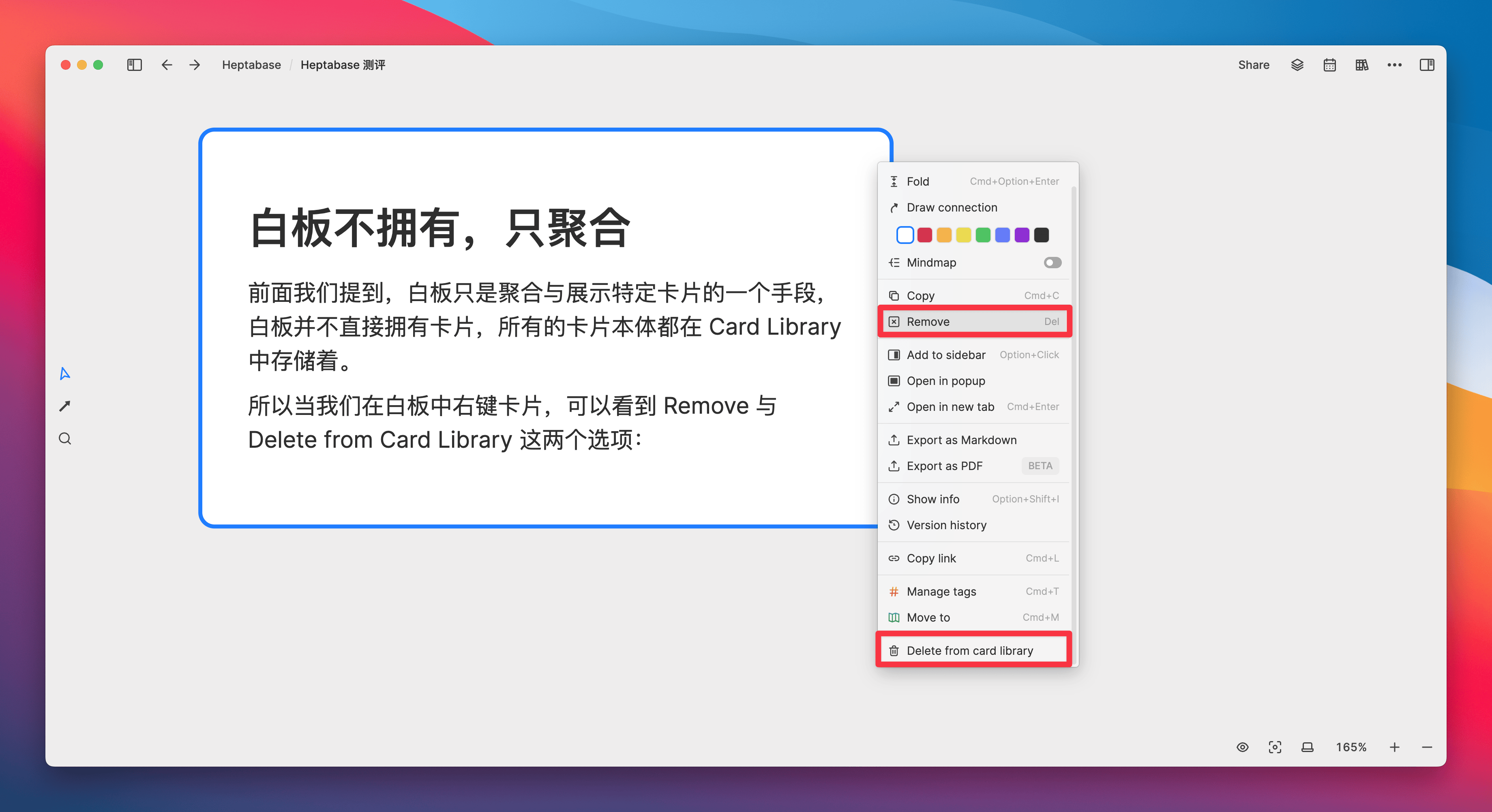
When we right-click on a card in the whiteboard, we can see the options Remove and Delete from Card Library . The former will only remove the card from the current whiteboard (not delete it), while the latter will actually delete the card.
So we say that the whiteboard is merely a means to aggregate and display specific cards, because all the card entities are stored in the Card Library.
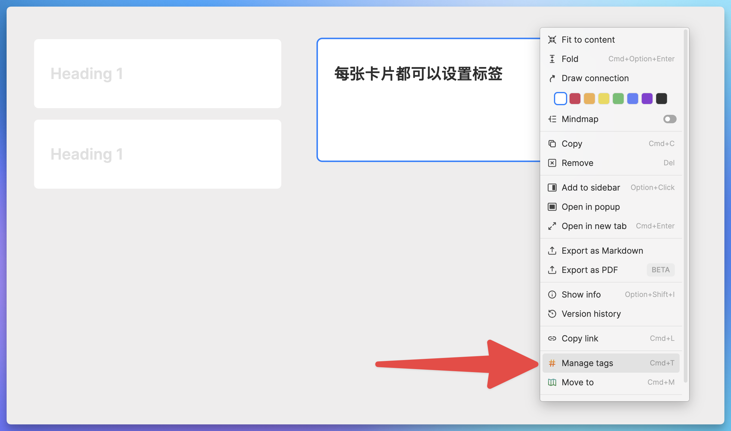
The next label to be introduced is another means of aggregating cards. First, we can add several labels to each card (including diary cards):
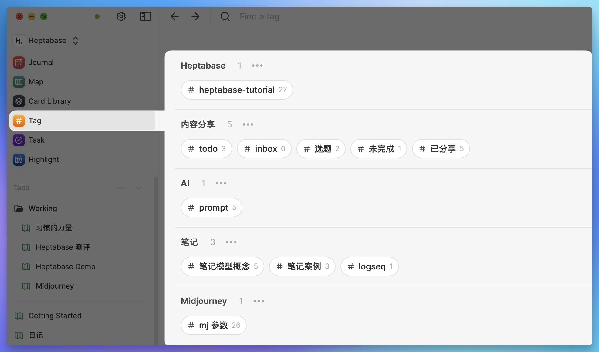
You can see all the tags used in the Tag tab of the sidebar:
In what scenarios would we need to add labels to the cards on the whiteboard?
The essence of tagging is to classify cards using abstract logic, and then aggregate them to achieve quick retrieval and access. On the other hand, the cards on the whiteboard are classified and aggregated using visual cues and spatial relationships.
However, after each whiteboard grows to a certain scale, it will encounter a problem where the number of cards gradually becomes uncontrollable. When you need to find a specific card, you either search for it or frequently zoom in and out of the whiteboard, then follow the thought process along the whiteboard to locate it.
Or, when you need to organize cards scattered in different locations and on different whiteboards in bulk, browsing through them methodically is also quite inefficient. It’s like on a Go board, if you need to quickly pick out all the black pieces, even though the color of the pieces is obvious, picking them one by one still requires considerable effort. This is the inherent disadvantage of the whiteboard as a tool.

At this point, the label can come into play.
In the figure below, I placed 20 simple diary cards on a whiteboard as the base. When the number of cards is limited, I can directly use colors to mark the cards, intuitively showing the mood state of each day:
- White: Calm and Unruffled
- Green: Happy and Joyful
- Red: Negative emotions
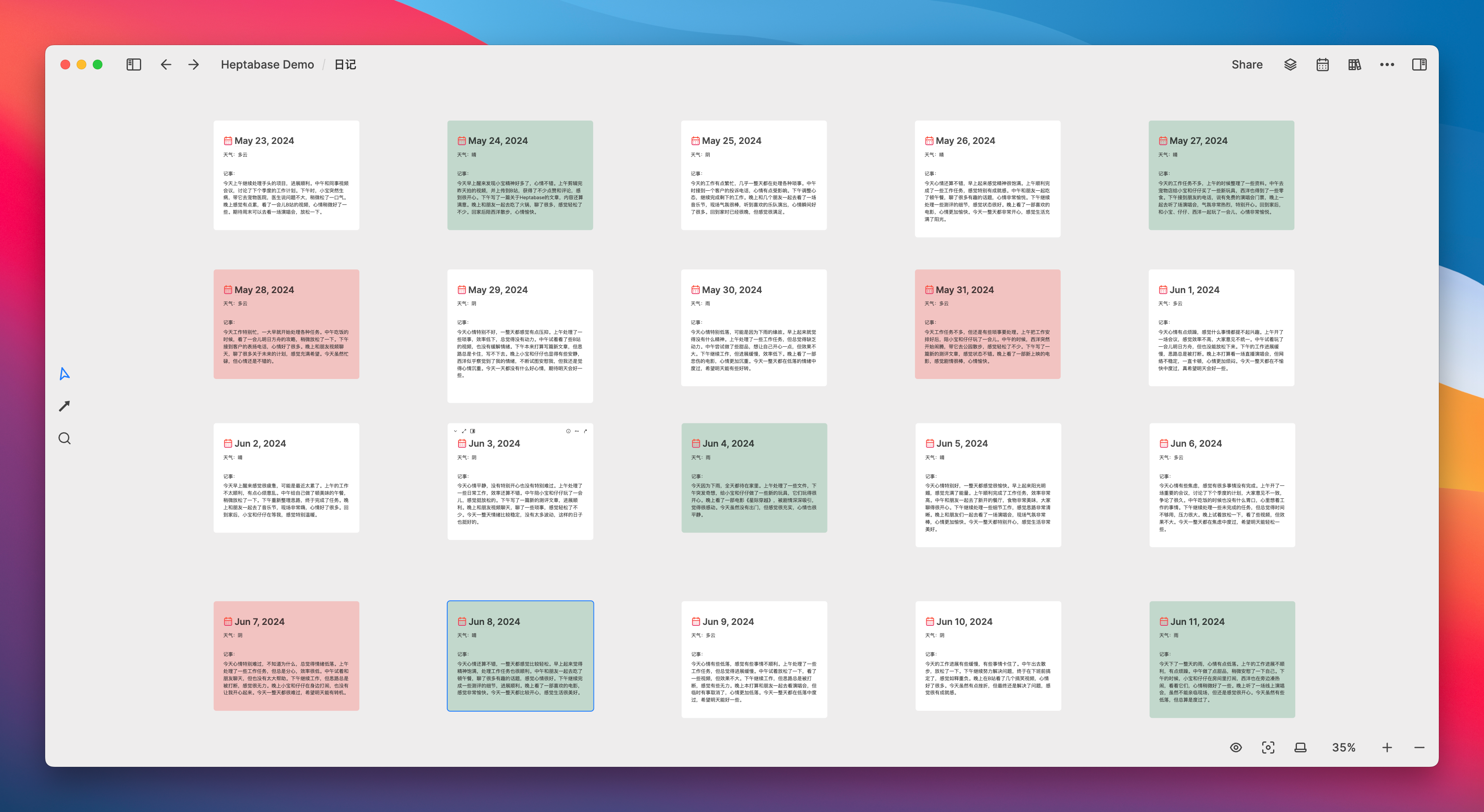
But what if I have 150 cards at the same time, and I want to focus on viewing all the diary cards with the mood “happy”? Then the freedom of the whiteboard would actually cause some trouble:
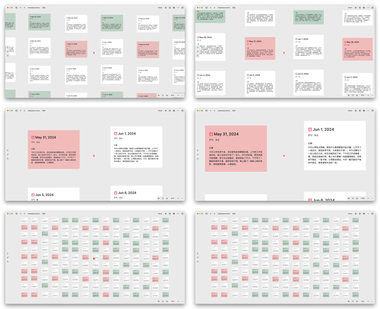
But now, Heptabase’s tags provide a new way to manage cards.
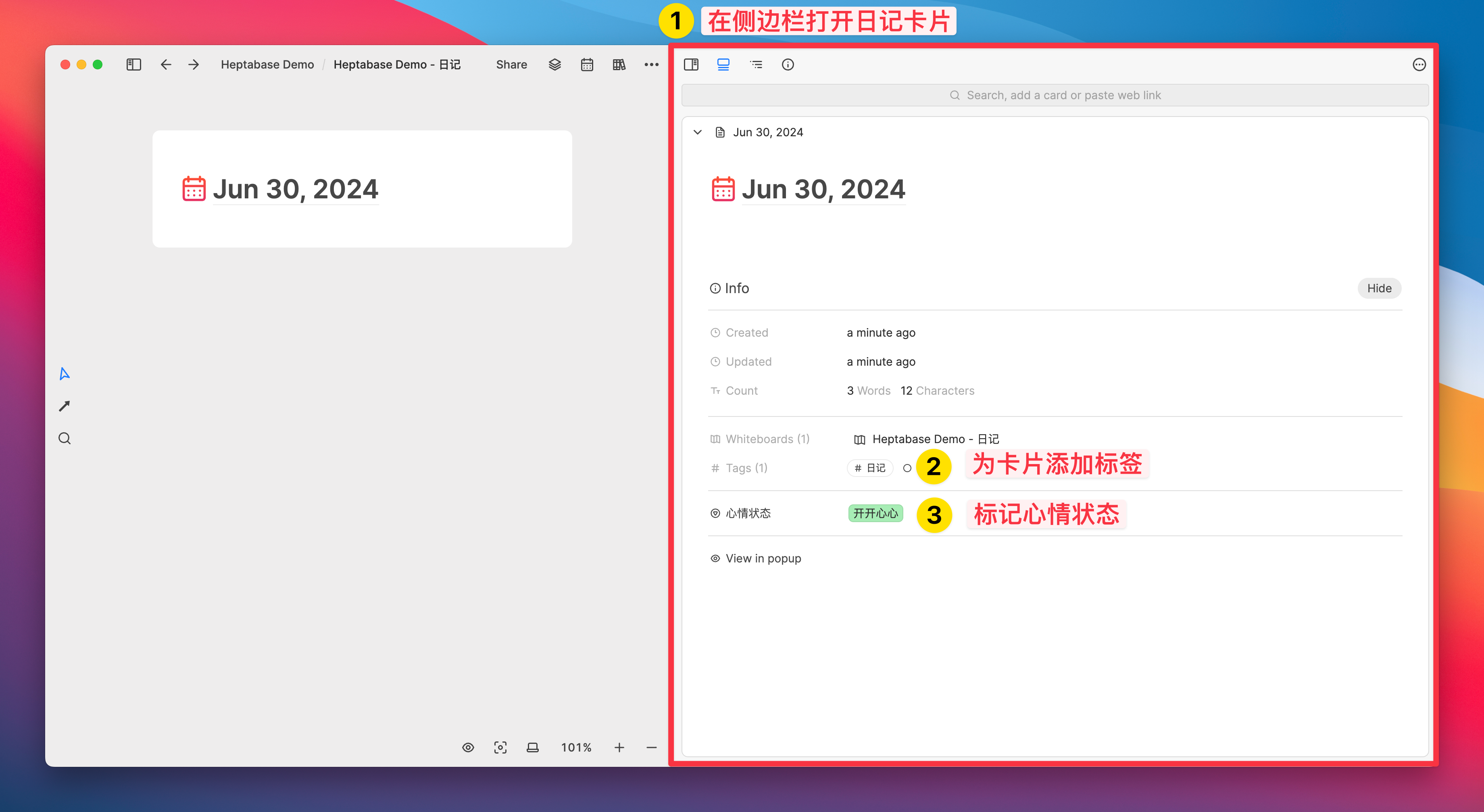
First, when we create a diary card, using ctrl+T can quickly add the “diary” tag to the card; then, by holding down the alt key and double-clicking the card with the mouse, the card can be opened in the sidebar, and then specific field statuses can be added to it in the Info attribute bar of the card:
Next, click on the “Diary” tag in the Tag tab, and you will see that all the diary cards are aggregated in this table, with the “Mood Status” Select field
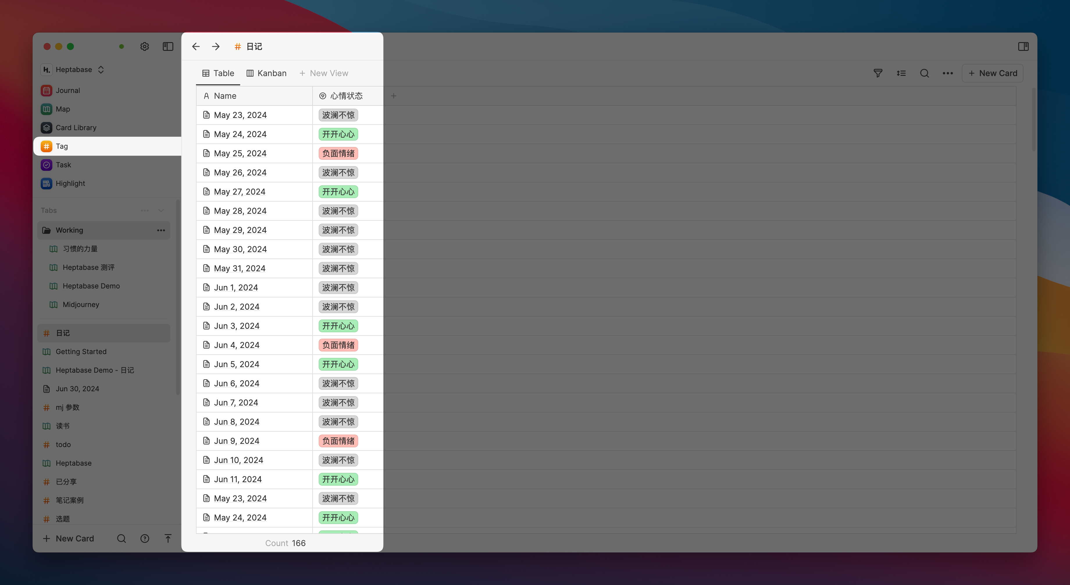
Based on the filtering function of the Heptabase simple database, we can easily filter out the specific types of cards we want to find and create categorized views for them, just like the Database of Notion:

At this stage, we can also add a Kanban view to facilitate viewing the grouping of different attribute values of the same field simultaneously:
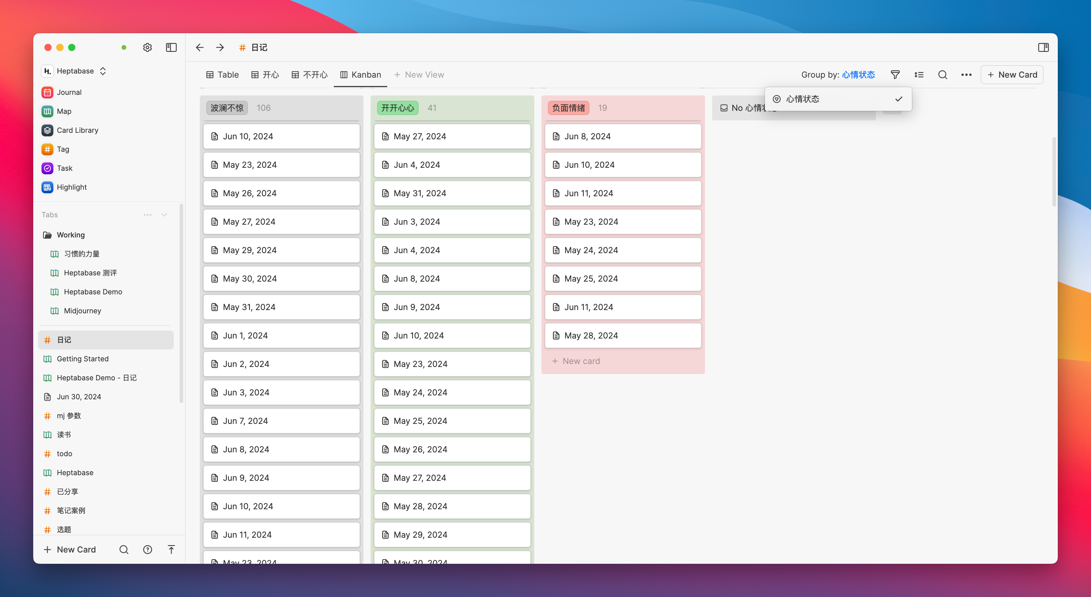
Although its current functionality is still very weak, it is indeed worth saying that the future is promising, as it is already sufficient to meet a variety of cross-whiteboard aggregation needs
For example, during the process of using a whiteboard to study various subjects, you may come up with many strange questions that cannot be quickly resolved at the moment. If left unattended, these questions will inevitably be forgotten. Therefore, we can label these question cards (or topics that need further development) with the tag “Questions,” and then aggregate and categorize these questions across whiteboards in the kanban view under this tag
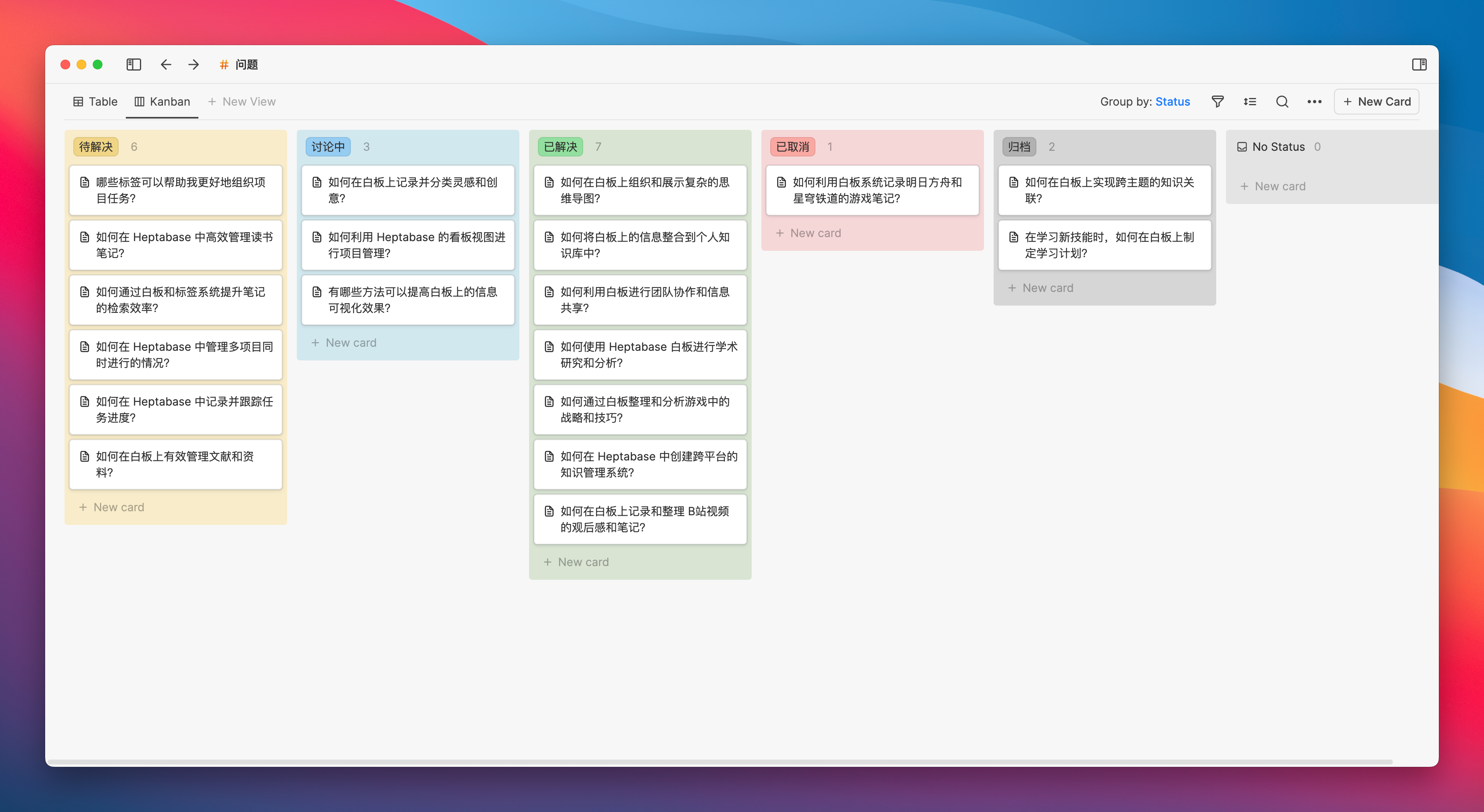
For topics that require systematic learning, such as learning a new skill or preparing for an exam, we can label the relevant study materials and task cards with “study plan,” and then categorize and manage them in a table or board view according to different learning stages or tasks.
Unlike multi-dimensional tables like Feishu, entries in Heptabase tables can be opened as pages. This feature directly elevates Heptabase’s utility to another level, and with filtering and sorting based on different views, the potential efficiency of these combinations can be significant. If you have used Notion, you should understand this intuitively.
Furthermore, since Heptabase’s tags are global, meaning the same tag can be used across different whiteboards, unlike Notion’s database which can only specify a particular data source, it might be more useful than Notion in certain scenarios.
How Heptabase Preserves the Thought Process
The goal of Heptabase 1.0 at this stage is to create a thinking aid tool that can help everyone learn and research complex topics. By building a knowledge base that can store thought processes, it helps you develop a deep understanding of a particular topic.
Remembering this core objective will help us better understand the functional design of Heptabase.
Building Visual Context with a Whiteboard
Now, please take a look at the following photos. If you can recognize where they are from, it means our taste in movies is very similar.

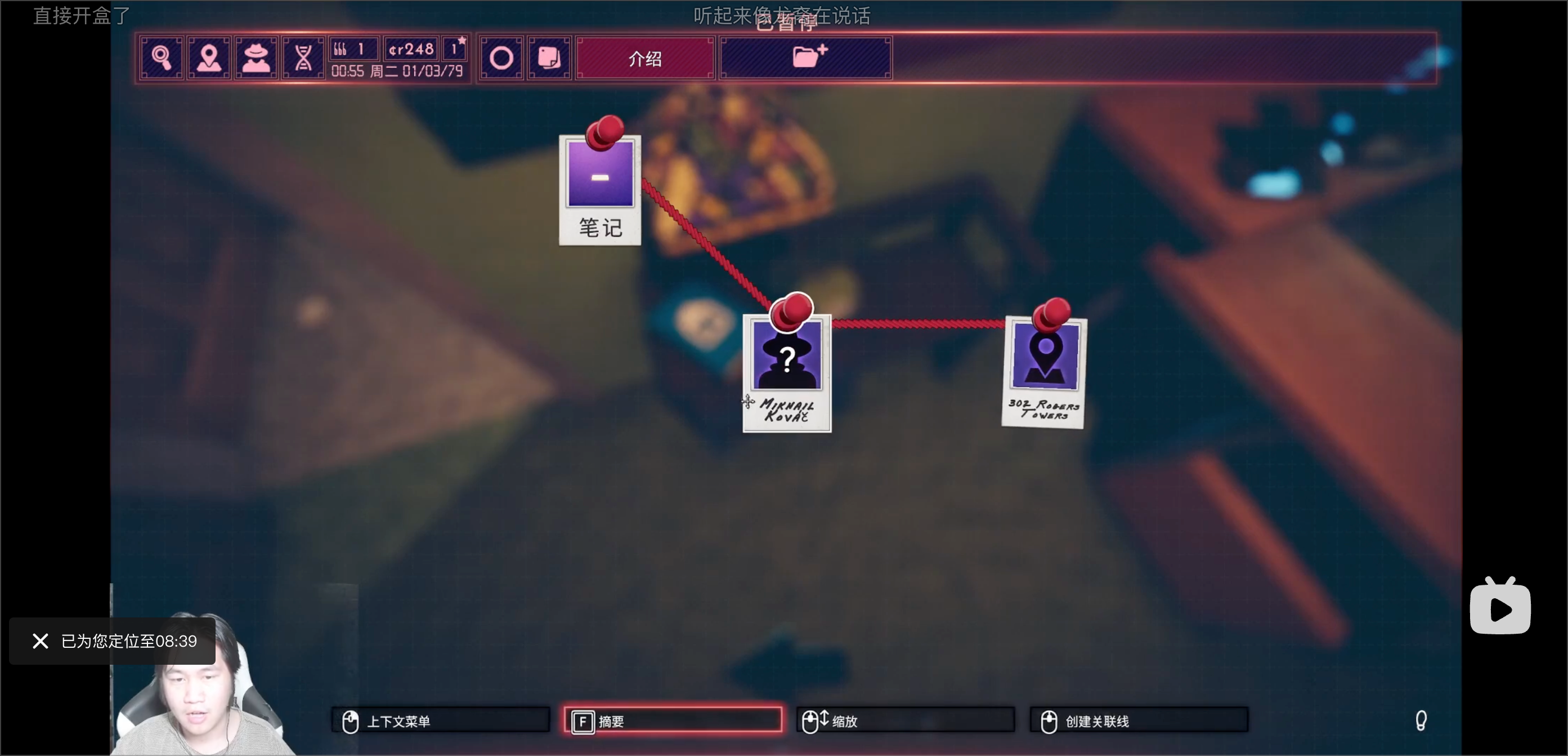
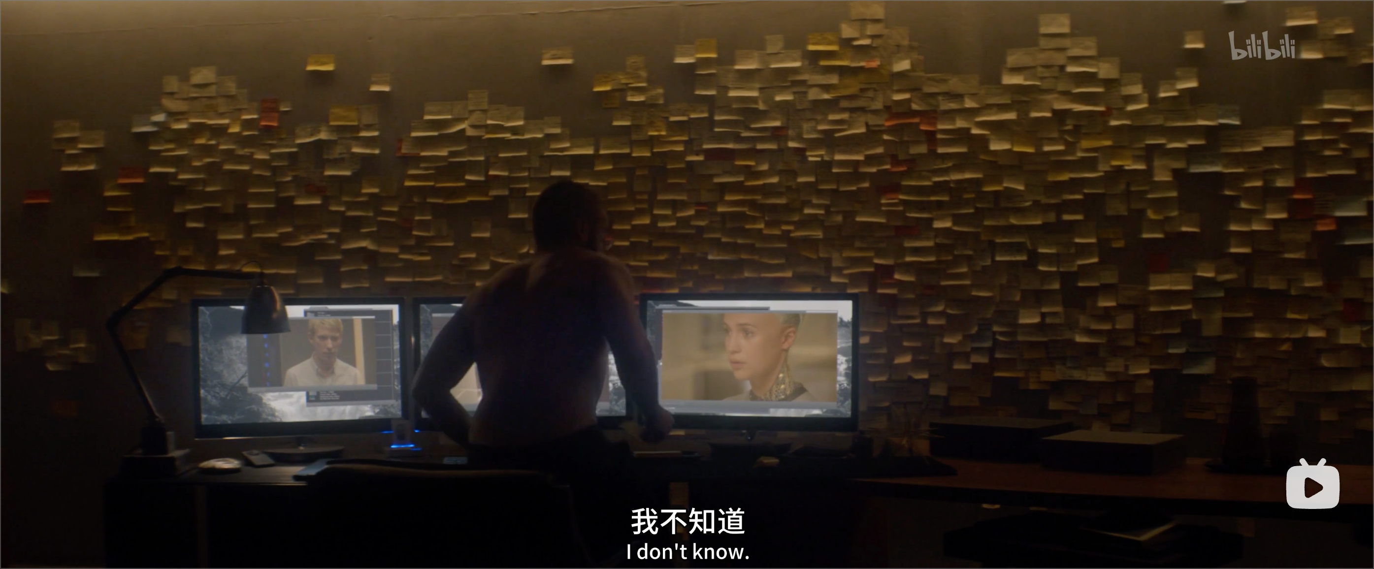
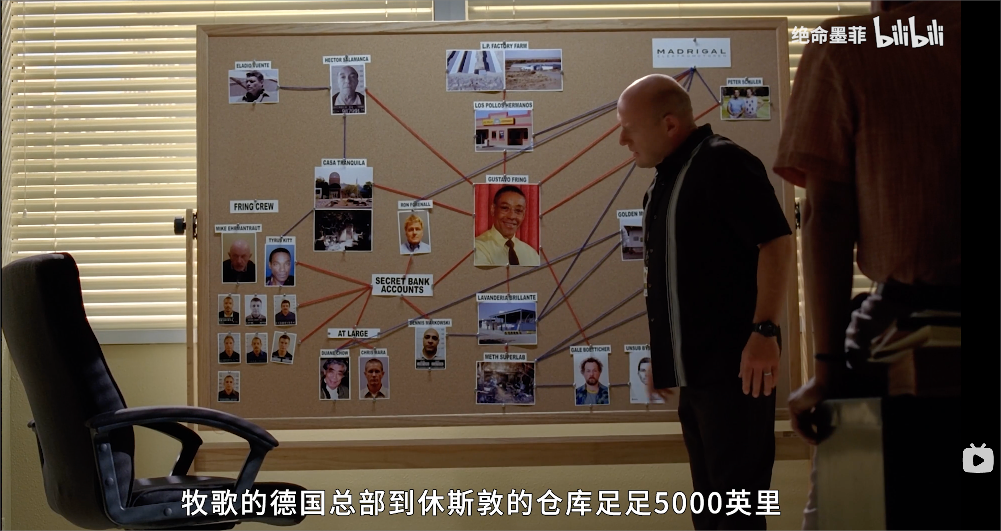

In the above film and television screenshots, the role of these physical whiteboards is invariably to present the following plot effect to the audience: under the guidance of an ultimate goal, core nodes are recorded using paper cards, and by connecting complex clues, layers of fog are peeled away, ultimately pointing to that final goal.
So can we consider that, in order to allow the audience to “perceive” this complex exploration process most quickly, the whiteboard and its network of interconnected cards are the best display method?

A consensus is that the brain interprets visual signals much faster than reading and then decoding text. A flowchart containing arrows and symbols can convey the steps and relationships more quickly than a textual description of the process. When we see a map, we can quickly understand the geographical information it presents. When we read charts, we can intuitively perceive changes in the data. The mnemonic “red light stop, green light go,” yellow warning signs, and green emergency exits—colors and shapes have always helped us make quick judgments and decisions in daily life.
In cognitive psychology, there is a concept called “representation,” which refers to the mental model by which the brain transforms external information into internal cognition. Visual representation allows us to process a large amount of information data extremely quickly.
Alan, the developer of Heptabase, also put forward a viewpoint: “The architecture of human thinking usually becomes clear only after visualization.” I deeply agree with this. Effectively using visual signals to encode notes can significantly enhance our ability and efficiency in understanding complex matters.
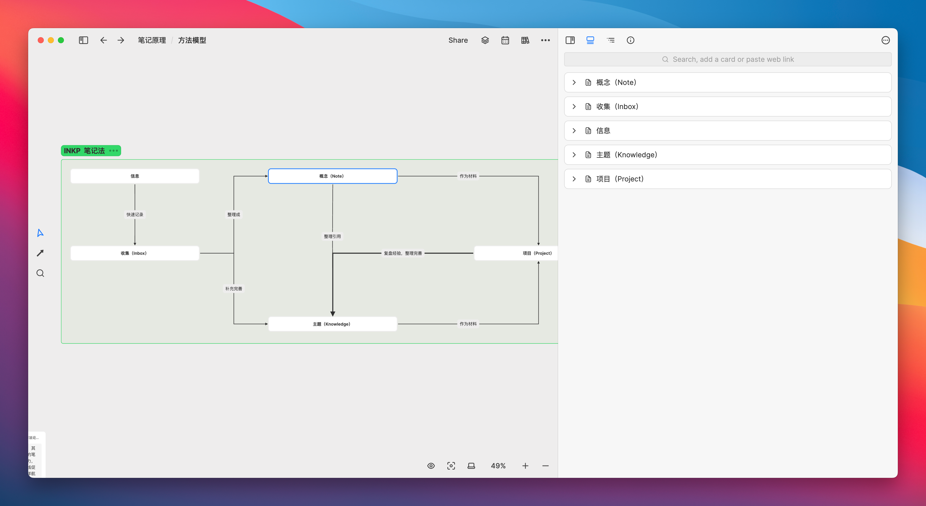
For example, when I was reading the book “The Power of Habit,” I could construct an easily understandable habit loop through a simple combination of three cards and three arrows:
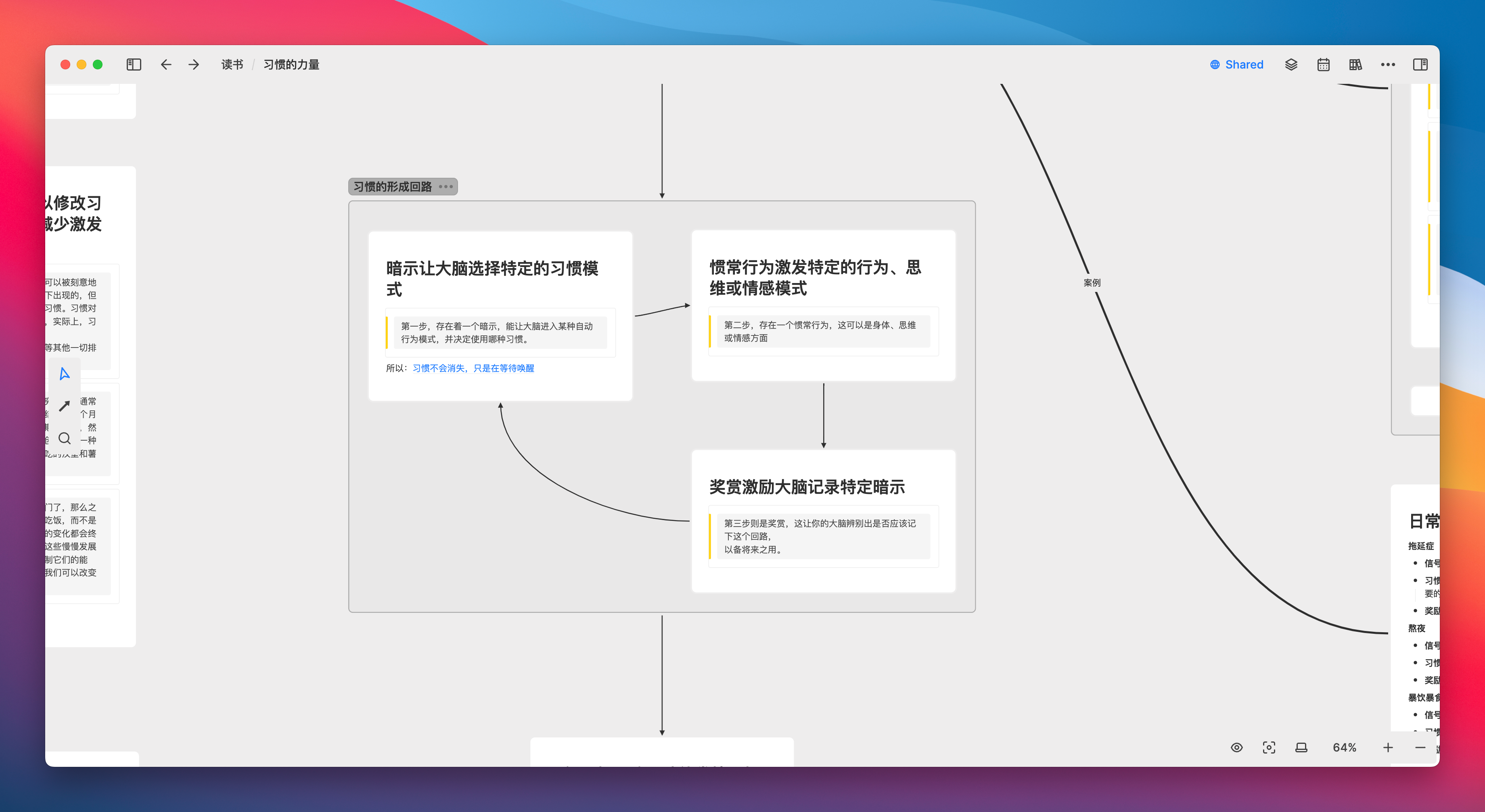
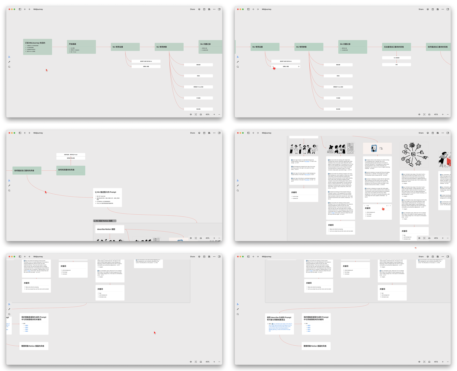
When studying Midjourney, I created a timeline of cards arranged from left to right to record my learning progress, allowing me to more intuitively review, in chronological order, the problems I encountered at each stage and the solutions I adopted
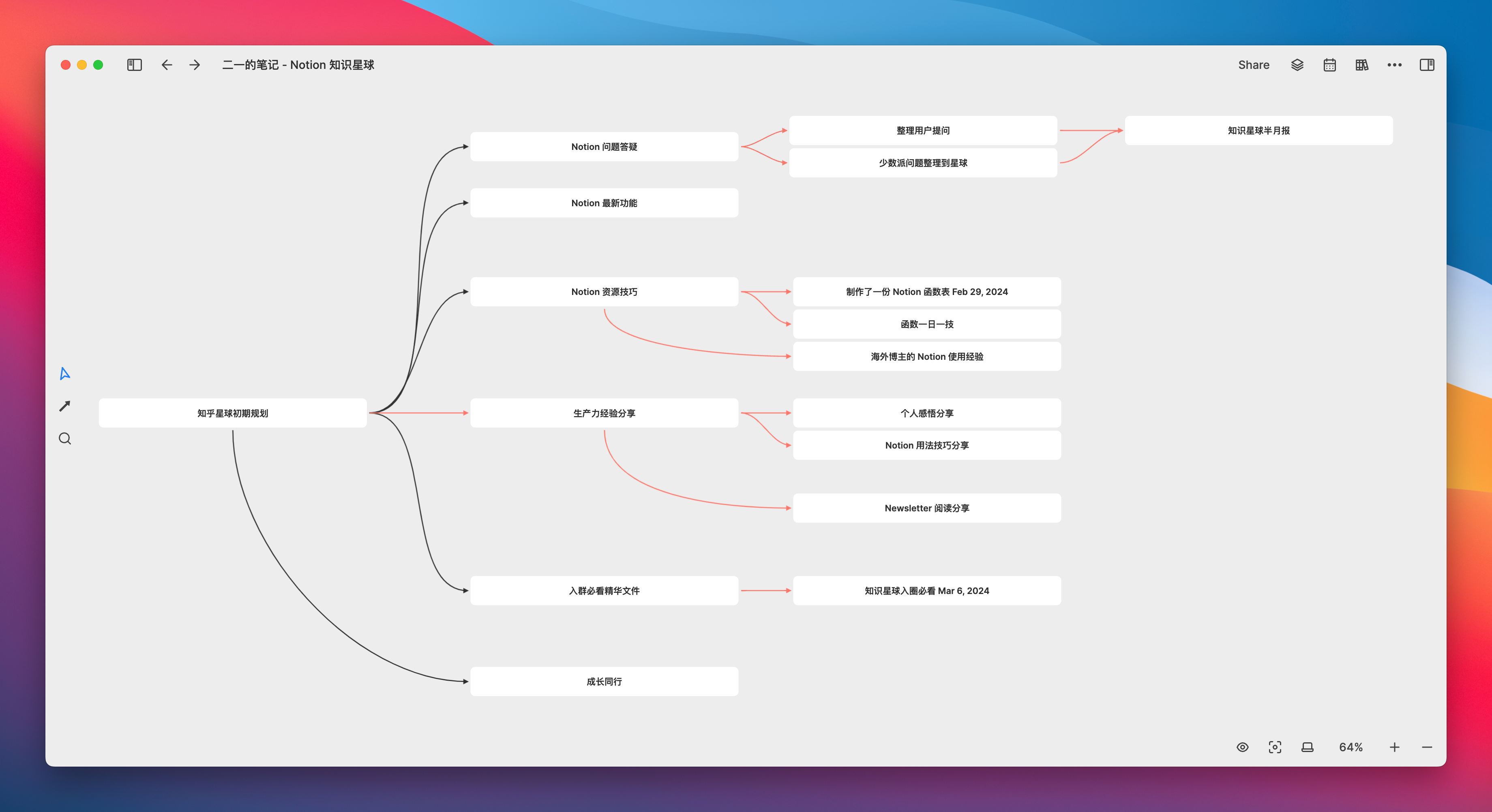
When planning a project, you can break down each step in a manner similar to a mind map, and then add more detailed content to the cards at each node
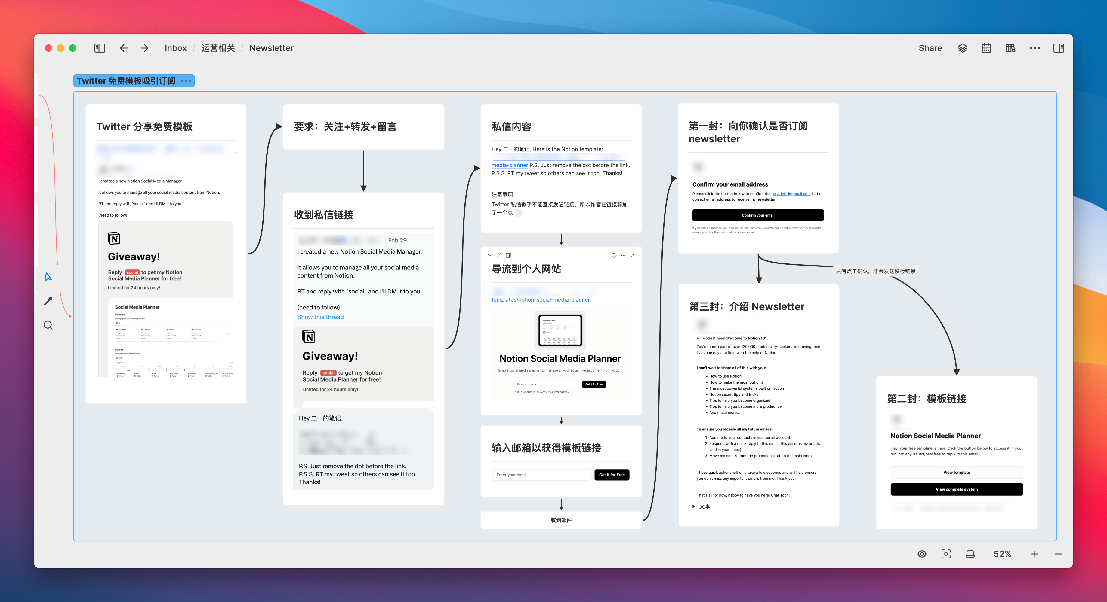
When deconstructing the follower growth strategy of blogger X, each step was clearly marked using cards and process screenshots to show what was done at each stage:
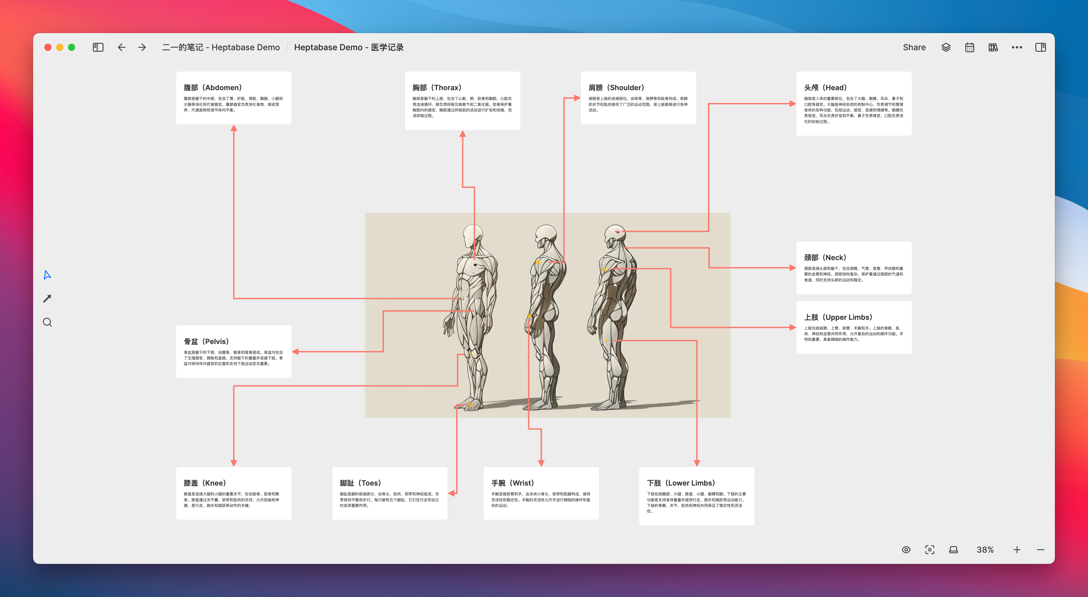
Or, if you are a medical student, can using pictures with arrows help you better record knowledge cards of different body parts?
If you are studying a period of history, would organizing specific events with a timeline and cards make the course of history clearer?
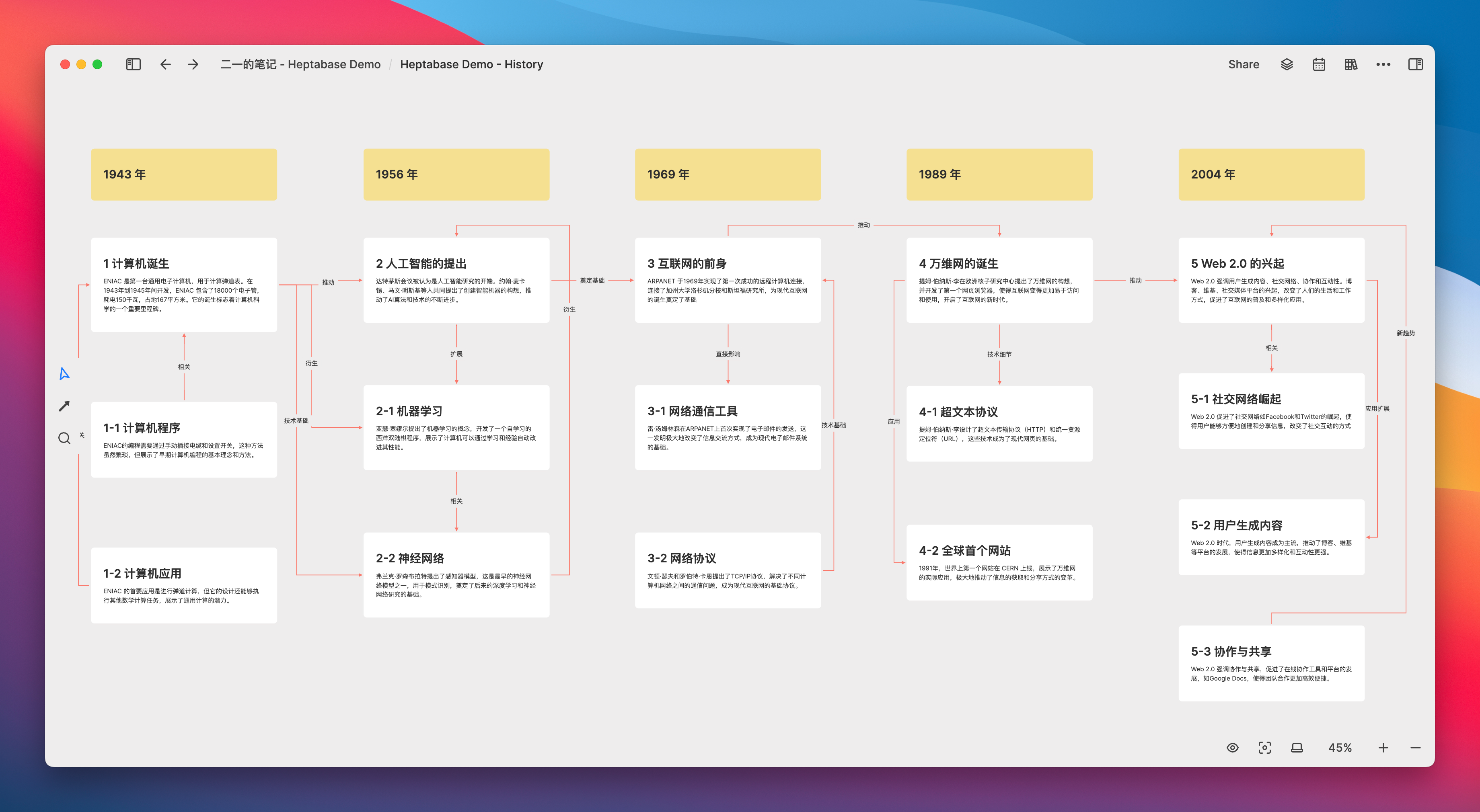
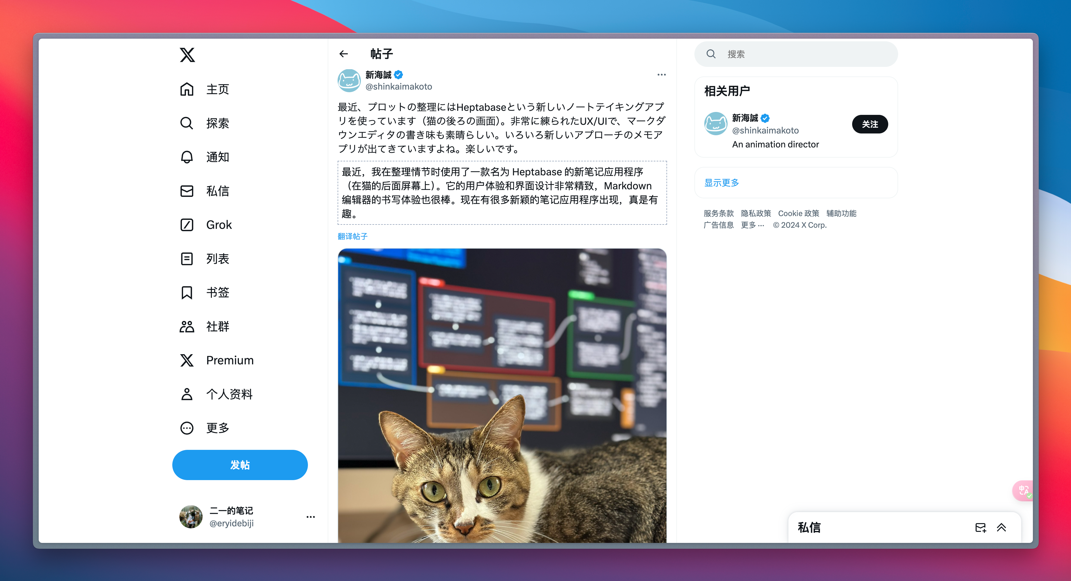
If you are Makoto Shinkai, you can certainly use it to visually compile the storyline’s framework…
During the general reading process, the author’s argument may be discontinuous, so I need to relatively frequently consider whether the logical links between the created cards are smooth. This can be quickly confirmed through the act of “looking,” because once a card appears isolated, it indicates that it is not or is less involved in the chain of argumentation.
Therefore, unless it is a self-contained concept card, it is necessary to continuously confirm whether the card is necessary or whether its position and relationship on the whiteboard can be reorganized.
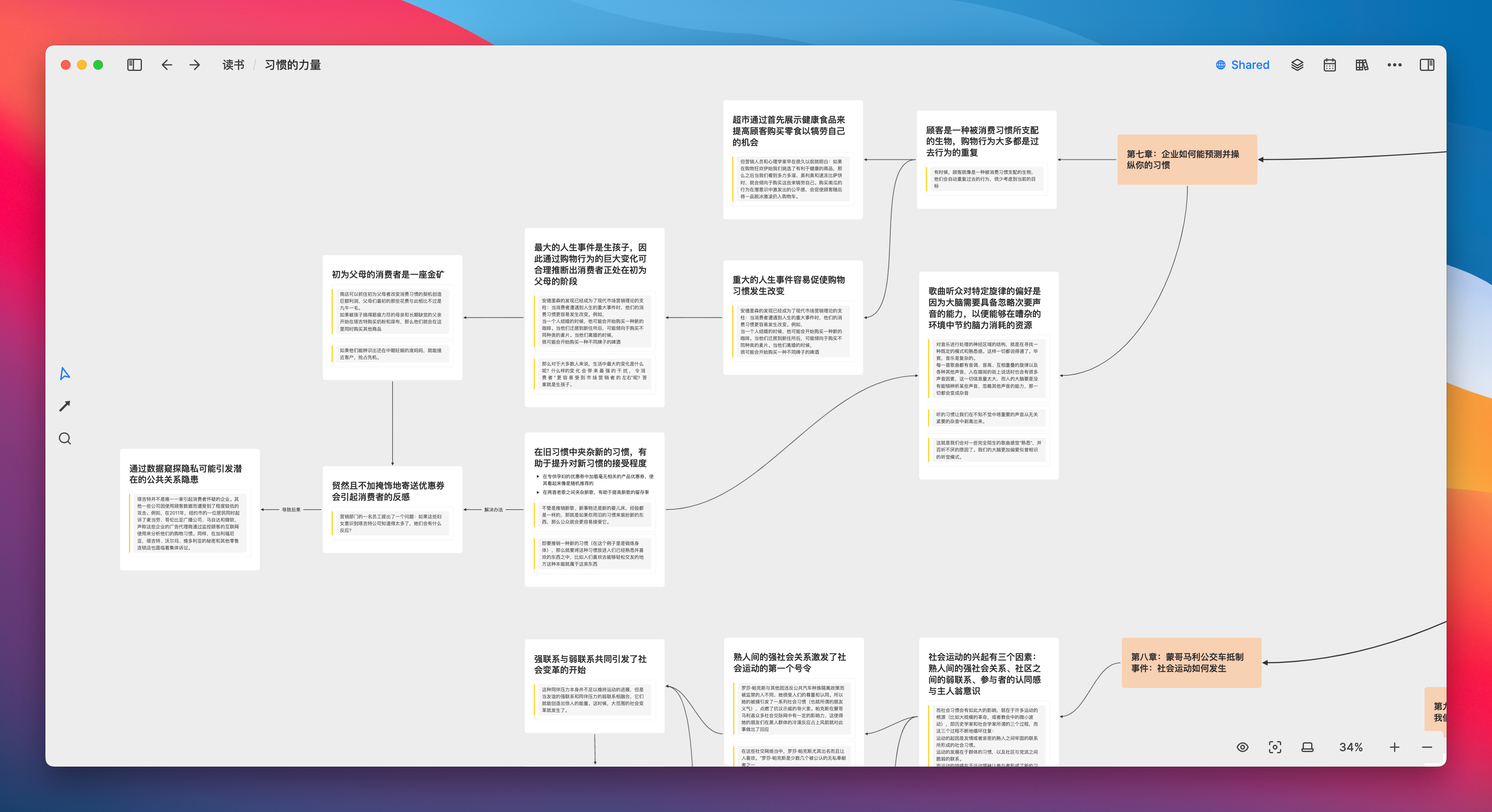
If there are relatively blank cards, it indicates that this card needs more evidence to fill it. This way, it can prompt me to search more meticulously and attentively in the book for materials that can serve as evidence. I believe that in this process, “visualization of knowledge” plays a significant role.
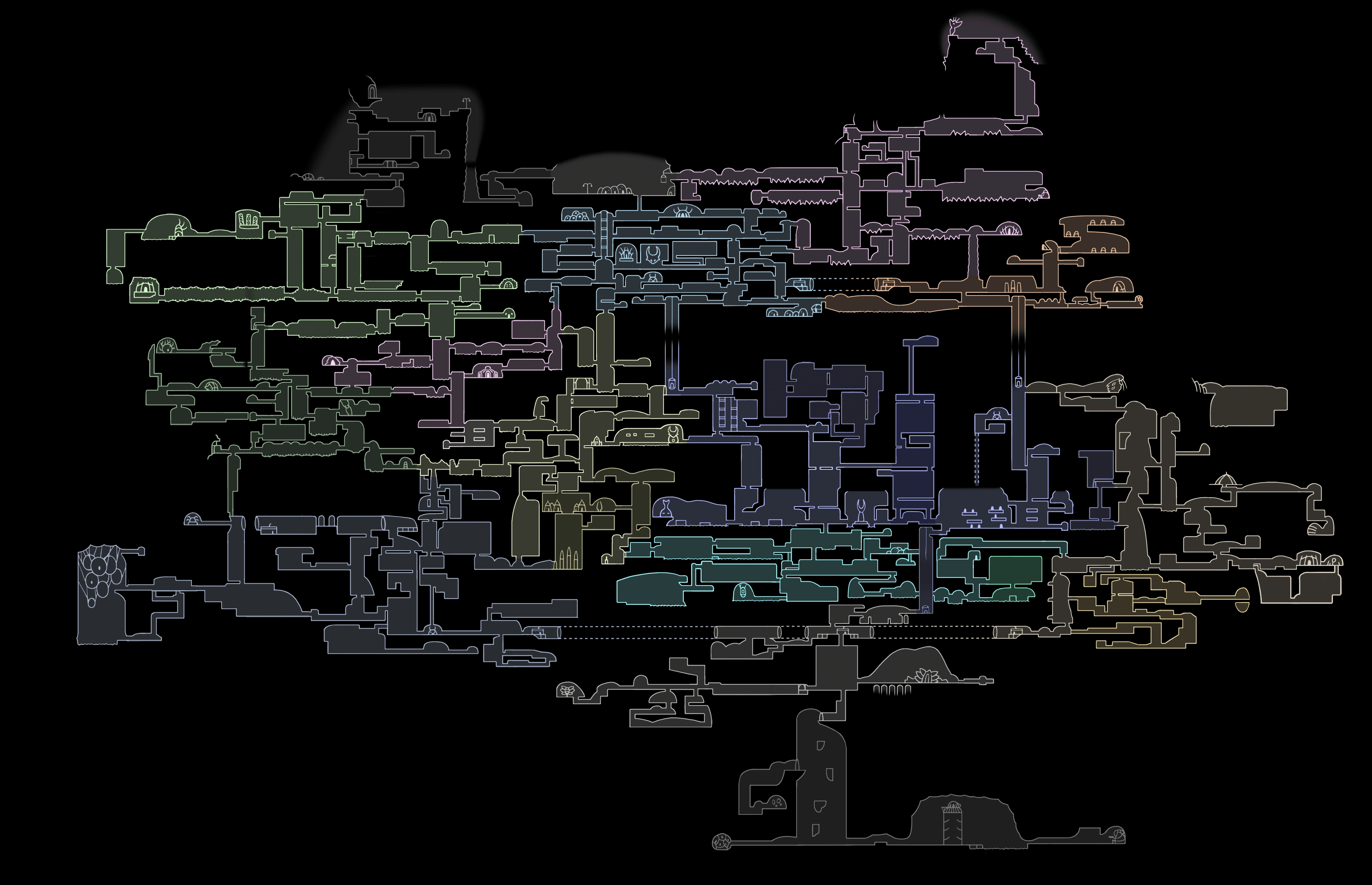
Sometimes I feel that when I create blank cards on the whiteboard and then link them together following the thread of my thoughts, it is quite similar to gradually uncovering the map in “Hollow Knight.” Each card is a piece of land waiting to be explored; the direction is already clear, and the only thing left to test is my courage to take the next step.
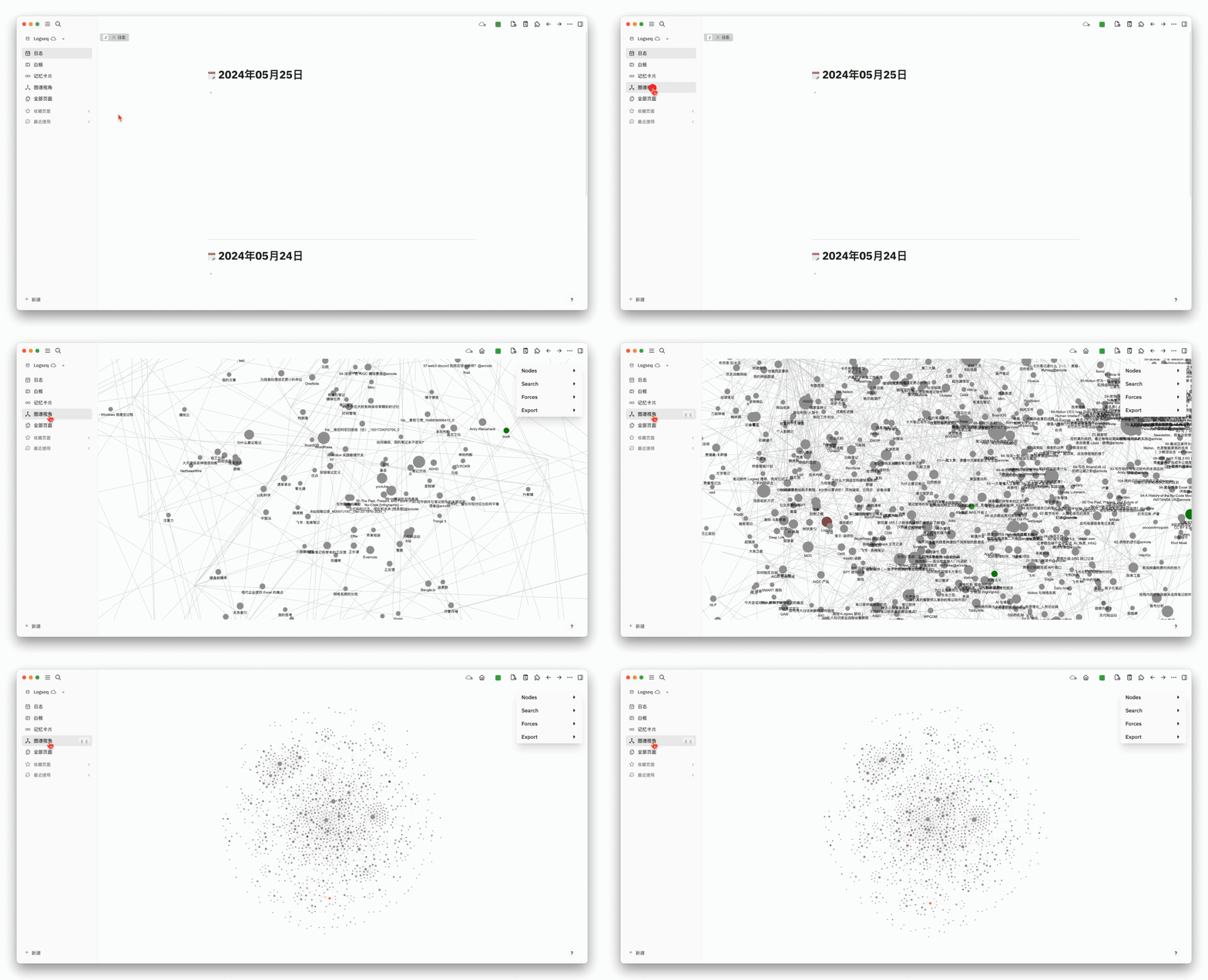
To this day, the craze for double-chain notes has subsided. I believe everyone has already realized that chaotic, almost uncontrollable graphs cannot generate any value. We once naively hoped to unravel the truth from the chaos, but in the end, only the slight lag when loading the graph could tell us: Oh! It turns out that the knowledge we have accumulated over time does have some weight. However, as we zoom in and out, zoom in and out, futilely gazing at the starry sky, the wisdom that could enlighten us seems as elusive as a shooting star.
In the knowledge graph constructed on the whiteboard, in addition to links between the cards, there are also directions and markers. One can immediately discern the conceptual proximity or distance between them. Each node is no longer just a title but also reveals the rich information behind it at a glance. I believe that such a structure is meaningful.
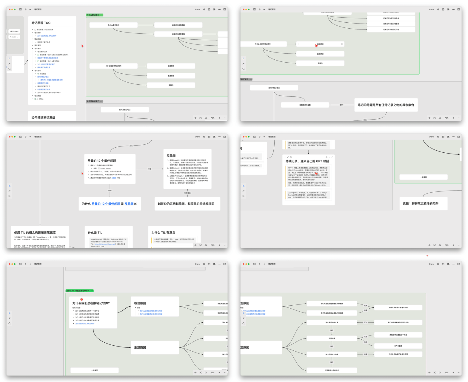
Of course, this article is not intended to promote Heptabase by criticizing the double-chain map. In fact, this viewpoint applies to any whiteboard product. You can also try the whiteboard in Feishu, Excalidraw, Canvas by Obsidian, and Milanote, among others.
Constructing the Context of Connections with Double Chains
Heptabase has an important feature, which is the ubiquitous bidirectional links. The specific usage is basically the same as Obsidian or Logseq and other bidirectional note-taking tools.
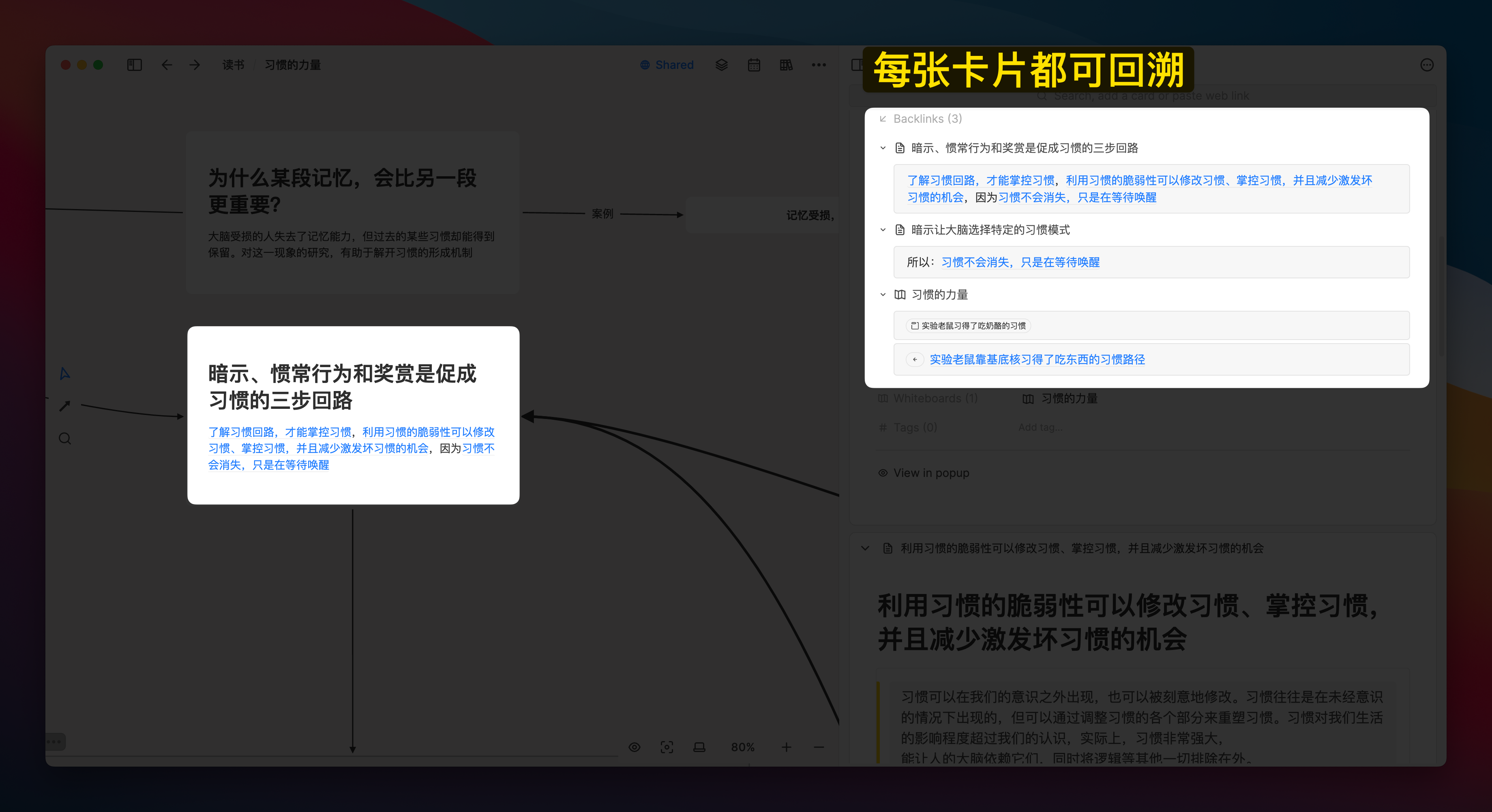
When I use the shortcut @ on card A to mention card B, I can see the existence of card A in the Backlinks section of card B. Moreover, using a connection on the whiteboard to link the two cards can also establish a bidirectional link between the cards:
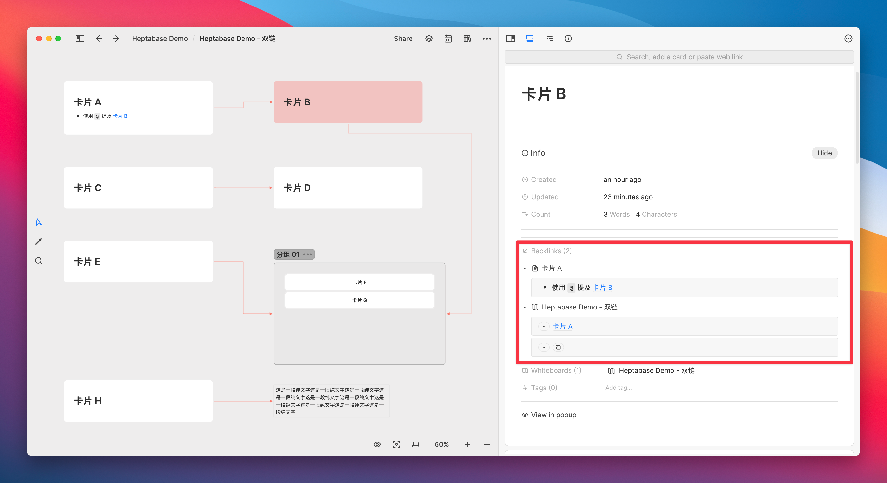
In addition, groups (sections) composed of multiple cards can also be referenced or linked, which can similarly be reflected in the context of backlinks:

Based on this characteristic, I habitually write the titles of knowledge cards as conclusions that can be directly cited, and then use multiple conclusions (i.e., the titles of multiple cards) to explain the title of another card
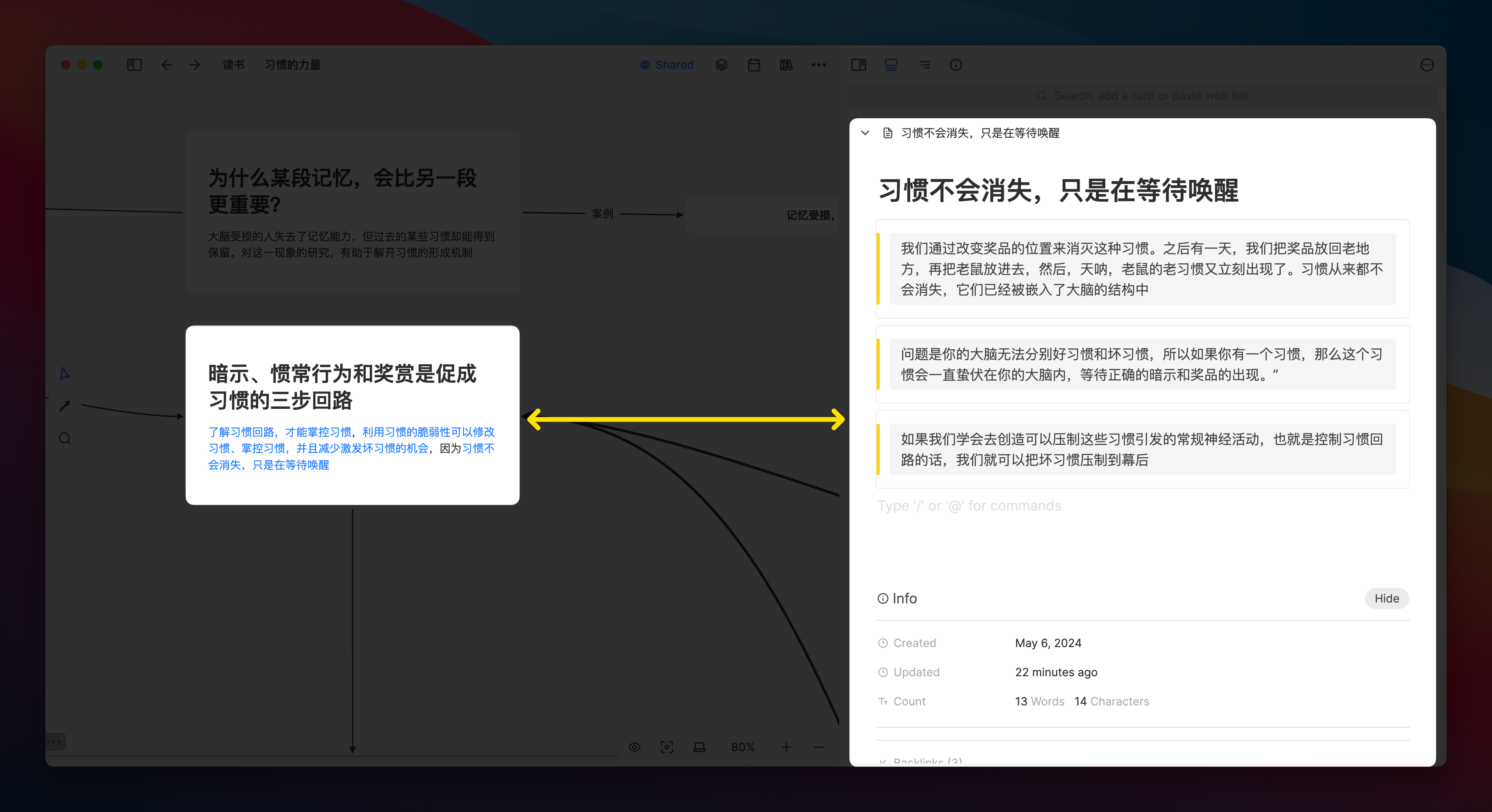
In the Info area of each card, you can see how many times you have been cited or who linked you on which whiteboard. This makes it easier for you to trace the thread of your thoughts and facilitates the reuse of the same information in different contexts.
Using clipping to preserve the browsing context
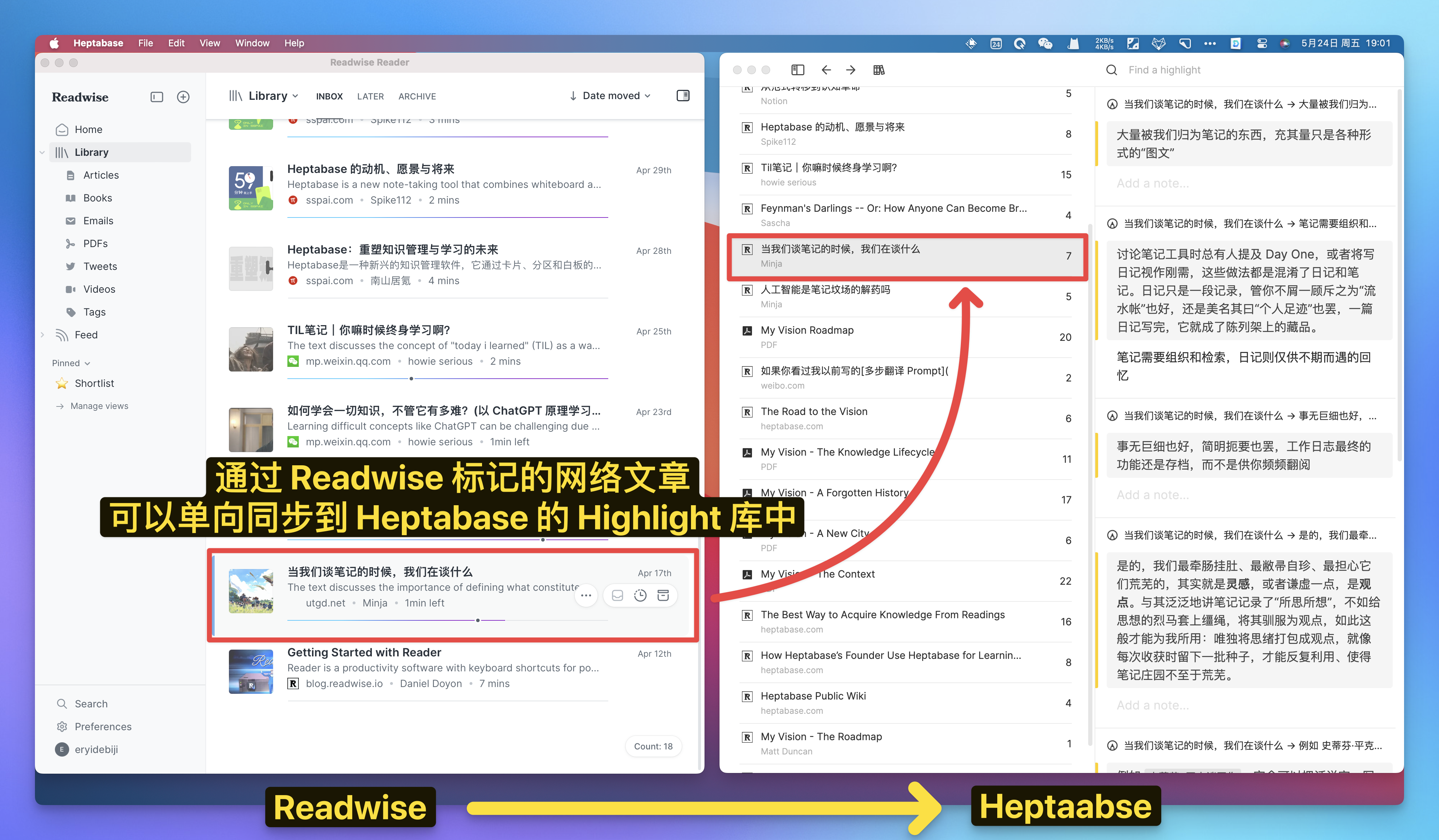
In addition to the PDF reading and annotation mentioned at the beginning of the article, we can also associate Heptabase with the Readwise read-later software. When we read any article on the web, we just need to right-click on the paragraph, then save it to Readwise, and we can immediately see the marked paragraph in Heptabase, with very fast synchronization speed.
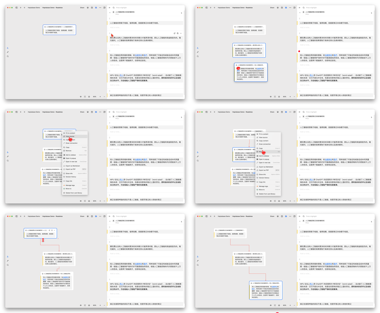
Then we can quickly drag this paragraph onto the whiteboard, making it a node in the thinking network:
Additionally, Heptabase recently launched the first version of their browser clipping plugin, which allows users to clip any web article into a card with a click of the plugin button:
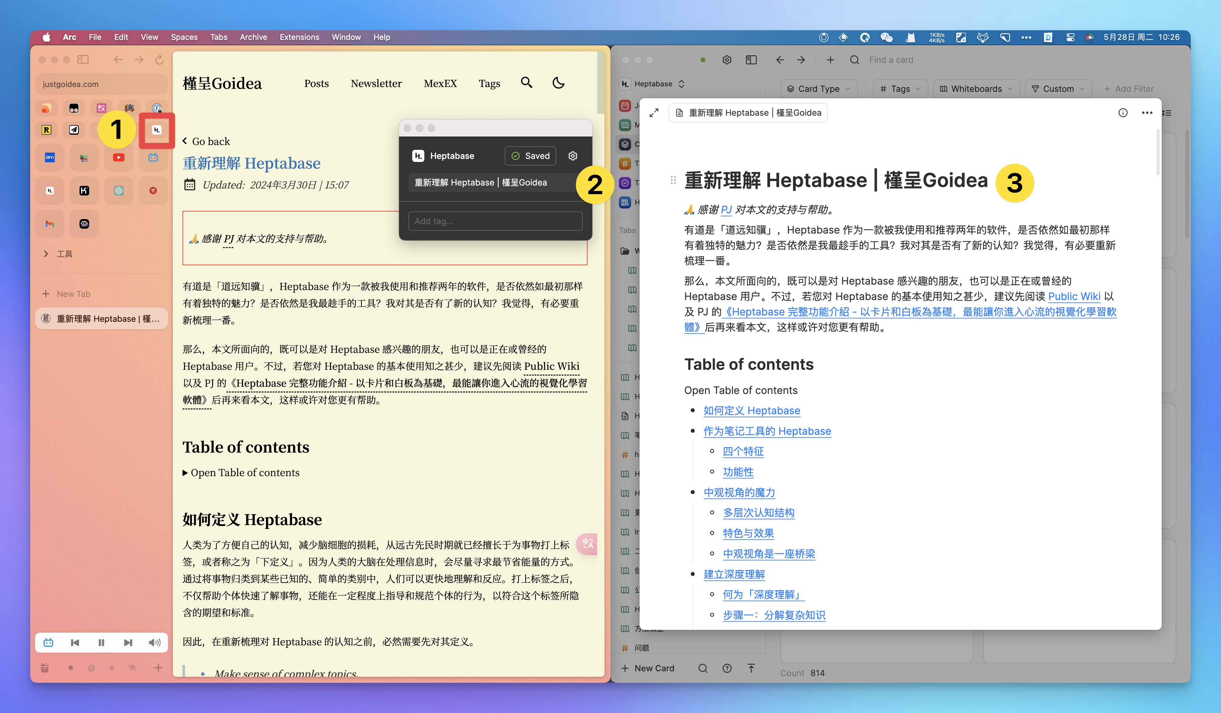
However, the current functionality of the clipping plugin is still quite limited, as it does not even include the original webpage link, nor does it allow for preset clipping tags. We can only look forward to more updates in the future.
Heptabase Comparison of Various Note-Taking Software
Because everyone has different expectations, uses, and methods for note-taking software, the following section will be a subjective description of my personal experience. If you have not used the corresponding product, you may choose to skip it.
These comparisons are not intended to highlight who is better than whom, but rather to further evaluate which features are more suitable for me personally after describing specific note-taking scenarios. Therefore, it is not necessarily a matter of product quality, but more about the adaptability to my personal habits.
Comparison of Logseq
In the past, when I used Logseq’s outline for note-taking, I usually just grouped entries with similar concepts together, but I did not organize the relationships between the entries well, nor did I often consider whether there were constraints, promotions, or complementary relationships between the entries.
Many times, I simply use a Tab key to indent nodes and then use a “general-specific” logic to roughly classify or expand them. Although this can produce seemingly neat documents, the classification results are rather crude due to the lack of deep thinking. If I need to reuse these notes later, I have to rethink how to link each node into a coherent paragraph or how to organize them into an article.
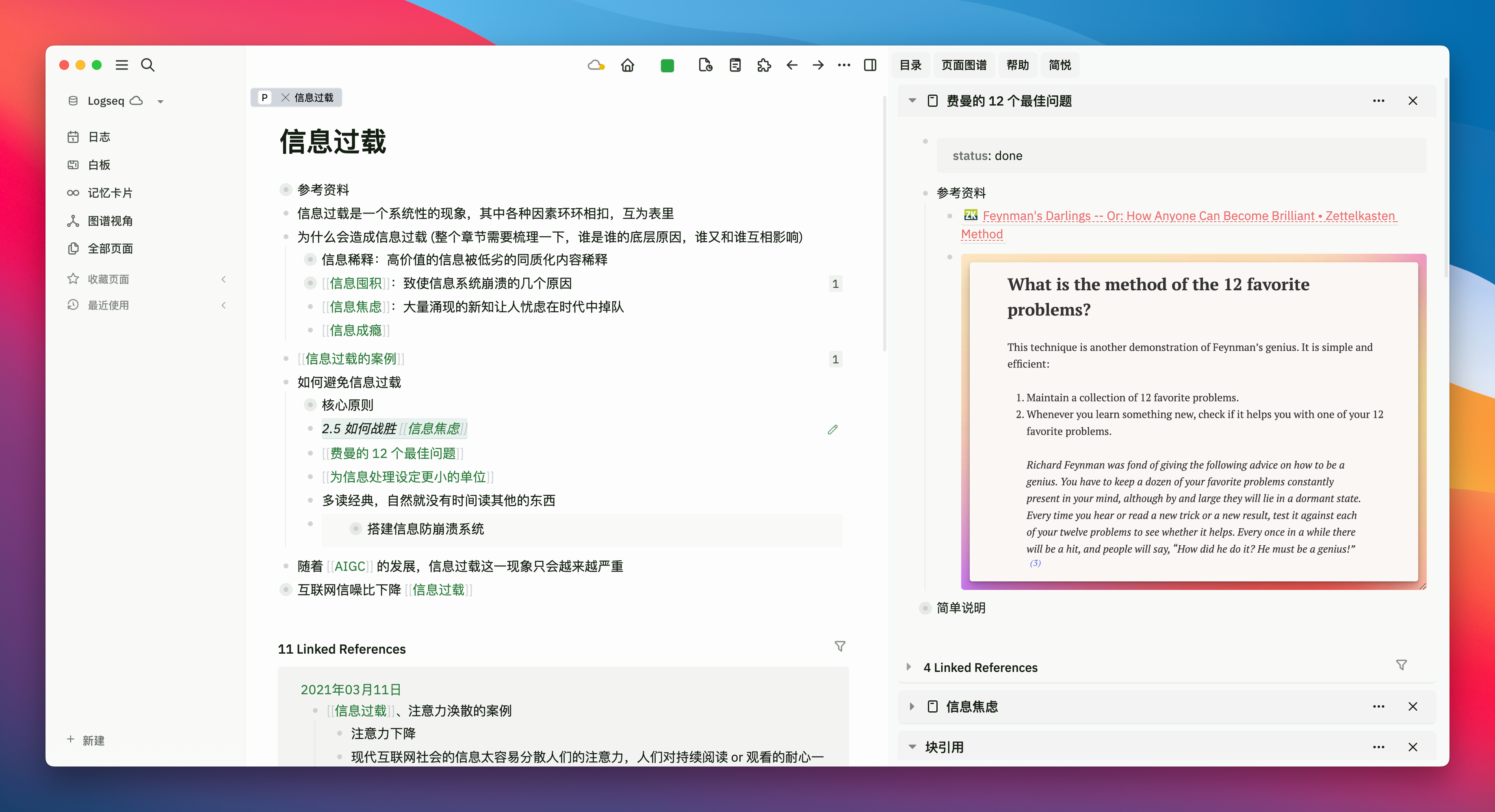
Therefore, I believe that the characteristic of an outline is to encourage the use of phrases or short sentences for quick recording. The advantage is that it reduces the resistance during “input,” but it can easily turn information entry into mere entry, thereby increasing the pressure during “retrieval,” as it requires secondary organization and secondary thinking to connect fragmented nodes into a coherent line.
During the use of Heptabase, because the whiteboard has no framework structure, it naturally prompts (or even requires) me to organize the logical chains between the cards and to think about where they should be placed more appropriately. In other words, it raises the threshold for “input,” but when retrieving information later, I do not need to think twice because the thought process saved initially is clear at a glance.
Overall, the outline involves going downhill first and then uphill, which is remembered faster; whereas the whiteboard is the opposite, climbing uphill first and then going downhill, resulting in faster output.

Additionally, although Logseq itself also has a whiteboard function, its whiteboard is far less mature than the Canvas of Obsidian, and the development team’s current focus is on restructuring the database version. Therefore, I have not tried its whiteboard much and will not include it in the scope of this discussion.
Comparison Notion
It is still my primary note-taking application, mainly used for structurally recording documents related to project execution, building a mature document knowledge base, planning and executing schemes step by step, and sharing various document pages. However, now when I have a new topic I want to learn, a book I want to read, or a skill I hope to master, I will consider prioritizing Heptabase.
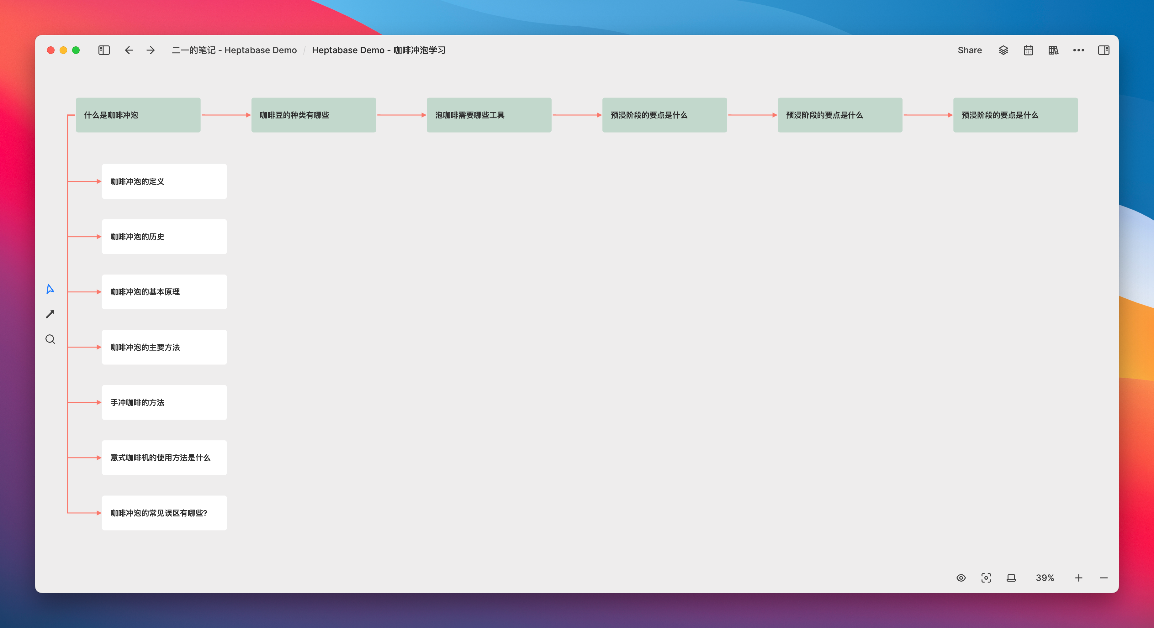
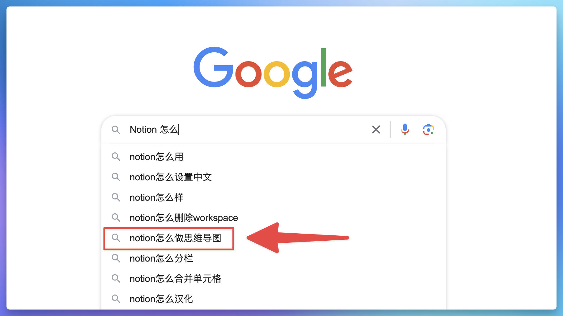
At the initial stage of learning, we will have quite a few fragmented ideas. At this time, you may not know what order to use to organize them, but the documentation or database framework of Notion naturally requires these “problems” to be organized in some orderly manner. This may cause some trouble and prevent you from pouring out all your ideas at once. Therefore, the question “how to make a mind map Notion” ranks fifth in Google’s search results:
The whiteboard of Heptabase at the beginning of learning allows us to freely extract questions or ideas from our minds, make them into scattered cards, and then review them together on the whiteboard. Moreover, the functions of the whiteboard are relatively simple, so you won’t have too many thoughts unrelated to learning, and you won’t be distracted by thinking about whether there are templates, plugins, or more automated note-taking methods.
Treat the whiteboard as a blank sheet of paper, and you can focus more on the act of learning itself.
Obsidian Canvas
Theoretically, Obsidian combined with plugins can almost meet any document-level editing needs, not to mention that Obsidian has also launched its own whiteboard (Canvas) feature. So, between the free Ob whiteboard and the expensive subscription-based Heptabase, why did I choose Heptabase? The reason lies in the fundamental differences in the way the two create and manage cards.
Canvas is currently a quite mature core plugin, with all the necessary card types and card organization functions. It not only allows nesting between Canvases but also enables direct embedding of Canvas within document pages.
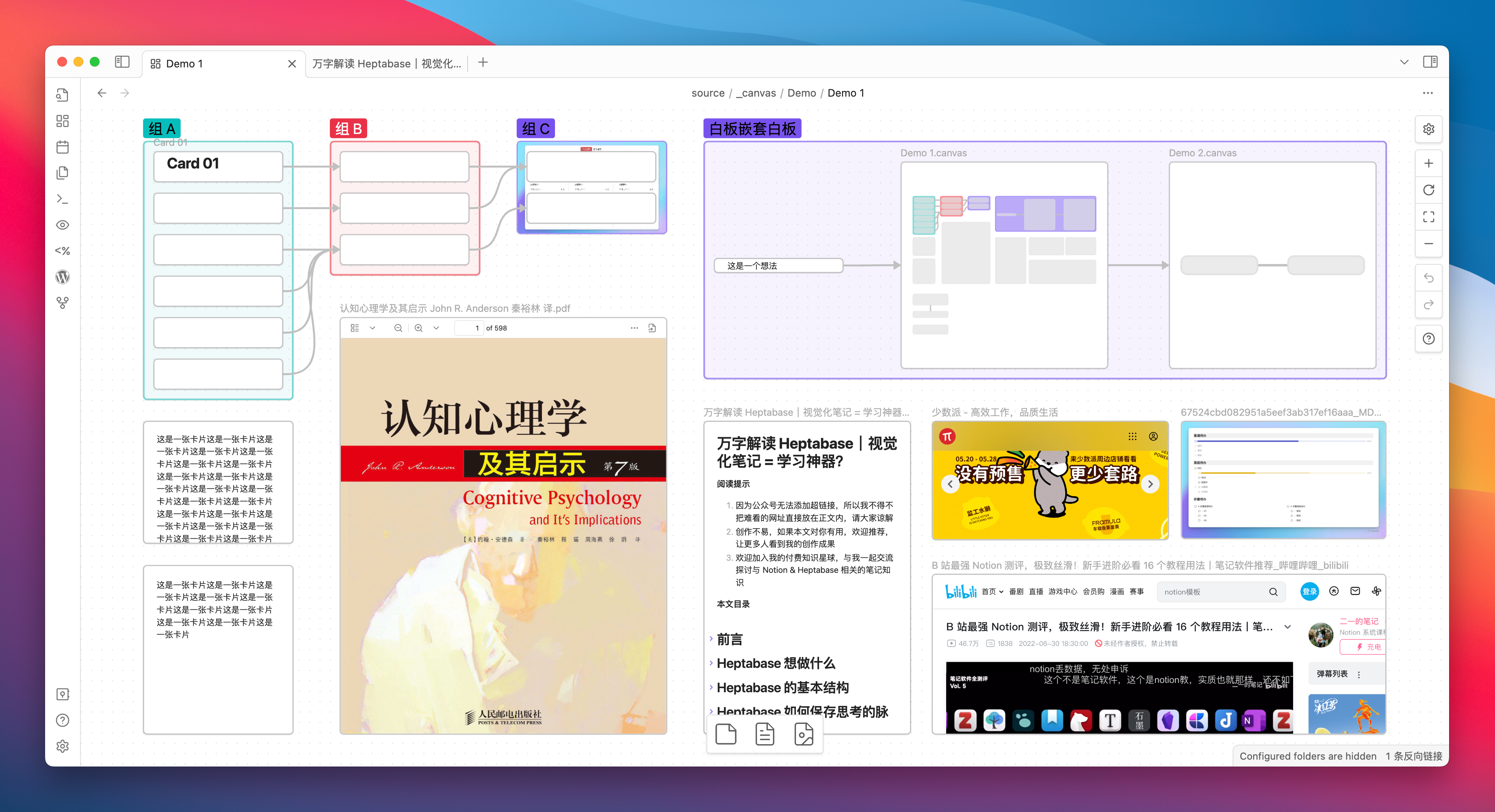
You can freely brainstorm ideas in Canvas and organize the structure of card notes in a mind map-like manner:
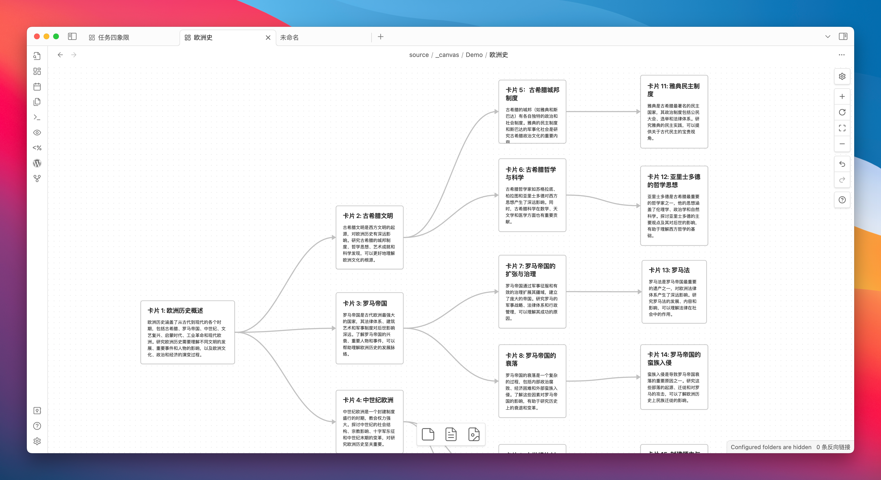
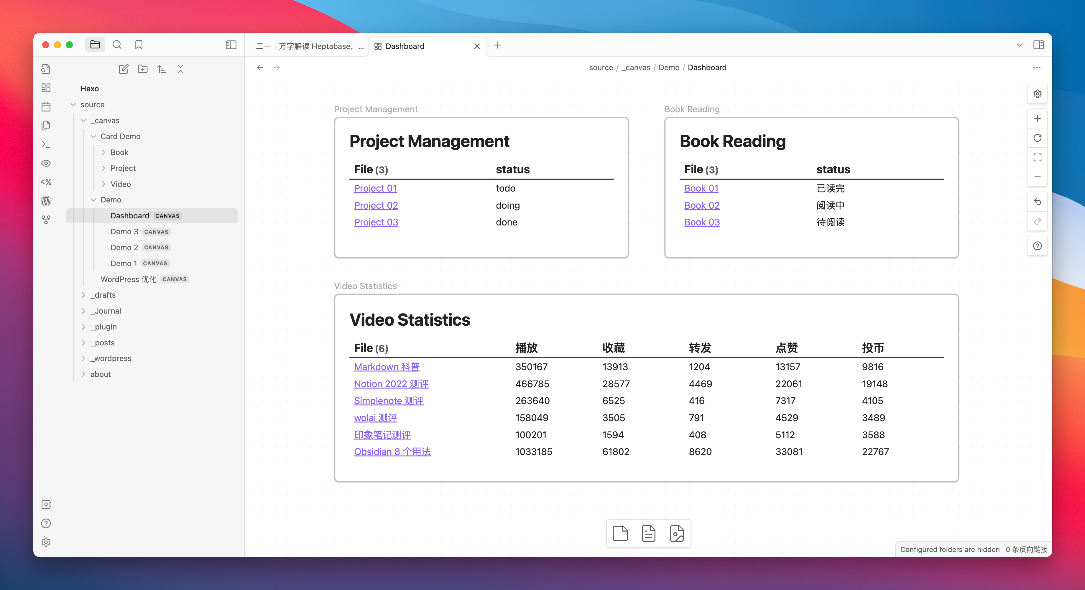
You can pair it with the Dataview plugin to build a Dashboard in Canvas, and I believe this will make many loyal Ob users’ eyes light up.
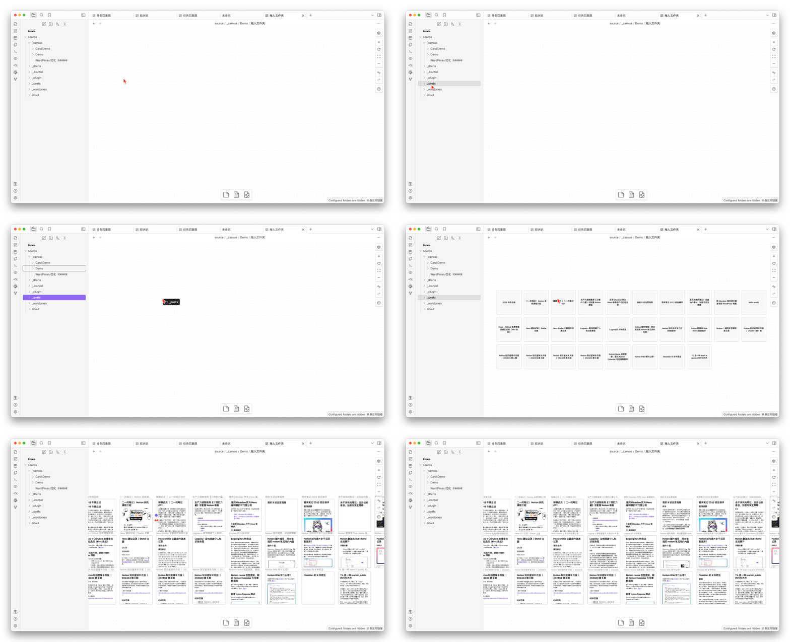
You can even drag an entire folder into the Canvas and visually organize each document:
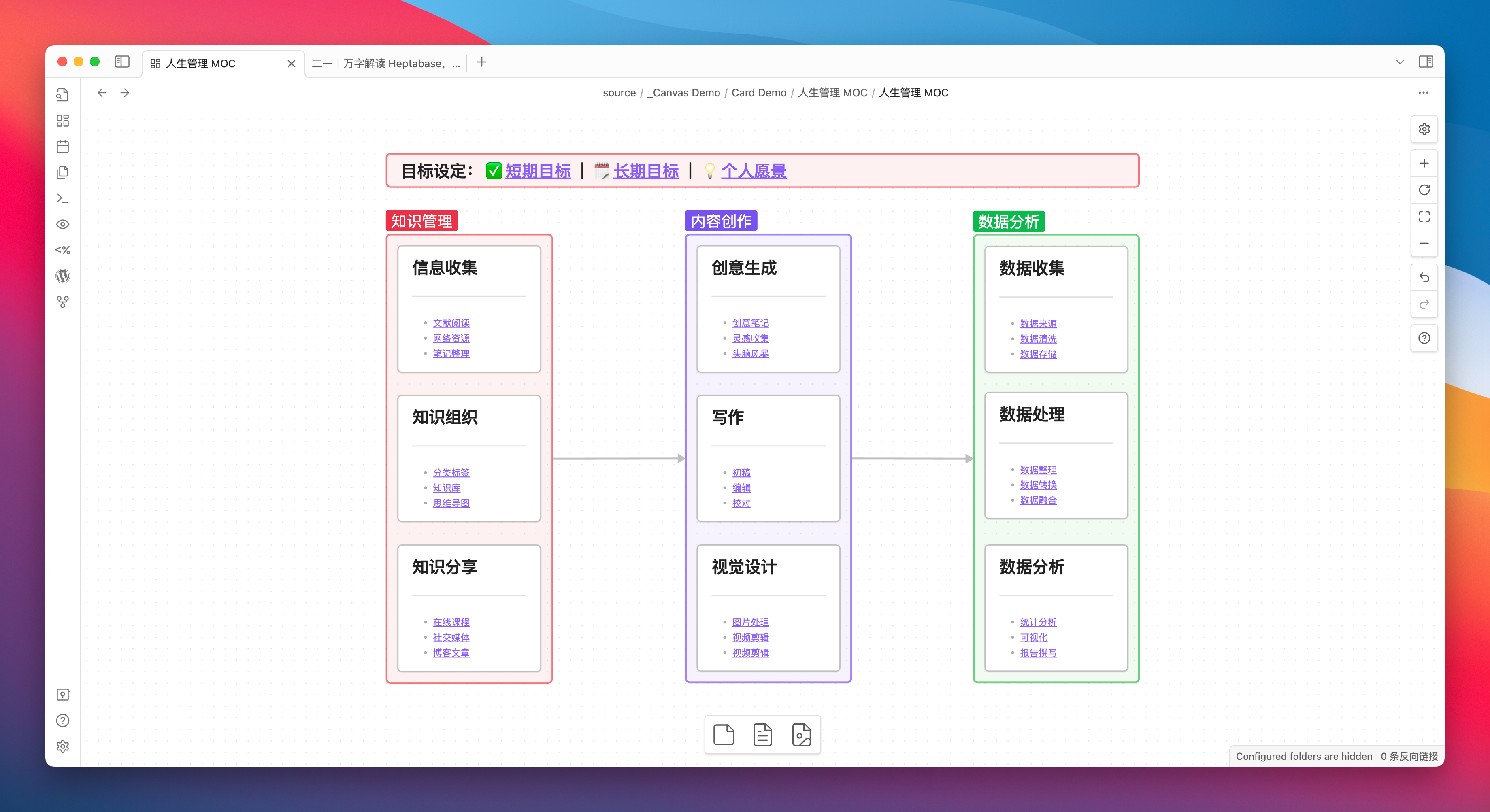
Make good use of the grouping function, and you can build your visualized MOC in Canvas:
Therefore, a simple conclusion can be drawn: if you have never used a whiteboard product, I would strongly recommend you start with Obsidian Canvas, as it is truly powerful and completely free.
But if you are currently using Heptabase and are hesitating whether it is necessary to switch back to the free Obsidian due to Heptabase’s relatively high subscription price, I would say that Heptabase’s various functions, interactions, and details are largely superior to Obsidian Canvas. After all, the former specializes in whiteboards, while the latter is relatively just a core plugin that can be toggled on and off.
I believe that in comparison with Heptabase, the Canvas of Obsidian lacks several core features that I personally value highly. Perhaps there will be plugins in the future that can achieve this, but for now, we will only discuss the current state of Canvas out of the box (without plugins).
- Canvas cannot open cards in the sidebar with one click
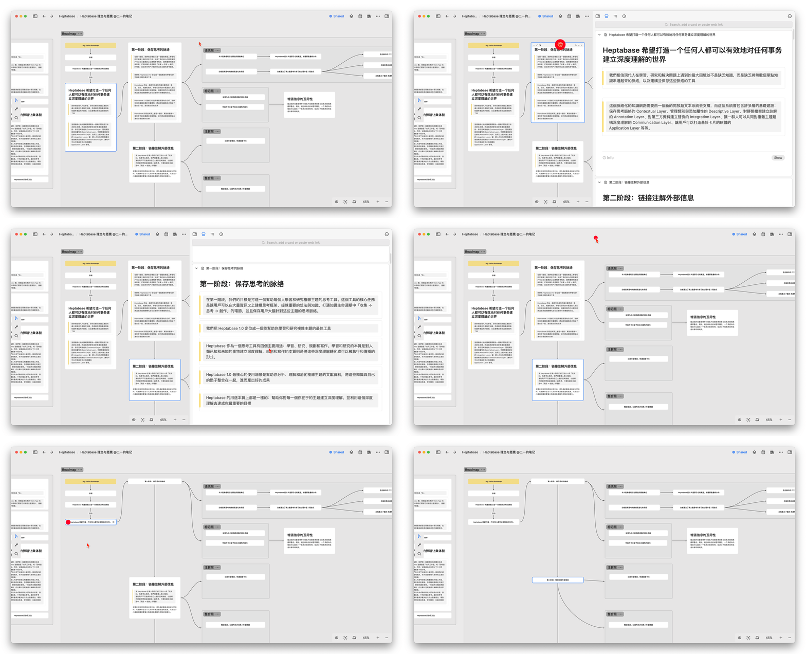
When the number of cards on the whiteboard reaches a certain level, some cards need to be appropriately folded. Heptabase provides a folding button for the cards, and you can open and browse the complete card in the right sidebar with just 鼠标左键双击 , and multiple cards on the right can be continuously swiped for reading:
However, if Canvas wants to open the card in the sidebar, it first needs to use the shortcut key ctrl+鼠标左键 to open the card in a tab, and then manually drag the tab to make its window side by side, which is not a very good user experience:
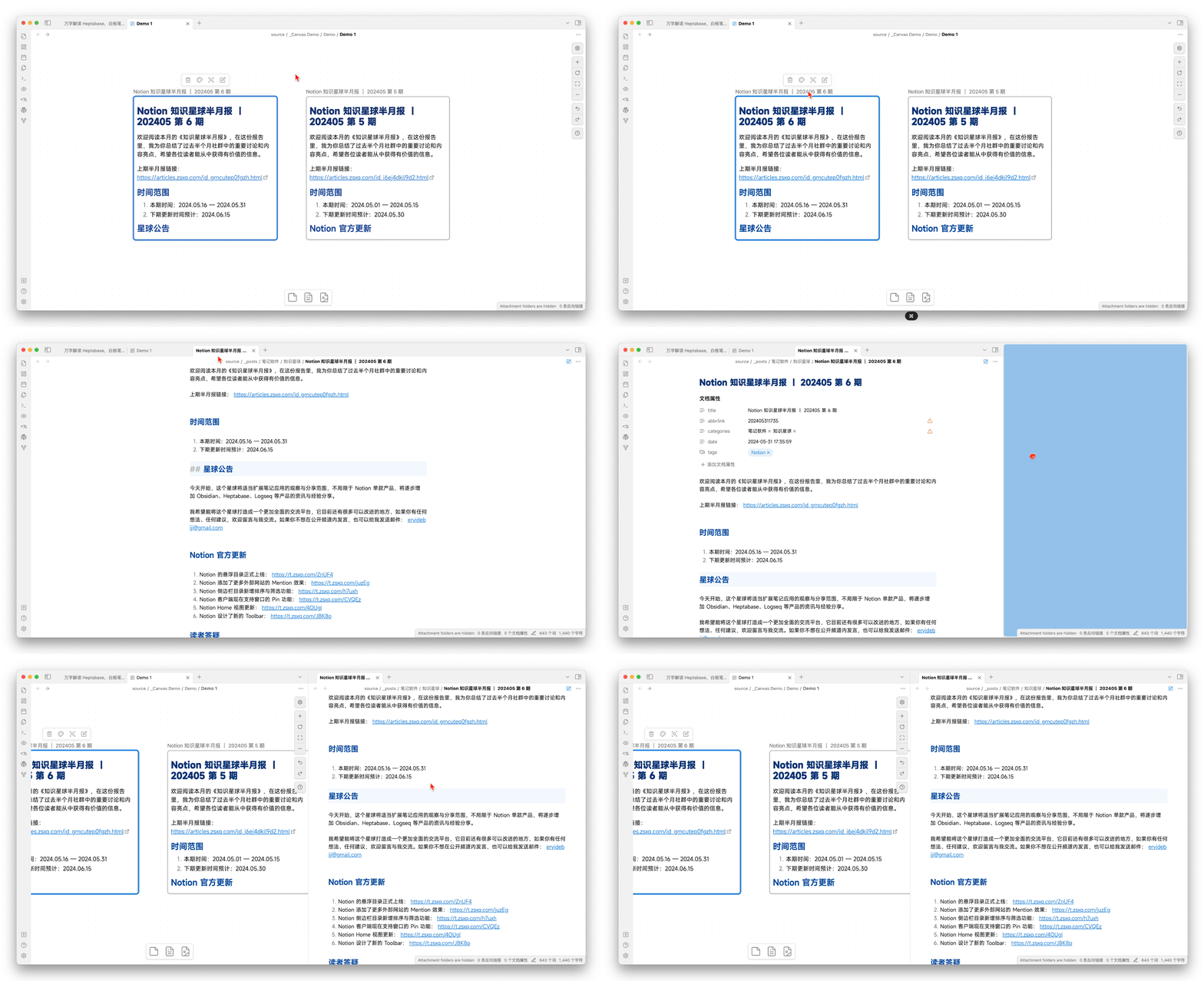
Additionally, although Canvas cards can retain only a certain paragraph, they cannot automatically collapse to just the title and must be manually resized, resulting in a significantly higher frequency of manual card size adjustments compared to Heptabase.
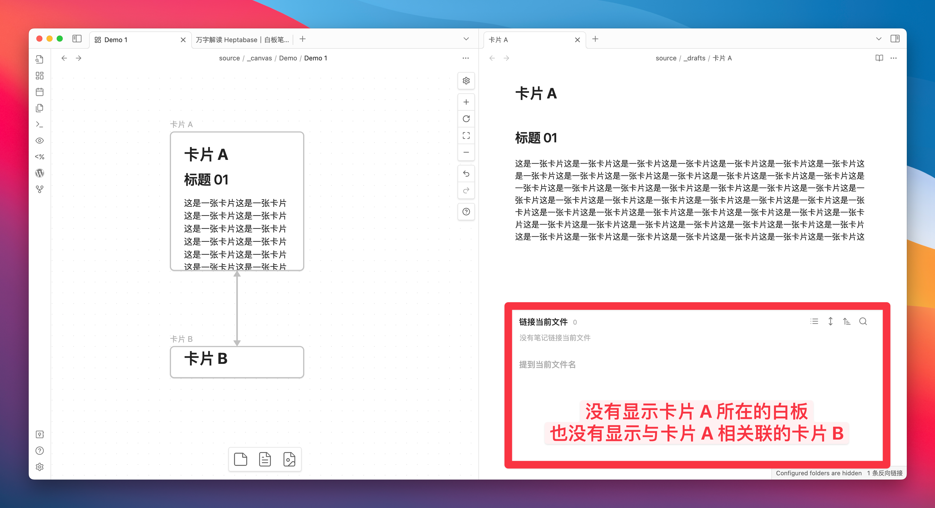
- Canvas’s cards lack backlink context
Obsidian is a note-taking product with dual-chain as its core feature, but the cards you create in Canvas, or the cards linked to each other in Canvas, surprisingly do not include backlinks by default, which is somewhat unexpected. I searched for a long time for a plugin but couldn’t find a solution. If any readers know, please leave a comment.
And Heptabase, as mentioned earlier, the Backlinks section of each card will display the whiteboard it exists on, the cards it is associated with, and even the sections it is related to:
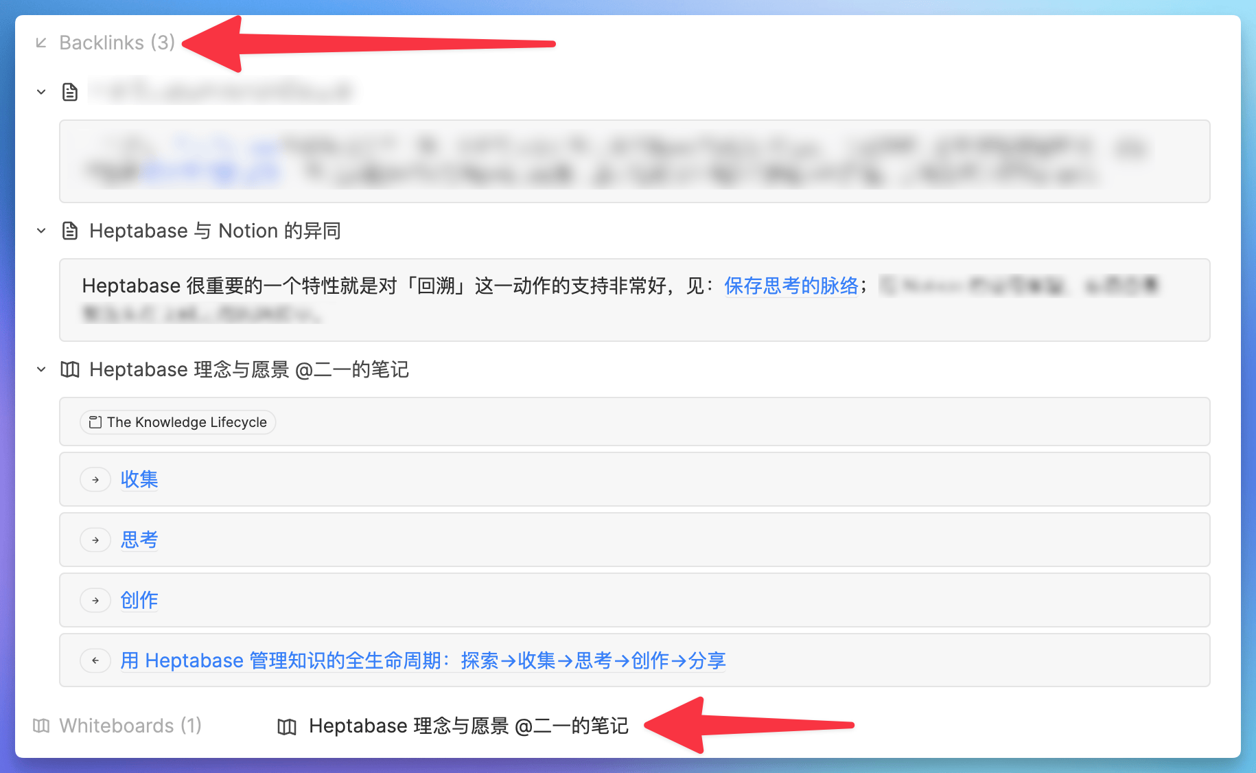
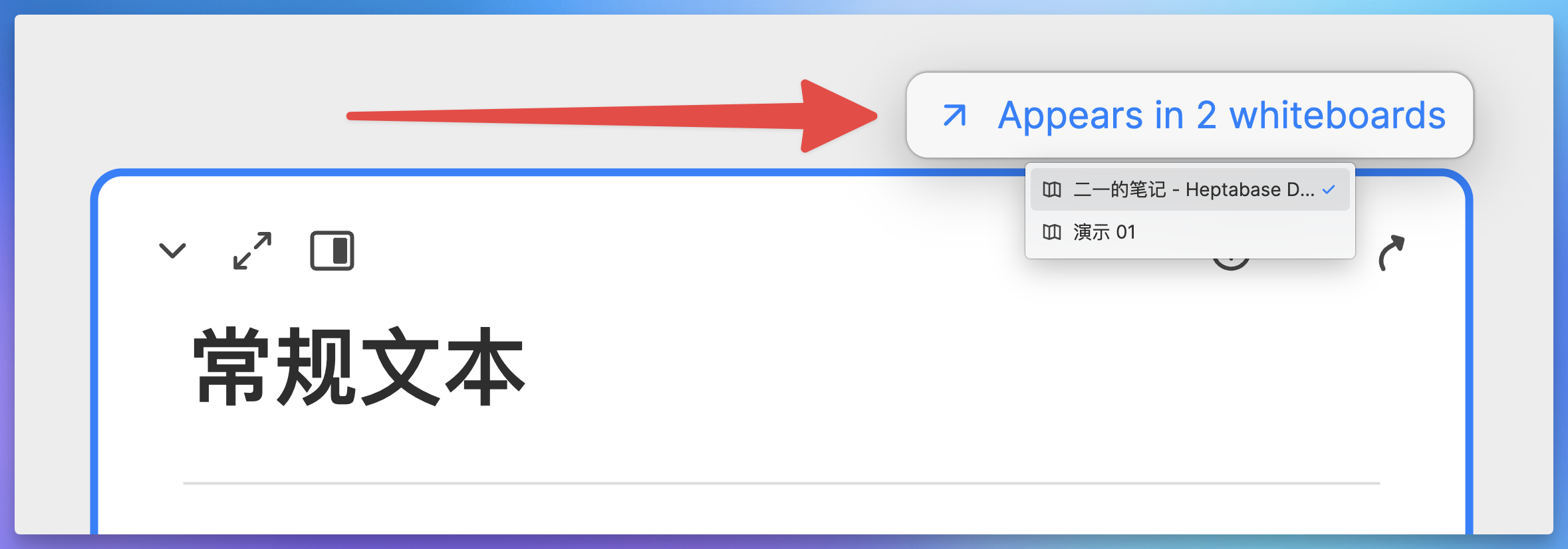
And if this card exists in multiple whiteboards at the same time, a corresponding prompt will also appear at the top of the card:
- Canvas applies the document management approach of a tree-structured folder
First, the card created by default in Canvas will only exist in the current Canvas. It will only appear in the sidebar directory and become a Markdown file when you convert this card into a file. Otherwise, this card will just be a string of data in the JSON file of Canvas.
Because the card is not an MD file, it cannot be referenced within other pages (but it can be searched for):
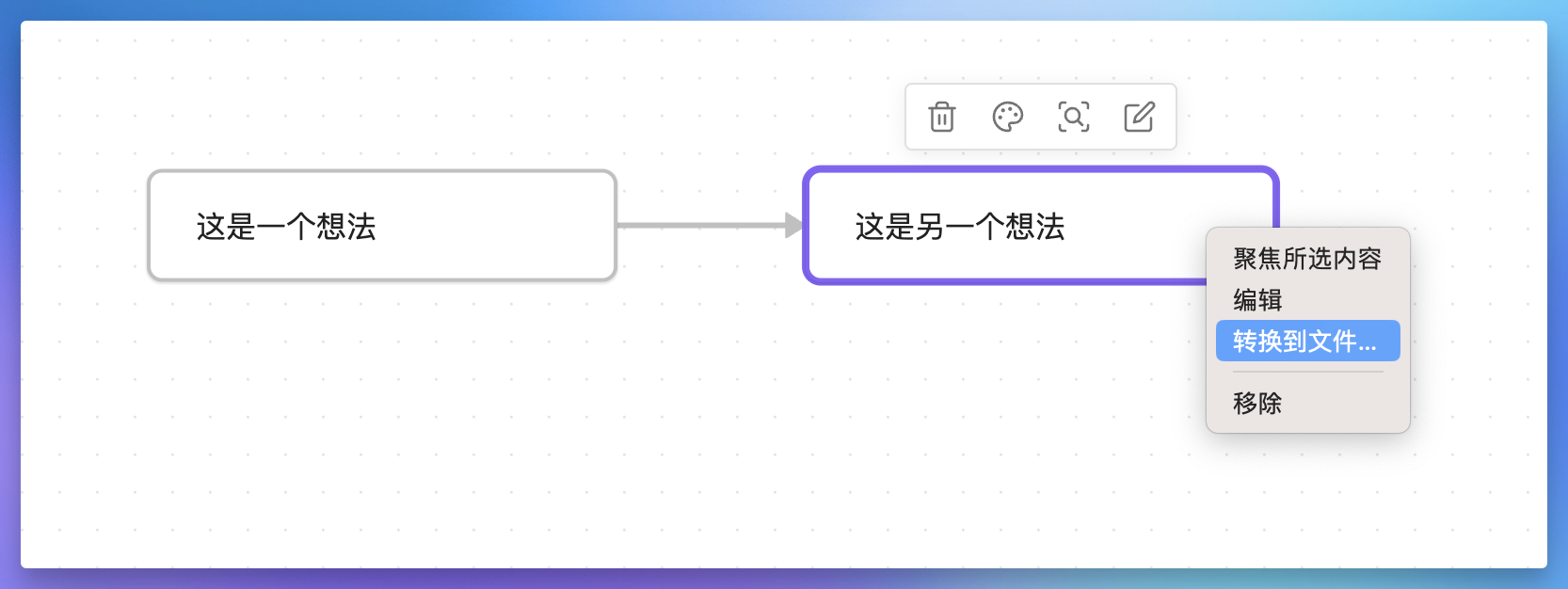
Secondly, when we convert the Canvas card into a Markdown file, this file will appear in the folder you specified for storing new notes:

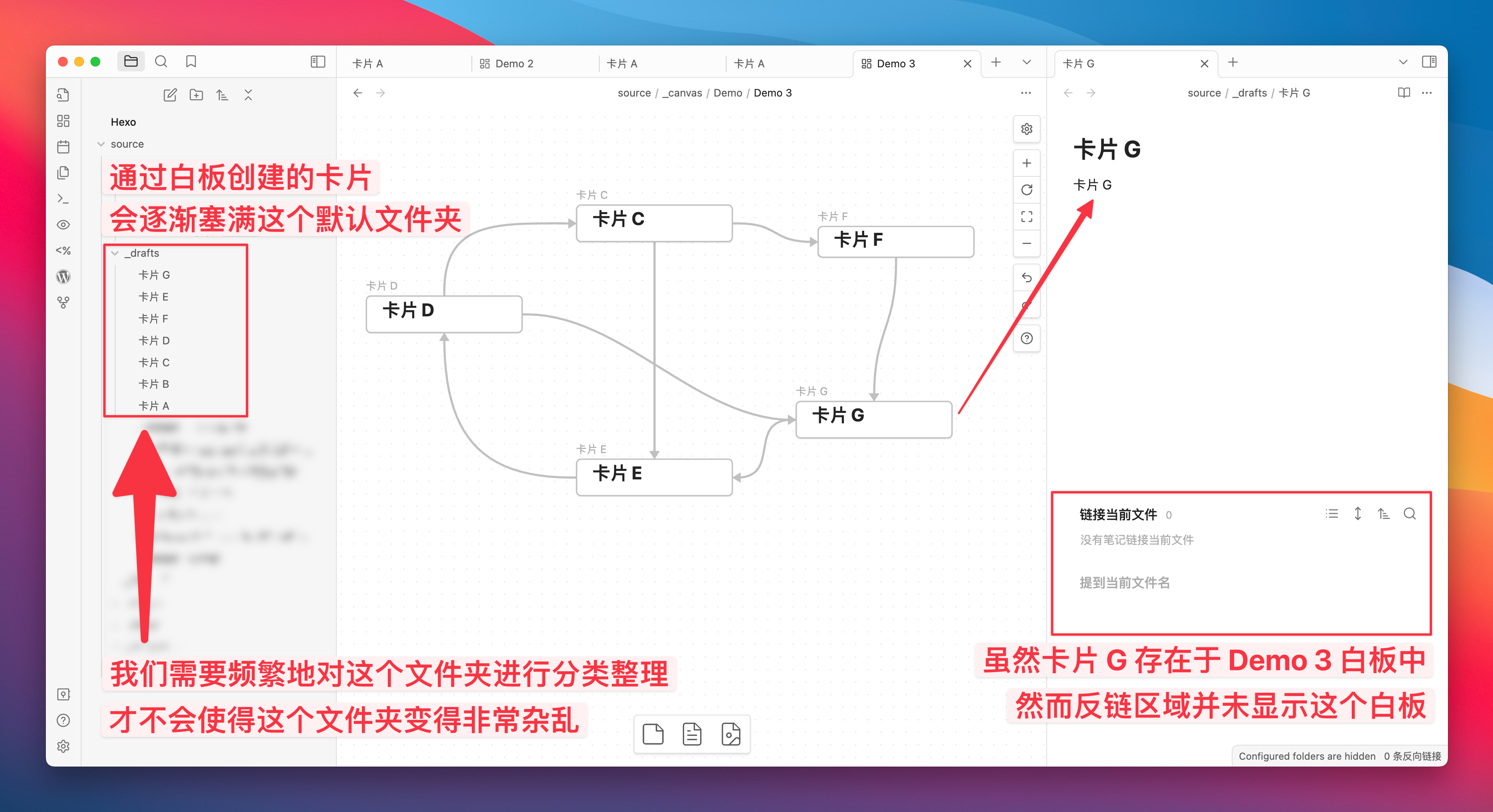
However, this folder is also generally used for storing new notes, as Canvas can currently only specify the folder used for storing Canvas

In other words, if the cards are not promptly organized after being converted into MD files, this folder will be filled with documents created from various whiteboards. Additionally, since these documents cannot be traced back to the corresponding whiteboards through backlinks, it becomes difficult to determine which files can be deleted and which cannot when the number of files increases. This experience is not ideal unless you can completely ignore the chaos in this folder.
Canvas in Obsidian is quite useful for divergent thinking, allowing you to quickly build a knowledge network on the whiteboard. However, when you want to use the [[ symbol to reference this card in another note page, you must manually convert this card into a Markdown file. After the conversion, you need to consider which folder to place this card in.
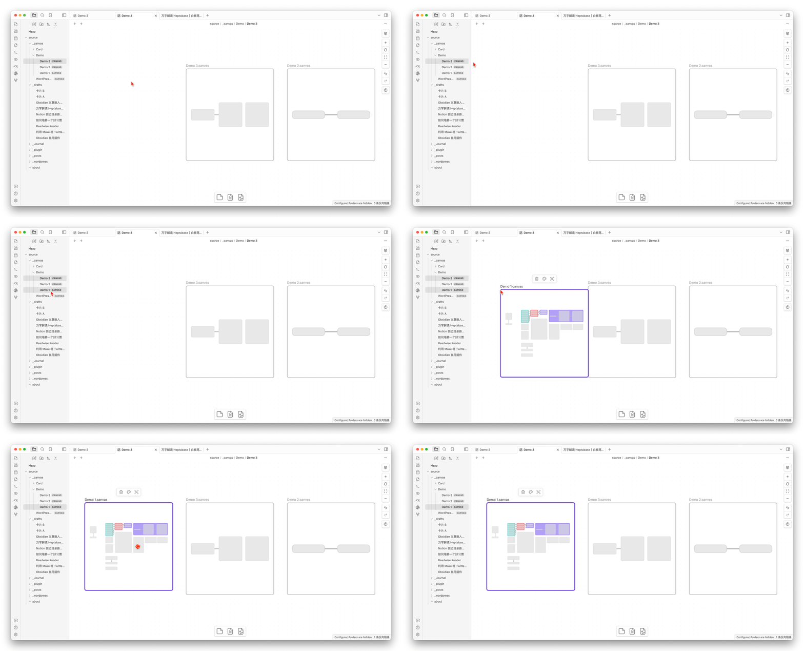
There is one more point: although we can embed a Canvas within another Canvas, we must first create a Canvas B in the sidebar folder before we can drag it into Canvas A. So, we need to consider another question: which folder is most appropriate for this newly created Canvas?
So I say, Cavans is not suitable for managing documents, Canvas is more suitable for linking existing documents.
I believe the current Obsidian Canvas is more suitable for the following usage scenarios:
Used to disseminate short, fragmented thought nodes, because it lacks quick folding and cannot be quickly opened in the sidebar
Used to link documents that have already been orderly stored in the folder, because creating new documents or whiteboards in the whiteboard will make the directory chaotic
For Heptabase, the whiteboard is inherently a tool for managing cards and whiteboards. We can create a new card on the whiteboard, and this card can be referenced anywhere; we can also create a new whiteboard on the whiteboard, which similarly has the function of being referenced anywhere. This means managing all newly created documents entirely based on the whiteboard itself, which is a completely different usage logic compared to Canvas.

After all, Heptabase is a product specialized in whiteboards. Since its launch 3 years ago, all function developments have been centered absolutely around the whiteboard. As for the Canvas of Obsidian, since its launch in 2022, there have been 30 update records related to Canvas, but only 5 of those were for new features. The last new feature was added on February 22, 2023, and the remaining updates have all been performance optimizations and detail adjustments for Canvas.
I have compiled all the version updates related to Canvas on this Notion page, you can click me to visit this page.
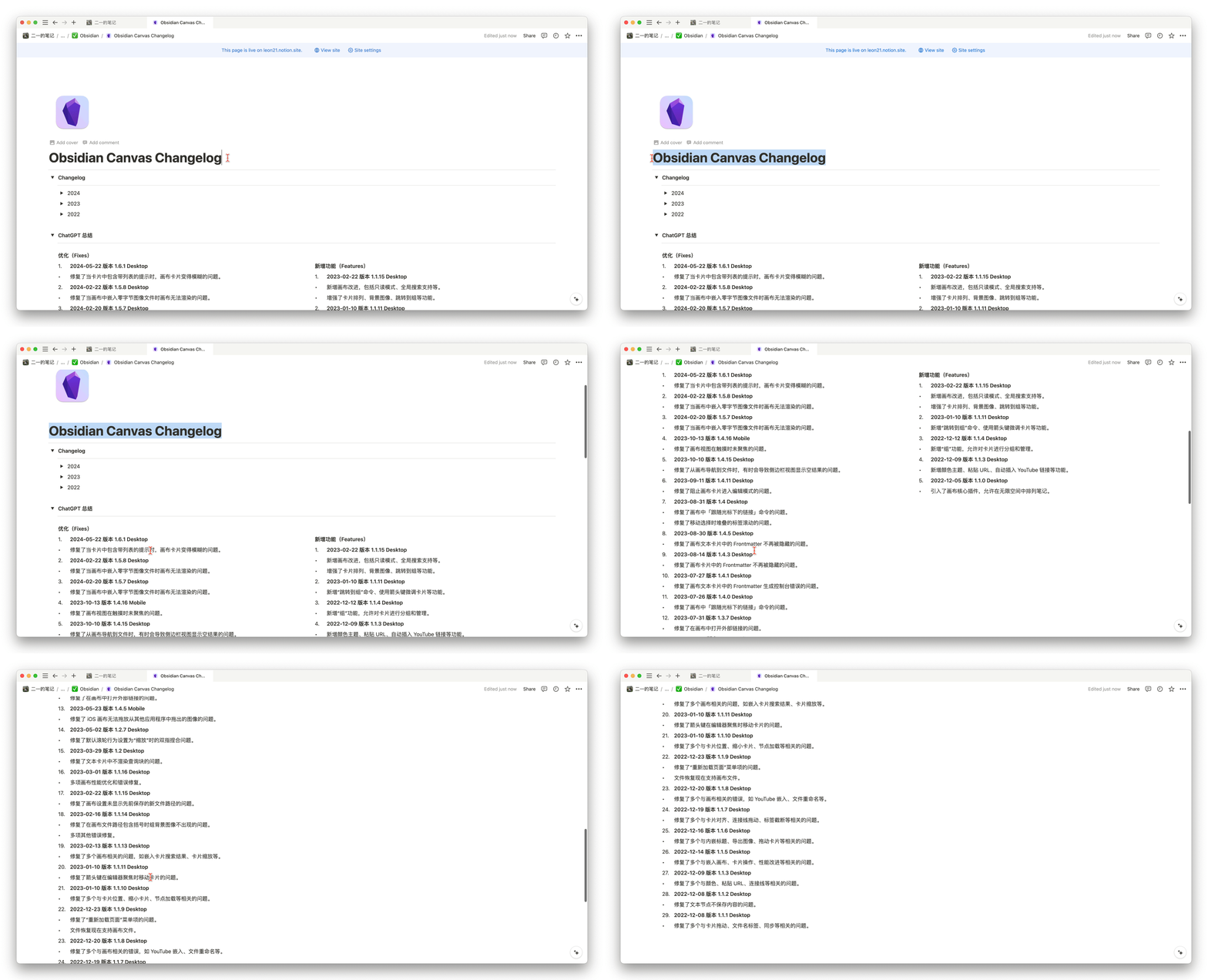
Therefore, I do not doubt the Canvas capabilities of Obsidian, but in fact, Canvas will not become the core development direction of Obsidian, because the priority for adapting new features is not high. However, if you are already a user of Obsidian, you can consider Canvas as a very useful and powerful tool for brainstorming, to assist your thinking.
The completely free Canvas is often much more useful than some paid tools, so we shouldn’t be too demanding of it.
Summary of Heptabase’s Advantages and Disadvantages
Advantages
I believe that if you currently need a note-taking tool to help you study and think, and you don’t want to spend too much time tinkering with templates like Notion or researching plugins like Obsidian, then I think Heptbase will be a competent, ready-to-use excellent product.
This article is so long that if more advantages need to be mentioned here to convince you, then I think Heptabase may not be suitable for you. Therefore, I will now point out a few disadvantages of Heptabase so that you can more decisively give it up.
Disadvantages
Although Heptabase has been in development for three years, there are still many features that need to be improved in detail. I have compiled a few issues that I personally care about, ranked by the degree of impact on me:
The client currently does not have a multi-tab mode, which makes reading and recording across whiteboards very inconvenient
Lacking the merge card function, it is not possible to select multiple documents and merge them into a complete card like Ulysses
No handwriting mode, unable to directly draw lines and mark on the diagram like Excalidraw
Performance still needs further optimization; if there are many GIFs when writing, there will be noticeable lag when scaling the whiteboard
Annotations or marking functions cannot be added to the whiteboard. It is hoped that a dedicated info area can be allocated for the whiteboard
The loading speed of the web page is too slow, and the experience of both using and sharing it is not very good- The price is slightly high, with an annual fee of 108 USD
- Currently, only the entire whiteboard can be shared; sharing a single whiteboard is still under development
- No plugin system

Entry Recommendations
If you feel inclined to use Heptabase after reading this article, then I believe the best way to get started is as follows:
- Choose a topic you are currently most interested in
- To master this topic, create a whiteboard for it
- Create various necessary cards on this whiteboard
- Organize the positions and relationships between the cards using the logic of thinking
In the introductory process, I believe the most important thing is not to treat Heptabase as an all-in-one note-taking application. Do not lay too much groundwork for a future note-taking system. All records should first focus on “mastering the current topic at hand.” Any unrelated tinkering needs to be temporarily set aside; otherwise, you will fall into the cycle of embellishing the note-taking system and then quickly abandon this product.
If you can persist in recording at least one complete topic, due to the non-linear recording characteristics of the whiteboard, your thinking will expand comprehensively, and at the same time, you will unconsciously accumulate a large number of cards strongly related to the topic. At this point, you will feel for the first time the value that the whiteboard can provide.

Another point is that many beginners (like myself) tend to create a whiteboard as soon as they come up with a new idea. However, each whiteboard takes a lot of time to develop, so if you do the same, you will end up with many whiteboards with only a few scattered cards, which can easily lead to negative feedback.
Therefore, I suggest that you also practice the concept of Inbox when you are starting out. When a certain vague topic has enough cards, then create a separate whiteboard for it.
Conclusion
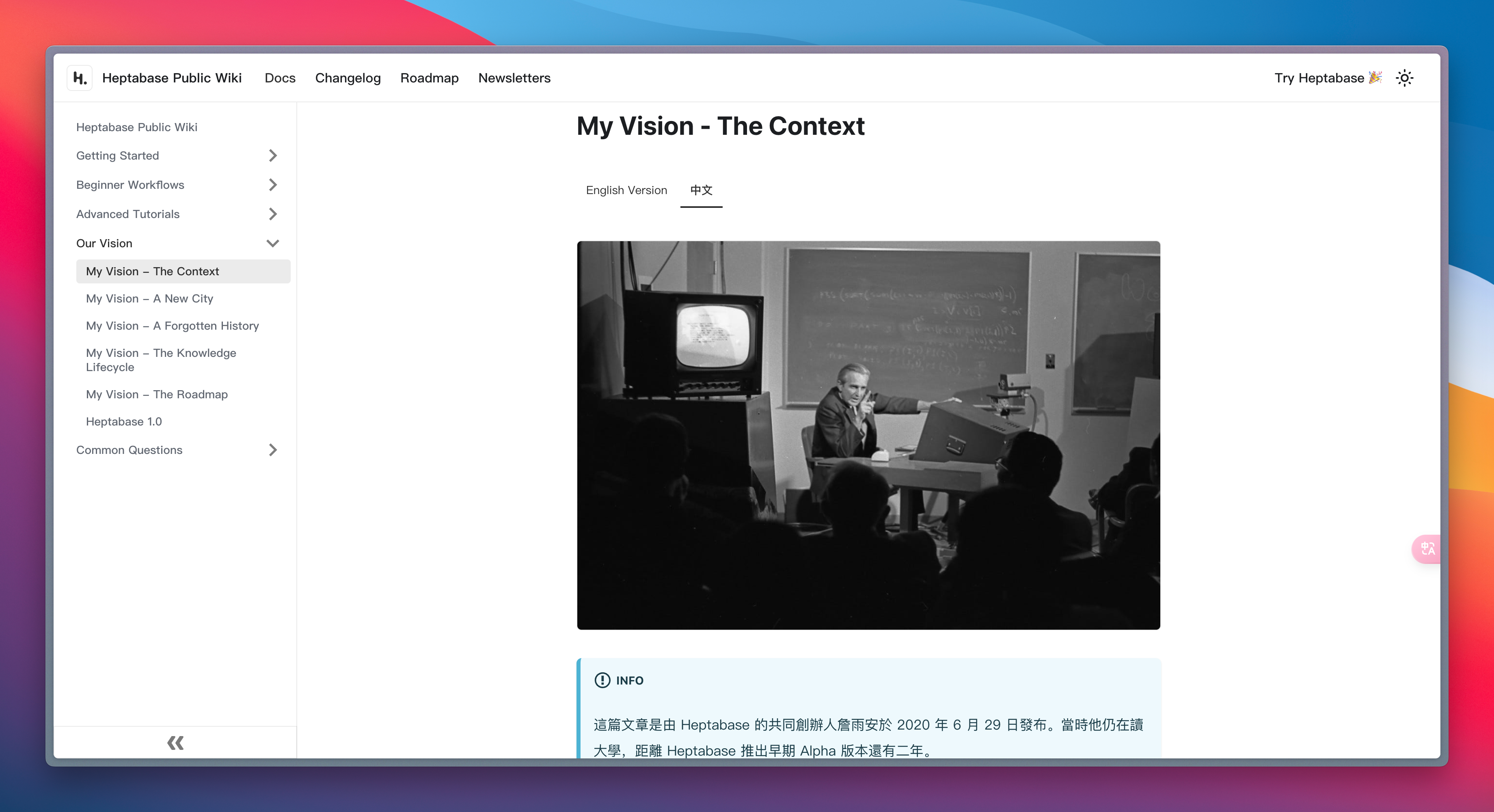
At the beginning of the article, I mentioned that Alan’s vision is to create a tool that can accelerate the construction of collective human intelligence and increase the speed of knowledge and technology growth. However, before this young developer created Heptabase, he had three goals that seemed even more incredible, which are as follows:

At first, I thought these goals were just unrealistic notions conceived by a spirited teenager during their student years. But after reading Alan’s series of vision introductions about Heptabase, I am willing to believe that his courage is genuine, and his actions indeed prove himself.
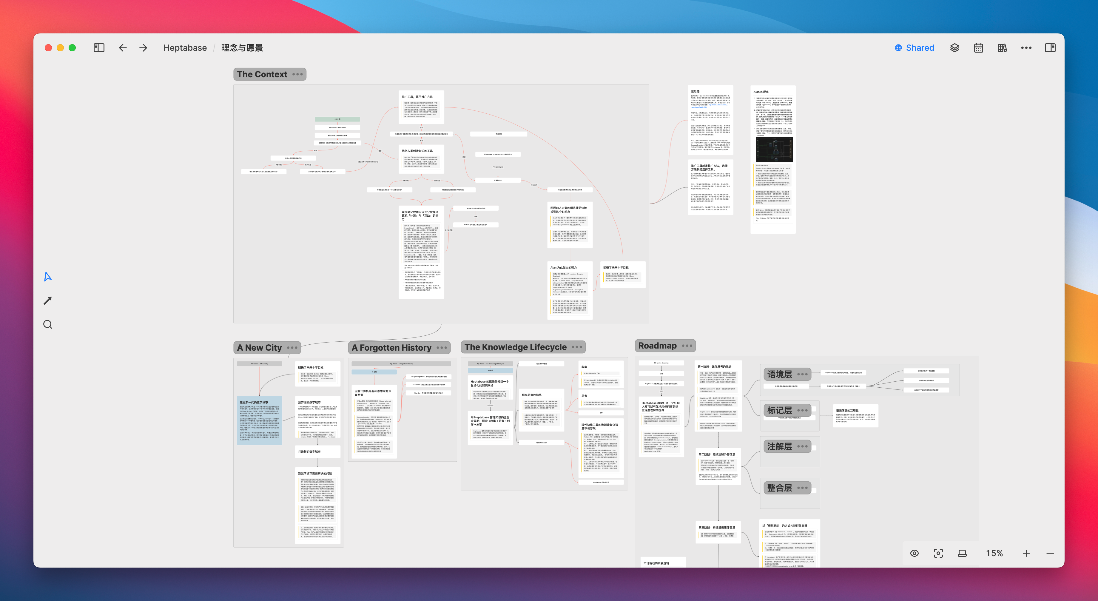
I wrote a simple review of his articles using Heptabase’s whiteboard. You can click this link to get a sense of what it’s like to use Heptabase for PDF reading notes.
想让 Notion 真正用起来?试试 FLO.W Notion 系统(Basic ¥199 / Pro ¥299 / Max ¥349)——了解 FLO.W →
Perhaps a few years from now, Alan’s fame will have the opportunity to be as well-known among insiders as Ivan Zhao, the founder of Notion, because both of them, to some extent, “studied under” Douglas Engelbart and possess a vision and ambition that their peers lack. I look forward to writing a “10-Year Development History of Heptabase” at that time, just like this “10-Year Development History of Notion”.

- This article has been translated using AI. The original text is from https://eryinote.com/post/1009. The translation has not been professionally edited and is provided for reference only.
- You are also welcome to watch my video review on this topic: https://www.youtube.com/watch?v=z-Q2YnvBN0c
- For a 7-day free trial of Heptabase, please visit: http://eryi.ink/appr
- To view shared Heptabase note examples, please visit: http://eryi.ink/gJL7
本站所有文章,除非特别说明或标注,均为本站原创发布。转载本文需附上本文链接,未经授权,禁止大篇幅复制、盗用、采集或发布本站内容至其他网站、书籍等各类媒体平台。
